Preview image. Unlock full-res
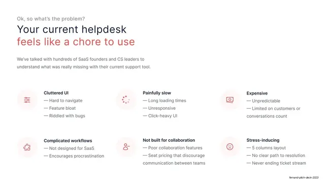
Problem slide with a red-accented headline over a 2x3 grid of pain points, each a tinted icon plus a bold label and em-dash bullets.
Summary
The problem slide: incumbent helpdesks "feel like a chore", broken down into six labeled pain points in a two-row, three-column grid.
Visual description
Gray eyebrow "Ok, so what's the problem?" sits above a two-line headline whose first line is navy ("Your current helpdesk") and second line is red ("feels like a chore to use"). A short gray intro paragraph follows. Below, a 2x3 grid of pain points, each with a small icon in a pale red-tinted circle and a bold navy label over two or three gray em-dash bullets: Cluttered UI, Painfully slow, Expensive (top row); Complicated workflows, Not built for collaboration, Stress-inducing (bottom row). Icons read as sliders, a loading spinner, a banknote, a puzzle piece, a person, and a frowning face.
Key takeaway
Using color only on the second headline line to make the pain land, while the layout stays identical to every other slide. The six tinted-icon cards turn a long complaint list into a scannable, calm grid instead of a wall of bullets.
Reuse notes
A reusable problem layout for any pitch that needs to enumerate several distinct pains without sounding ranty. The single red headline line is a cheap, effective emphasis device; keep red exclusive to the problem so it stays meaningful. Six items is near the upper limit before the grid feels dense.
From this deck: Problem grid current helpdesk
View deck

More like this





Keep what you find
A free account saves references to boards and can send you a weekly email of picks based on what you save.
To see every result, go Pro.