
Preview image. Unlock full-res
A 34-slide insurance brand guideline that pairs slate-grey, candy-pink and neon-green with a skewed "tape" logotype and oversized Roc Grotesk headlines.
Summary
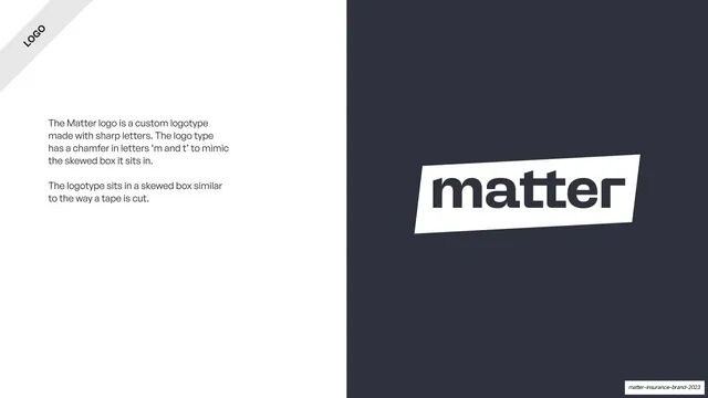
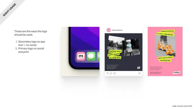
A 34-slide brand guideline for Matter, a possessions-insurance startup. Its identity rests on one idea borrowed from packing tape: a black-on-white logotype that sits in a skewed parallelogram "tape" container, repeated as a graphic motif across collateral. The deck pairs slate grey, candy pink and white with a neon-green highlighter accent, sets everything in oversized Roc Grotesk, and recurs diagonal banded section dividers throughout.
Visual description
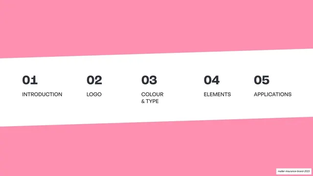
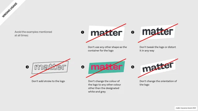
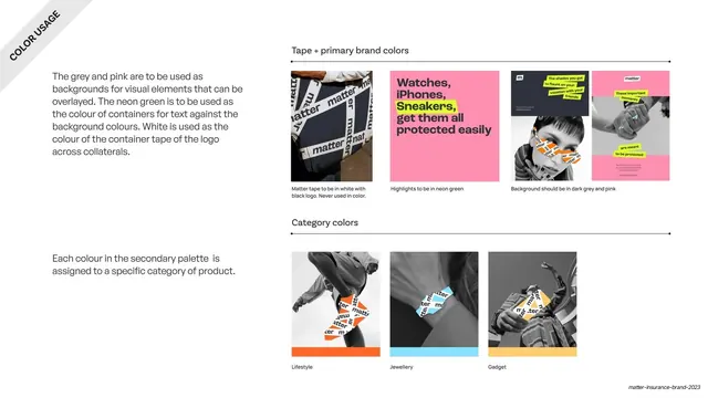
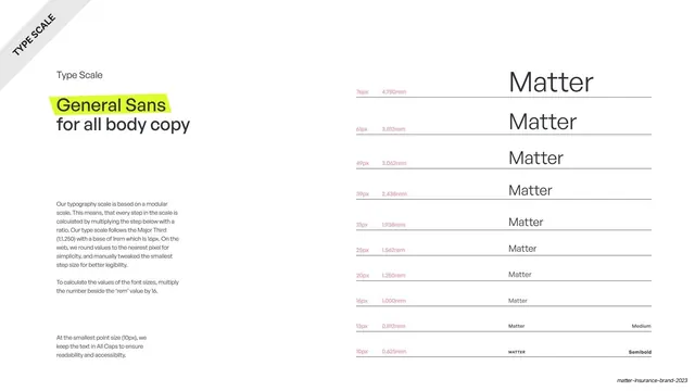
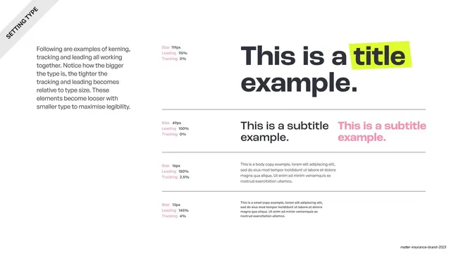
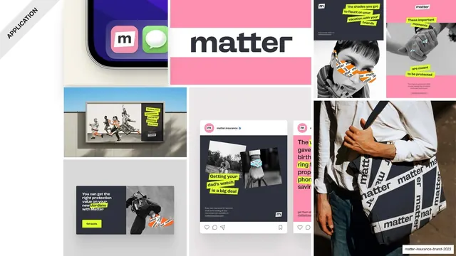
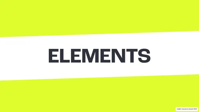
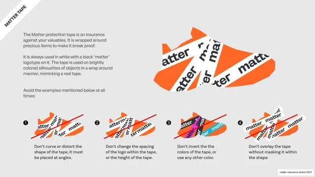
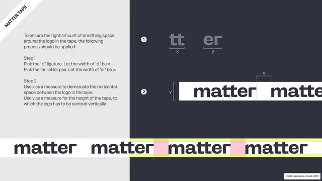
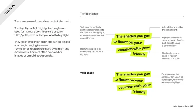
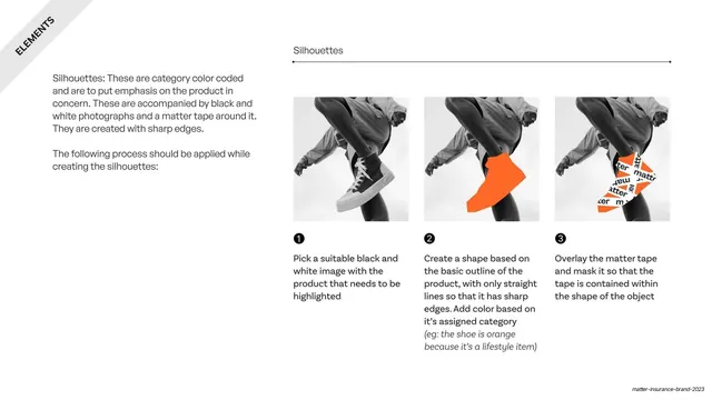
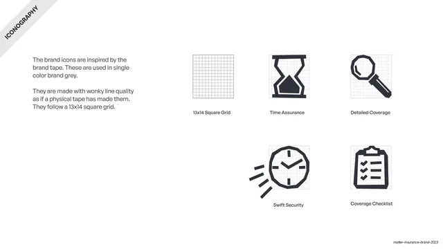
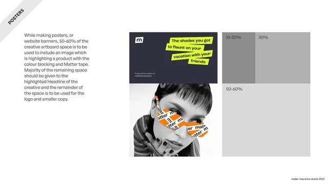
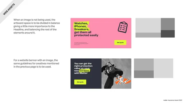
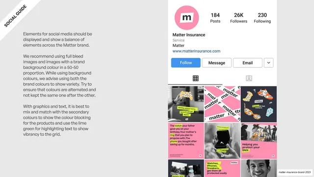
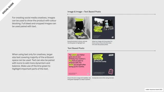
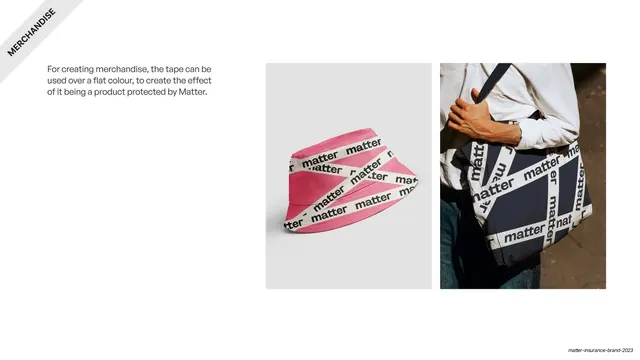
Slides run 16:9. The core palette is dark slate grey (#2F323A), candy pink (#FF8FAF), white, and an electric neon-green (#DDFC2C) used only as a highlight; a secondary set of orange (#FF6827), sky blue (#88E0FF) and warm yellow (#FFCD6E) color-codes product categories. Two recurring structural devices give the deck its rhythm: full-bleed section-divider slides made of three skewed horizontal bands (a white slab carrying an oversized all-caps title between two pink or grey bands), and a diagonal corner ribbon in the top-left of content slides carrying the section name in small rotated all-caps. Content slides use a clean split layout: a short General Sans body block on the left, a demonstration (logo lockup, mockup, swatch stack, type specimen) on the right. Headlines are set very large in Roc Grotesk Bold, frequently lowercase, with a neon-green highlighter block dropped behind a single keyword. The brand's "tape" device appears as the skewed white logo container and, more loosely, as orange or white "matter" tape strips composited across black-and-white lifestyle photography of people skating, holding watches and wearing jewellery. Logo-misuse grids use red diagonal strike-throughs; the type-scale pages show a "Matter" specimen stepping down a modular scale with pink px/rem labels.
Key takeaway
The tape concept carried all the way through: a logotype that lives inside a skewed parallelogram, then reused as a repeatable graphic strip on photography and posters, so the wordmark and the brand pattern are the same object. The neon-green highlighter behind one word in an otherwise grey headline. And the diagonal banded divider, a single reskinnable template that paces the long deck and instantly signals a new section.
Reuse notes
A strong reference for consumer fintech, insurance, and any youthful product brand that wants energy without losing a clean editorial base. The tape-container idea is directly transferable to any wordmark; the diagonal-band divider and corner-ribbon system are reusable structural templates for any multi-section guideline or deck. The candy-pink-plus-neon-green pairing reads young and bold, so temper it for more conservative audiences. Needs good black-and-white photography to carry the application pages.
From this deck: Matter Insurance Brand Guidelines 2023
View deck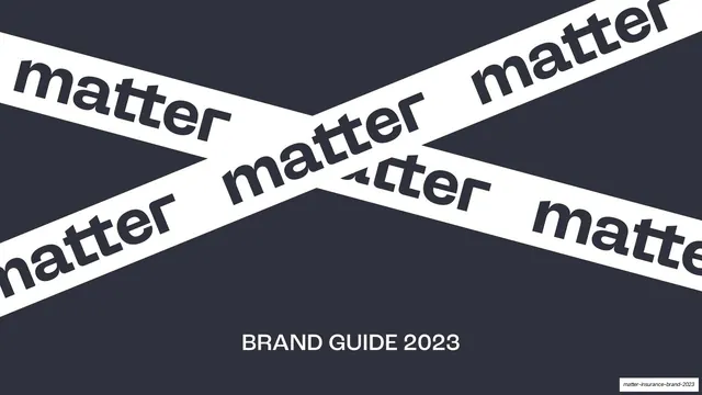











More like this









Keep what you find
A free account saves references to boards and can send you a weekly email of picks based on what you save.
To see every result, go Pro.