Preview image. Unlock full-res
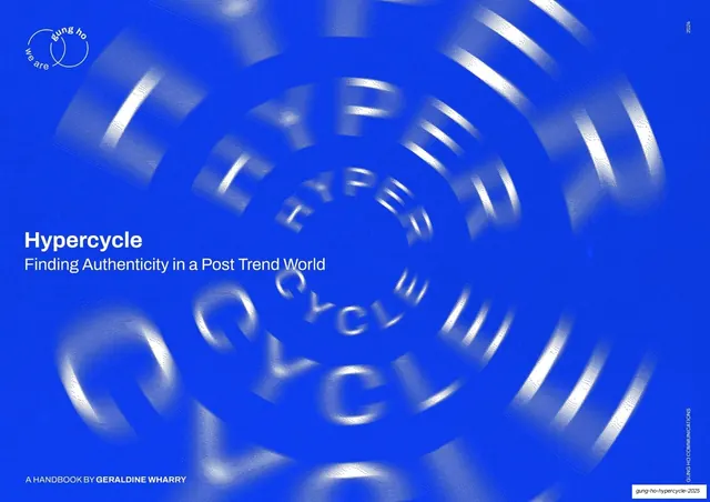
An 88-page editorial trend handbook in electric blue, halftone black-and-white photography and a pixel display face, built like a zine that argues for slowing down trend culture.
Summary
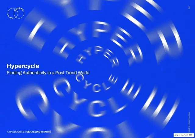
An 88-page trend report, "Hypercycle: Finding Authenticity in a Post Trend World," from Gung Ho and futurist Geraldine Wharry. It reads less like a corporate forecast and more like an editorial zine: electric cobalt blue, gritty halftone photography, a pixel/bitmap display face, and sticky-note annotations carry a long-form argument for slowing trend culture down.
Visual description
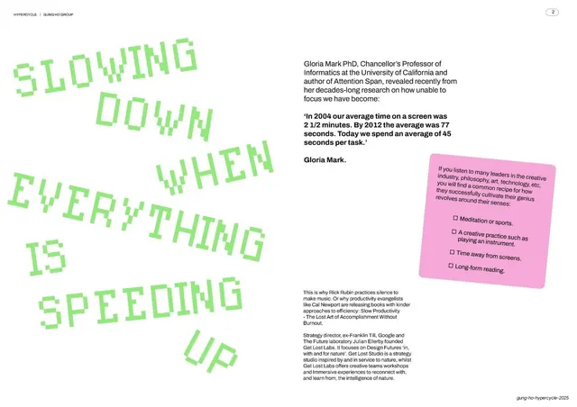
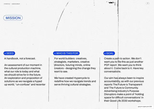
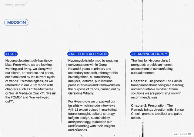
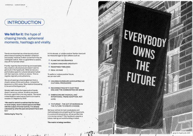
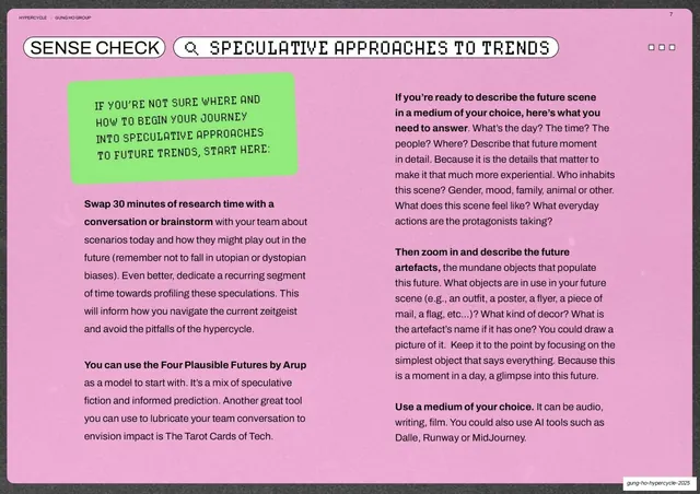
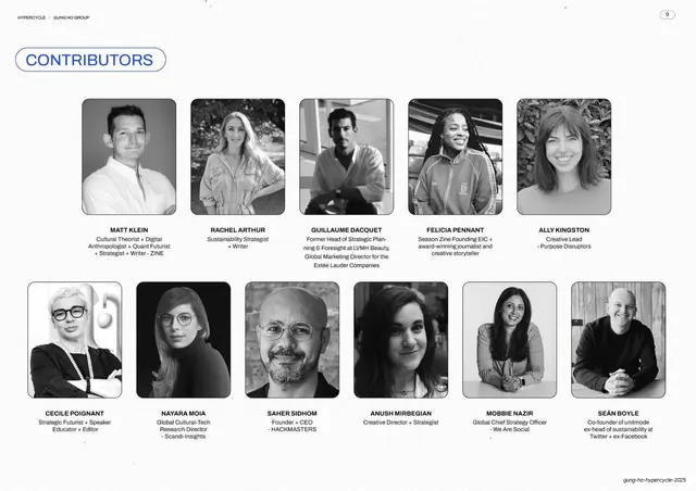
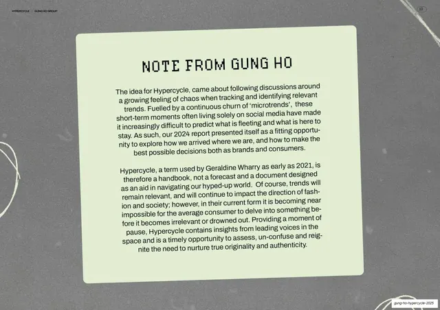
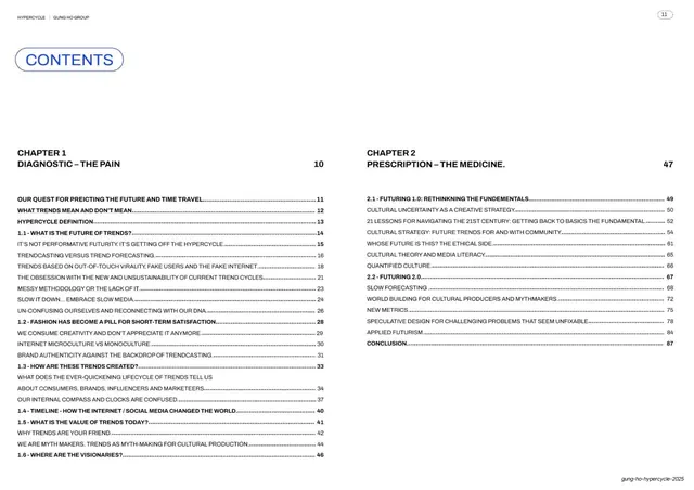
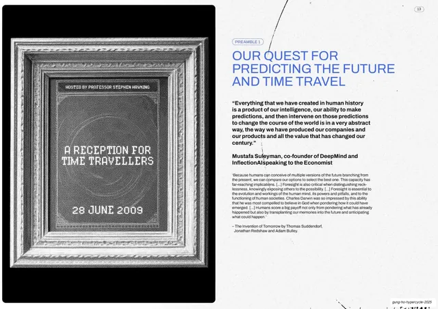
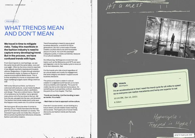
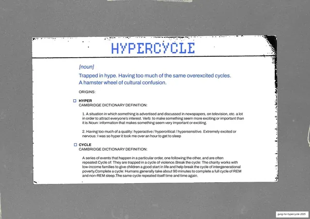
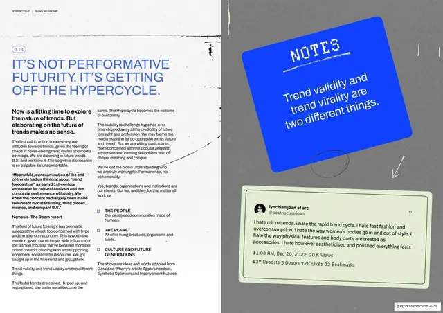
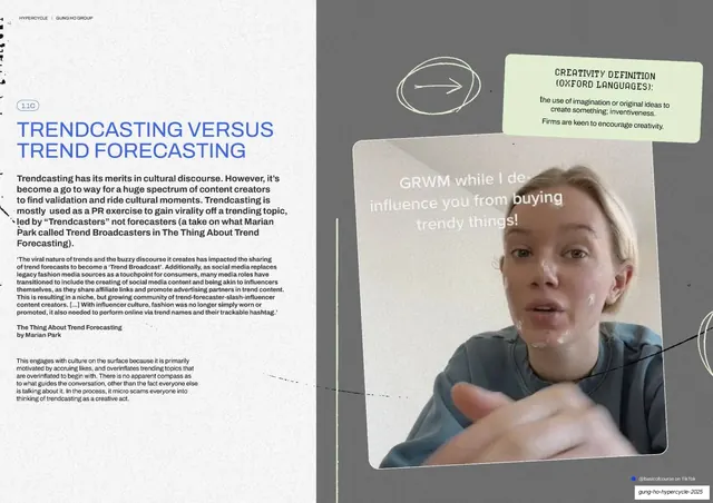
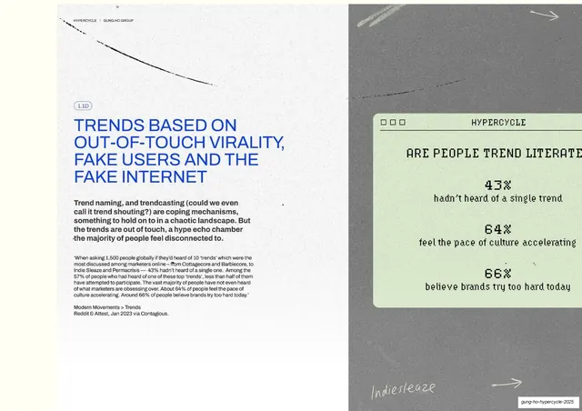
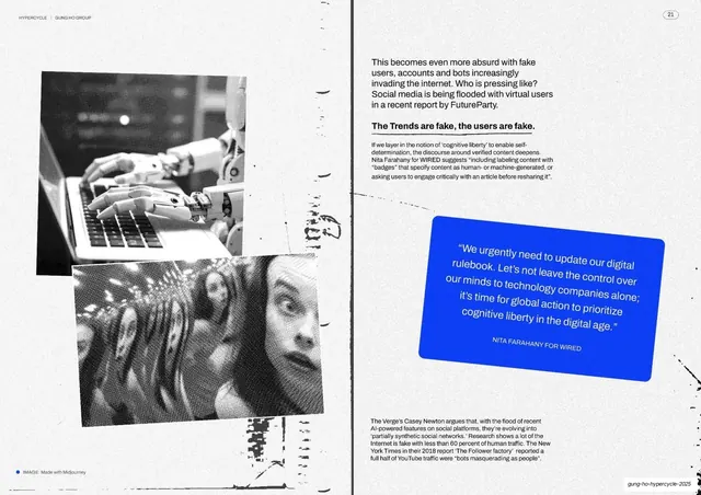
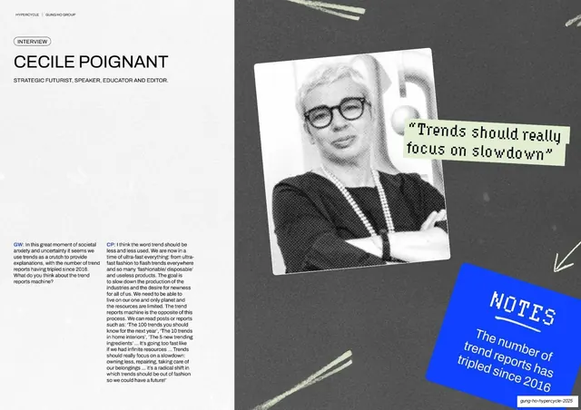
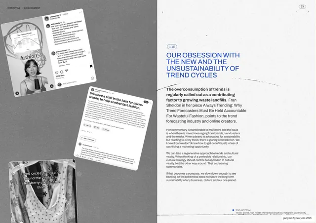
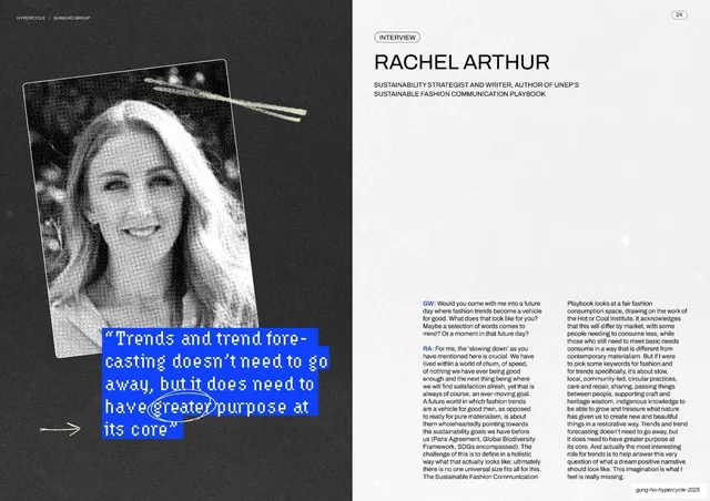
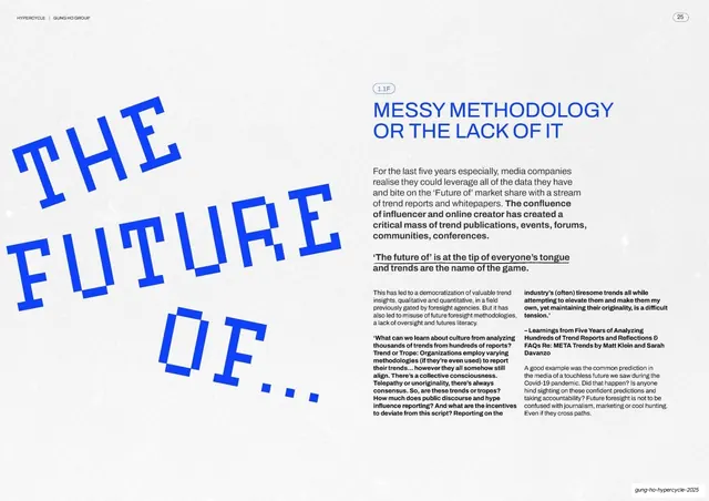
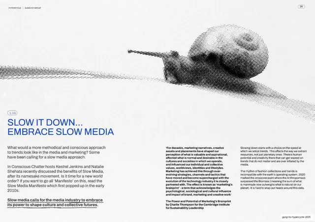
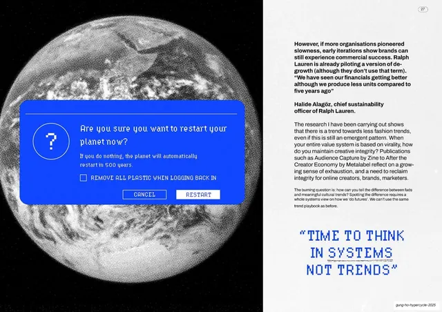
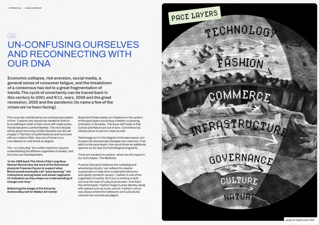
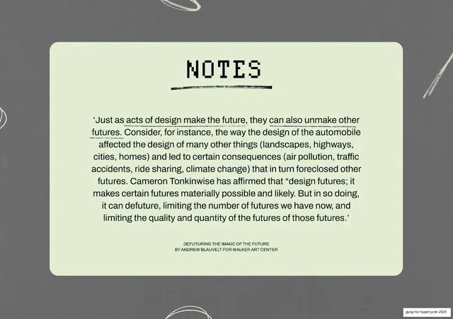
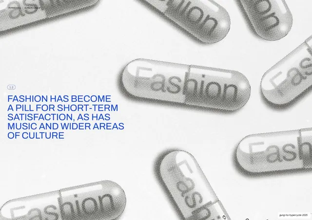
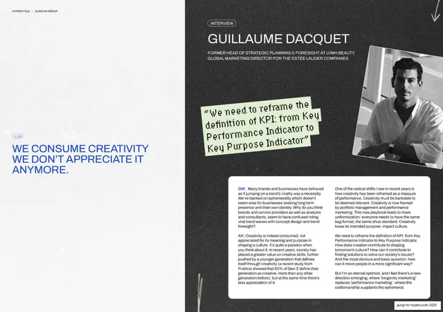
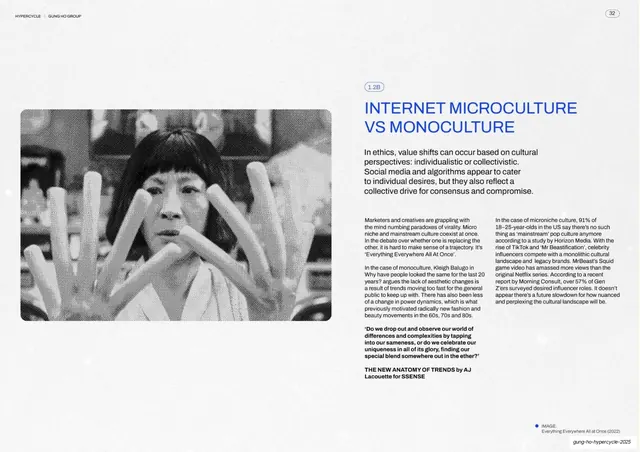
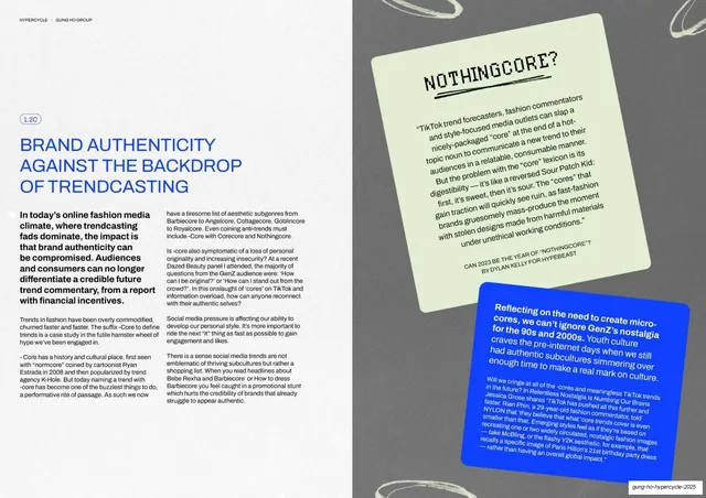
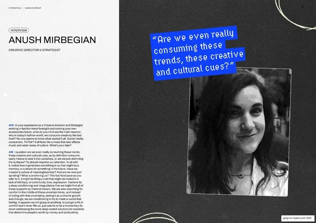
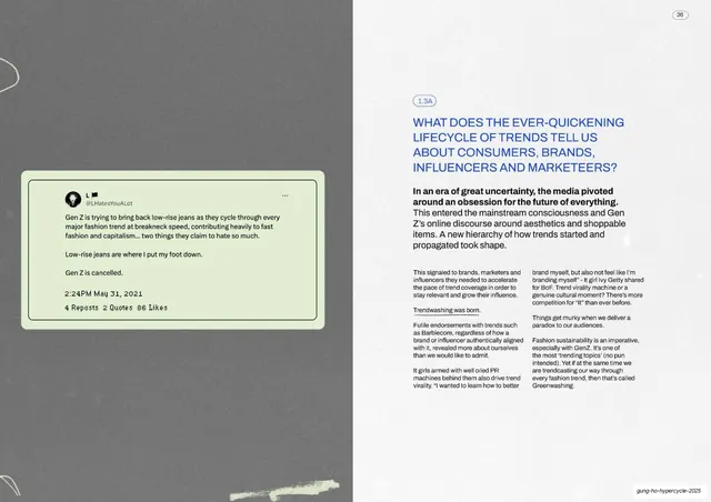
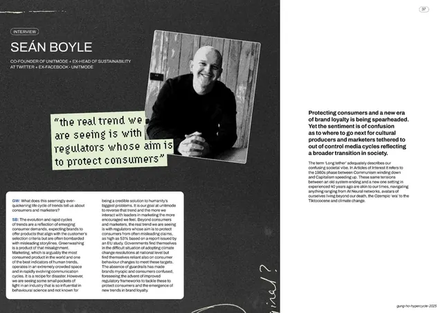
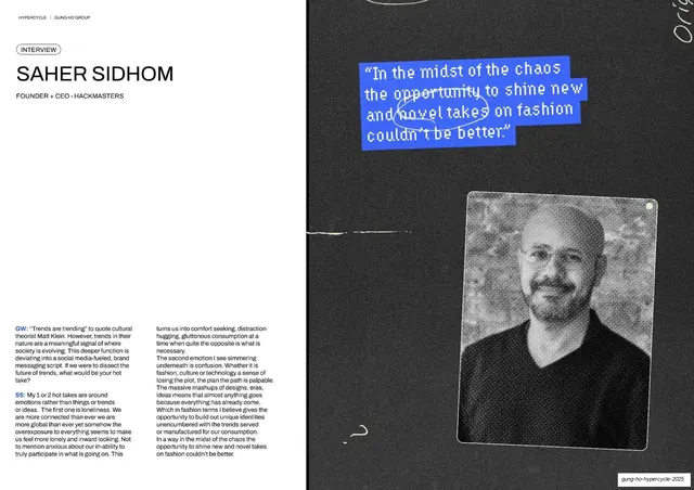
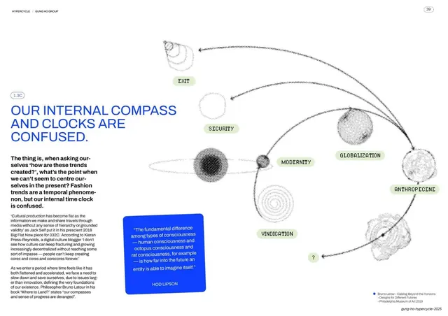
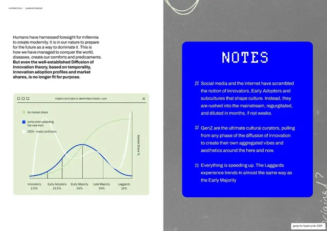
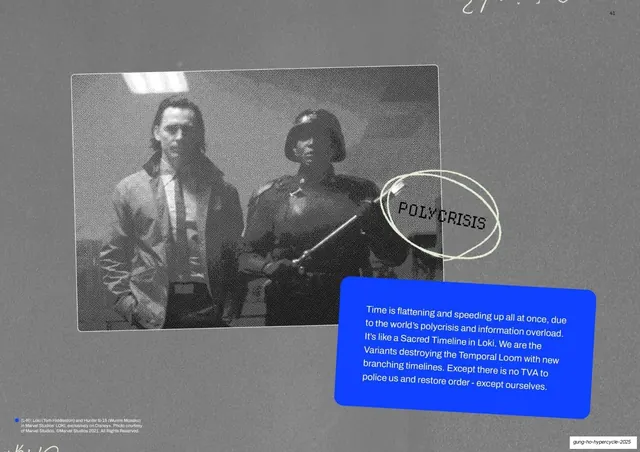
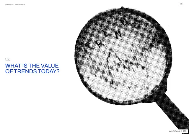
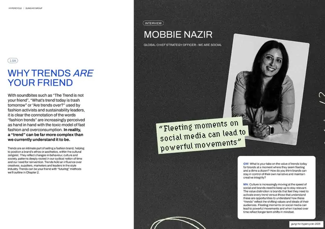
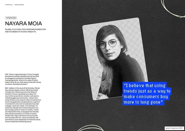
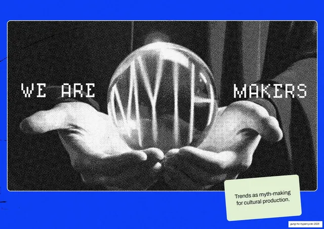
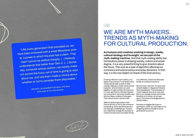
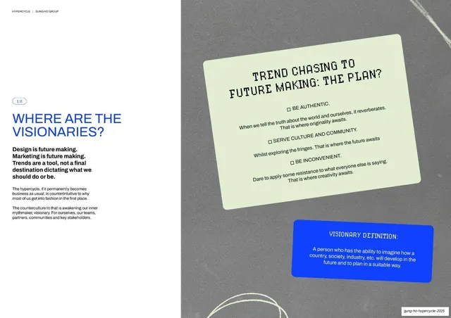
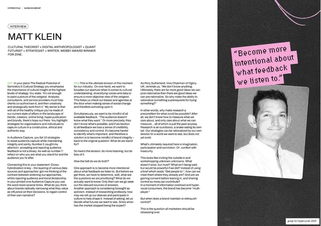
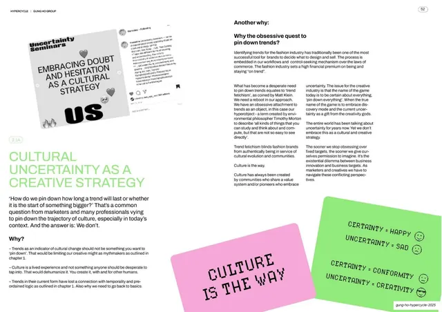
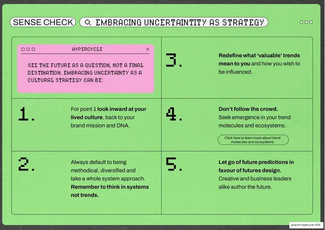
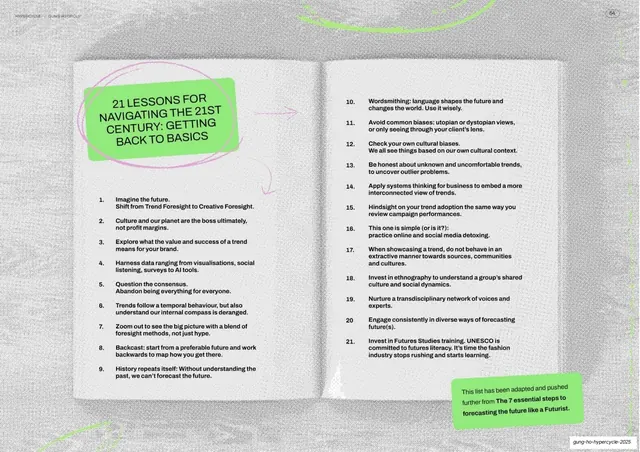
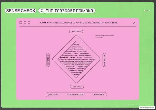
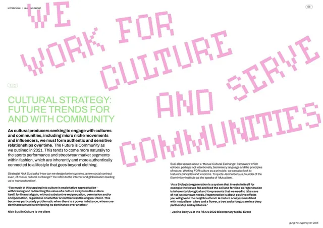
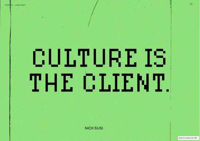
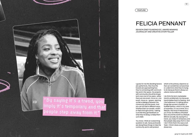
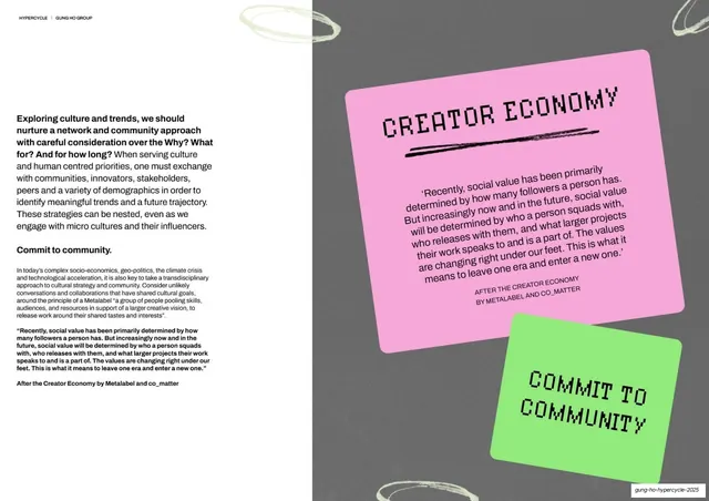
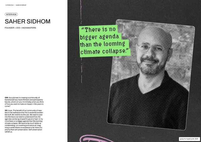
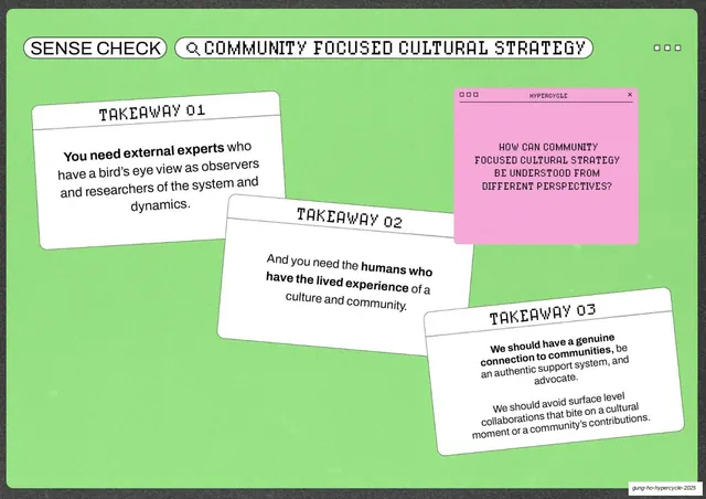
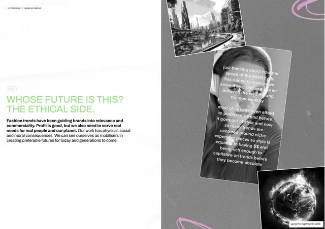
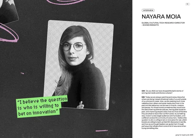
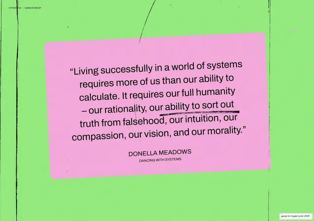
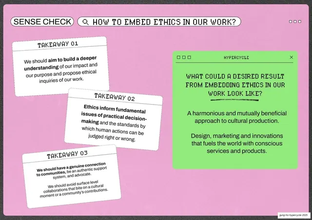
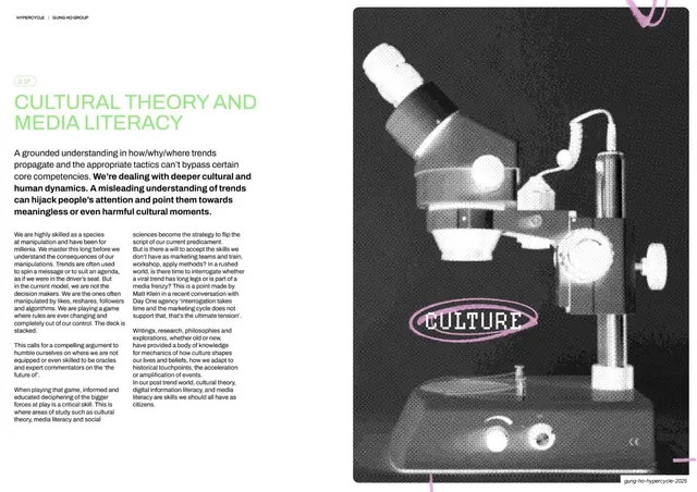
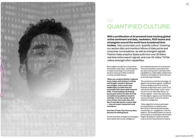
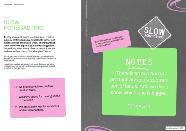
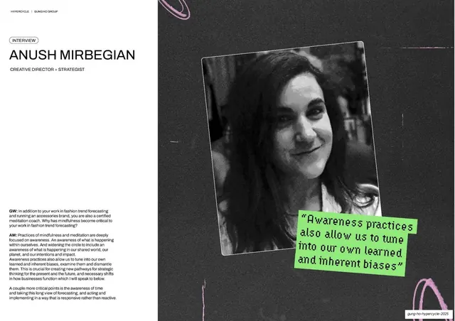
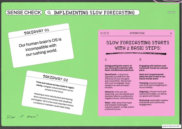
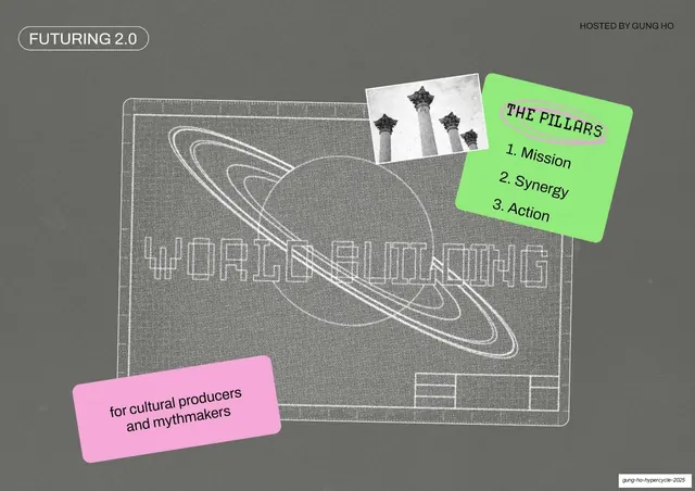
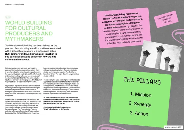
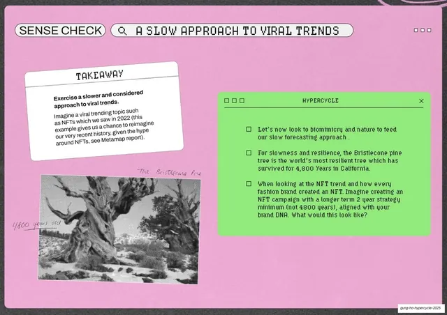
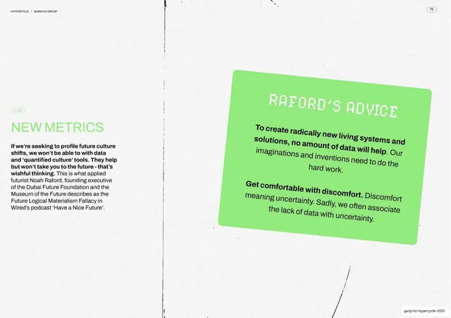
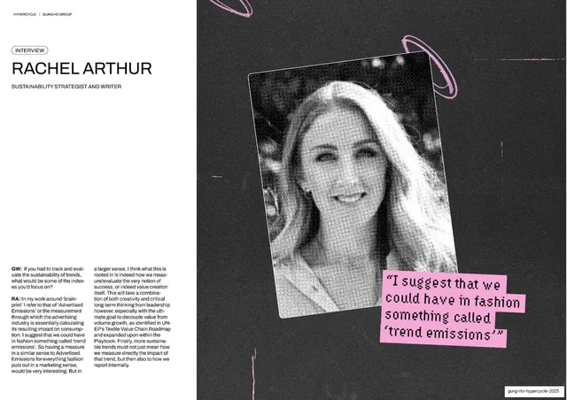
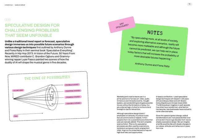
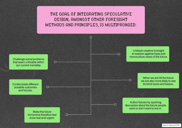
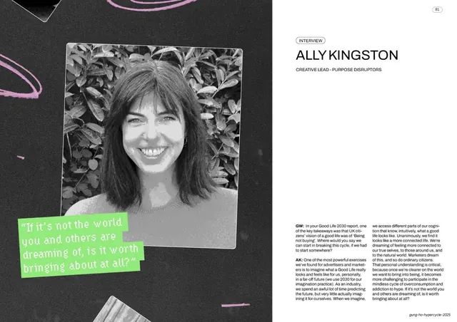
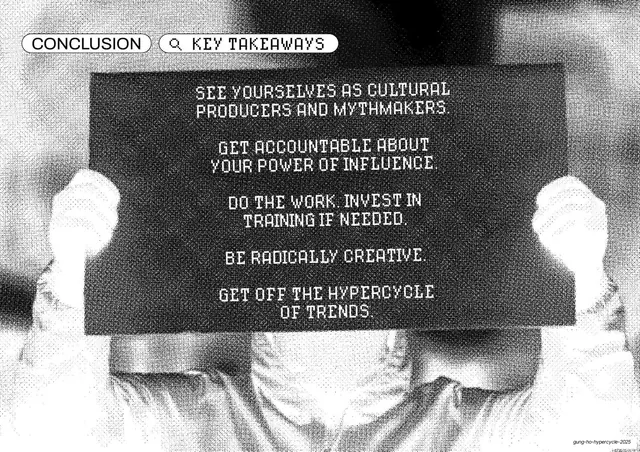
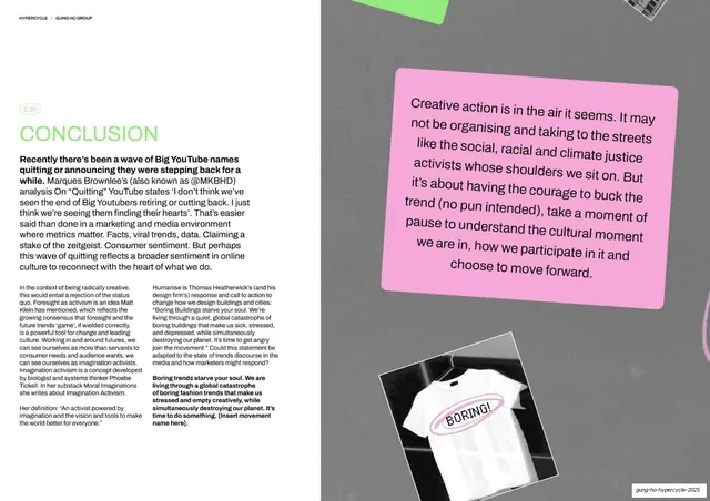
Pages run 16:9 and most are laid out as two-page editorial spreads. The palette is built on one saturated electric blue (around #2B3BFF) against white and near-black, with a single lime-green (around #9BE870) used only for highlight callouts and the occasional cool grey full-bleed. Photography is consistently treated as coarse halftone or dithered black-and-white, giving a newsprint/risograph texture; full-bleed photo halves frequently pair with a white text half. Type mixes three voices: a blocky pixel/bitmap display face (LCD style, used for big statement headlines and the "HYPERCYCLE" wordmark), a sharp grotesque sans for section headlines (often set in blue), and a small humanist sans for body copy. Section and chapter labels sit inside thin pill-shaped outlines ("MISSION", "CONTENTS", "SENSE CHECK", "CHAPTER ONE"), usually in blue. Recurring devices: rounded sticky-note callout boxes in lime or blue with rotated, handwritten-feeling notes; embedded social-media post screenshots (tweets, TikTok stills) dropped into the layout as evidence; hand-scribbled arrows and marginalia; and distressed photocopy textures and toner streaks across otherwise clean white pages. A persistent running header ("HYPERCYCLE | GUNG HO GROUP" top-left, a circled page number top-right) and an italic "gung-ho-hypercycle-2025" footer anchor every page. Layouts alternate between full-bleed cover/section/quote pages, two- and three-column text spreads, contributor portrait grids, and definition/diagram pages.
Key takeaway
The decision to treat a trend report like an opinionated zine: one loud electric blue, one gritty halftone photo treatment, and a pixel display face do all the personality work, so even dense text spreads feel designed. The pill-outlined section labels and the rotated sticky-note callouts are a cheap, repeatable system for adding voice and navigation to long documents. Embedding real social-media screenshots as inline evidence is a strong move for any culture or research deck.
Reuse notes
A reference for long-form editorial reports, trend and culture decks, and any document that wants to feel like a printed publication rather than a slideshow. The two-page-spread logic, running header/footer, and pill labels scale cleanly across 80-plus pages. The halftone photo treatment and pixel type are the load-bearing style choices; without genuinely gritty imagery and a strong display cut the look collapses into a plain text doc. Heavy text density means it is built to be read, not presented live.
From this deck: Gung Ho Hypercycle 2025 Trend Report
View deck