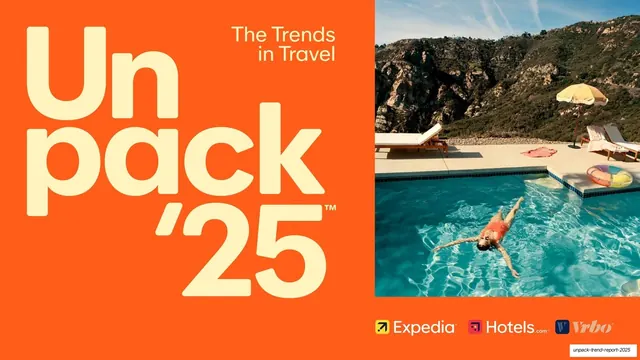
Preview image. Unlock full-res
A 26-slide Expedia Group travel trend report built on bold flat color-blocking, where each trend gets its own saturated background color and one oversized rounded-grotesque headline.
Summary
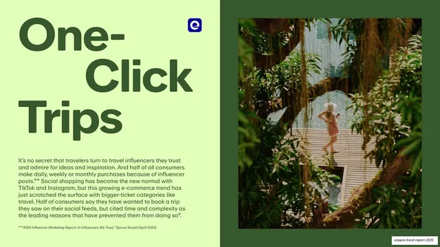
Expedia Group's annual consumer travel trend report across 26 slides. Its whole personality comes from color-blocking: each named trend (Detour Destinations, Goods Getaways, All-Inclusive Era, Hotel Restaurant Renaissance, JOMO Travel, The Phenomena-List, Set-Jetting, One-Click Trips) is assigned its own saturated flat color, and every section opens with one oversized rounded-grotesque headline in that color.
Visual description
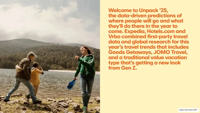
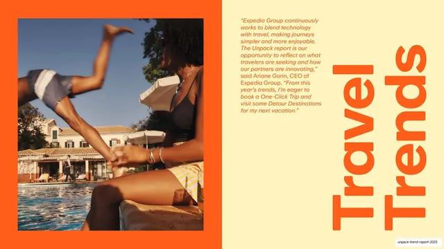
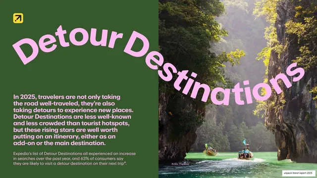
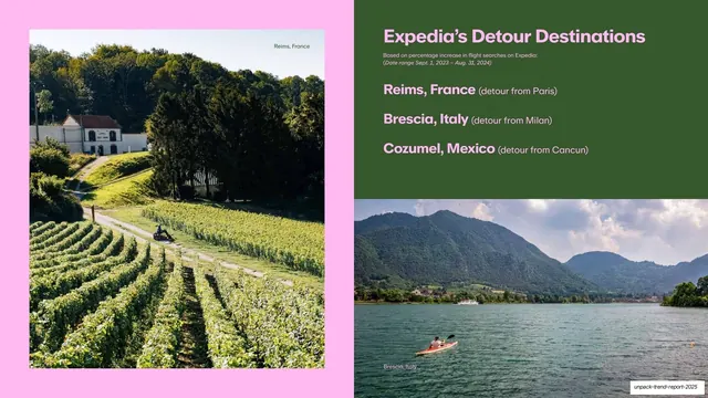
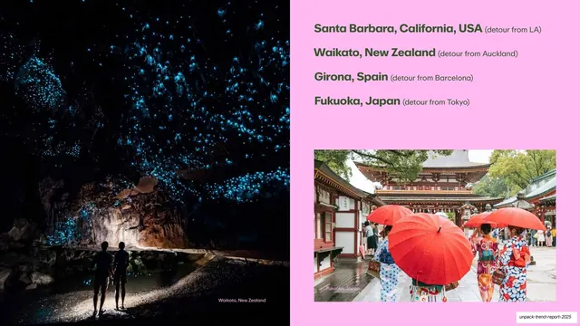
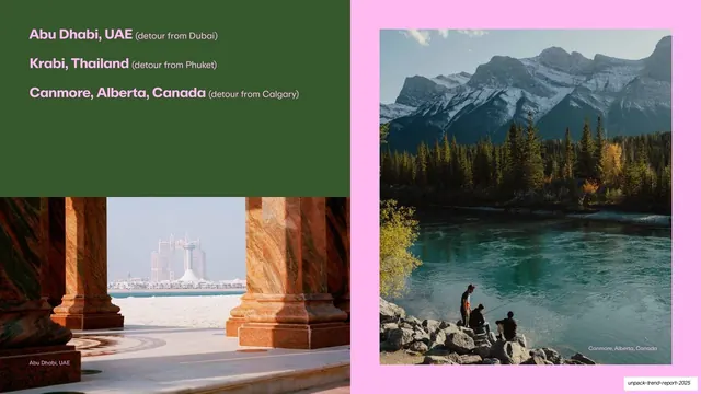
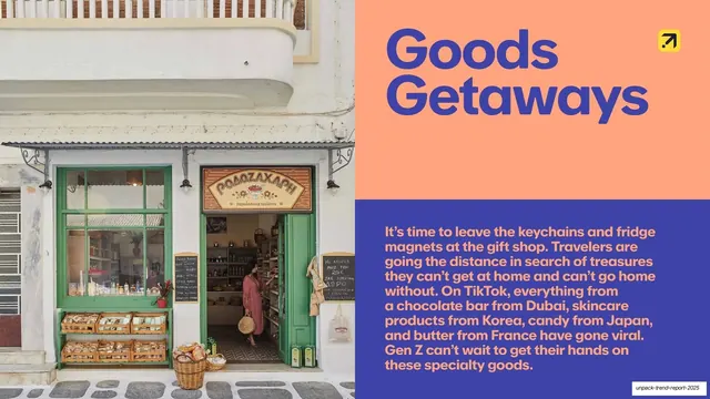
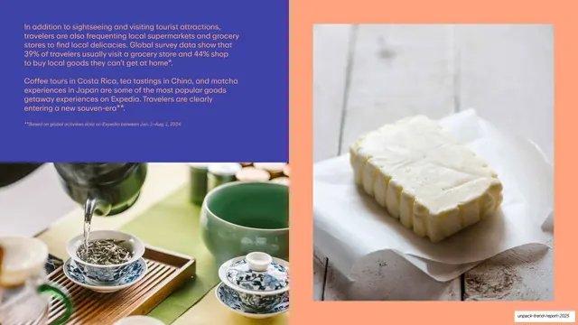
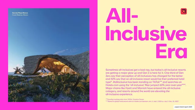
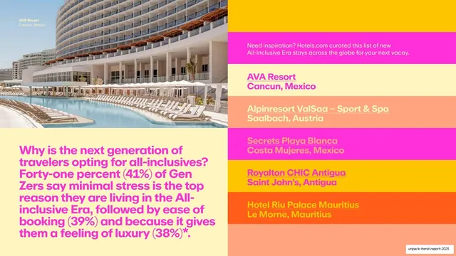
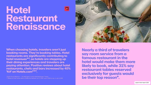
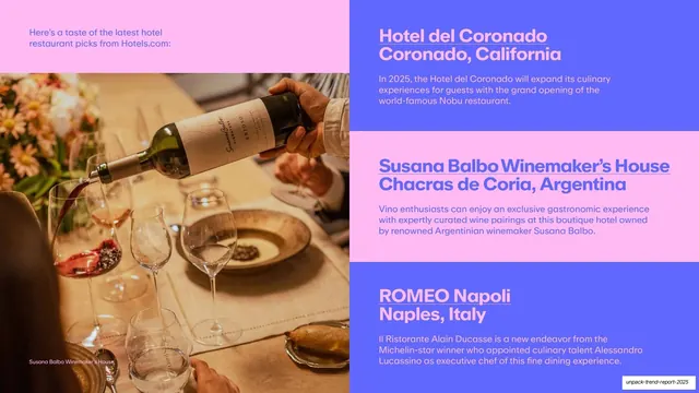
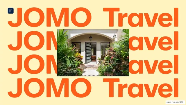
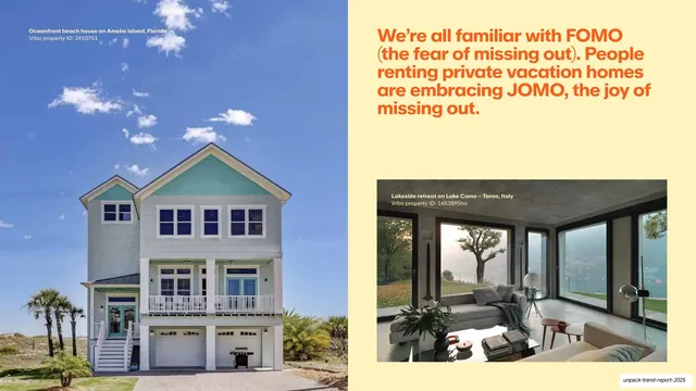
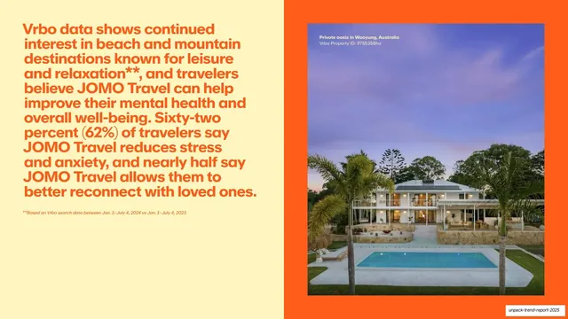
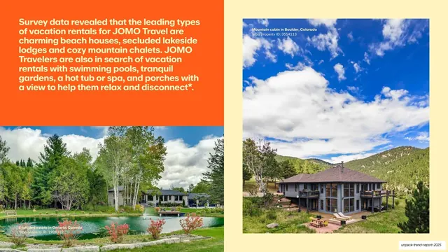
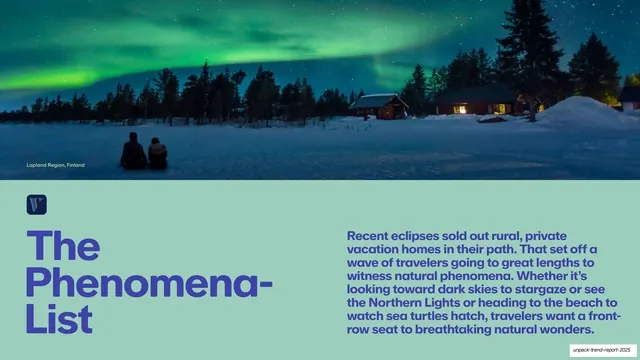
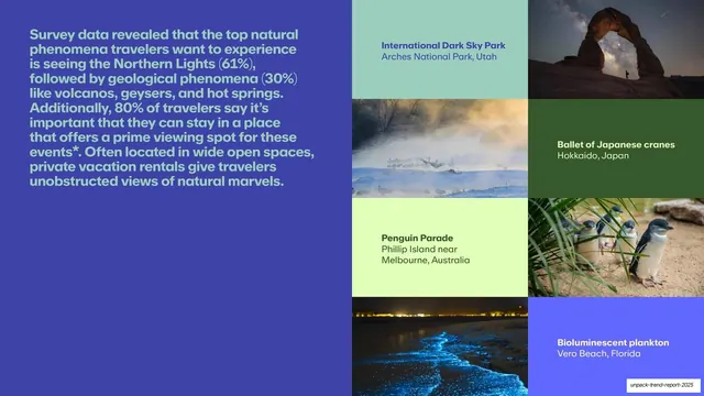
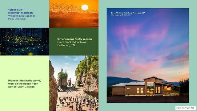
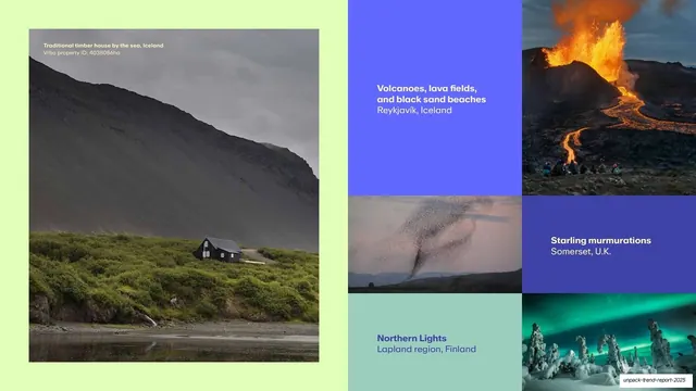
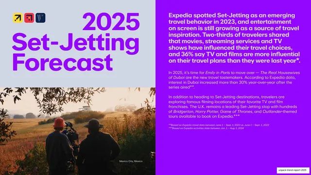
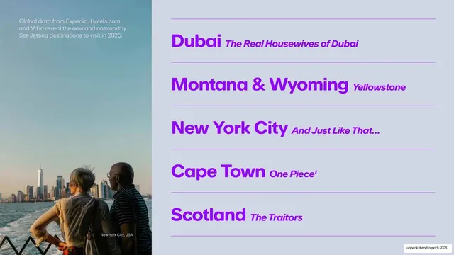
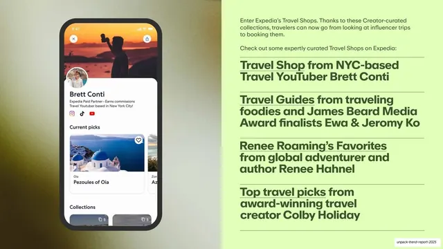
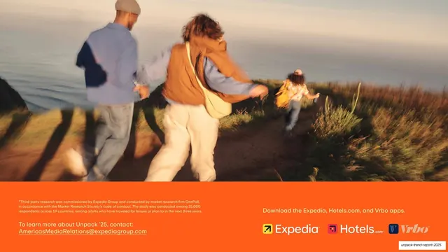
Slides run 16:9. There is no white space discipline here; the deck is loud and full-bleed. The recurring grammar is a two-panel split: a full-height travel photograph on one side and a solid flat-color block carrying the headline and body copy on the other, with the split sometimes stepping into an L-shape or stacked quadrants. Each trend rotates the palette through bold flats: tangerine orange (#F4541E), royal blue (#3B3BD8), hot magenta (#FF2EC4), pale butter yellow (#F7EBA8), lime (#C9F08A), forest green (#3F5A1E), mint (#A7D8C9), electric purple (#9B1FE0), and a cool grey-lavender (#D7DEEC). Type is a heavy rounded geometric sans; section titles are set very large in the section's accent color (often two or three stacked lines), while body copy is a smaller weight of the same family in a contrasting flat color, frequently set as a justified block. Data slides pair the photo-and-color split with image grids: destination lists with bold place names plus parenthetical context ("Reims, France (detour from Paris)"), color-blocked ranked lists, and multi-cell photo mosaics where empty cells are filled with the accent colors. Photography is large, warm, and lifestyle-led (pools, markets, vacation rentals, natural phenomena), with small caption labels and Vrbo property IDs in the corners. The three brand icons (Expedia, Hotels.com, Vrbo) recur as a small mark per section. The cover stacks a giant cream "Unpack '25" lockup on orange beside a poolside photo with a logo row; the closing slide is a full-bleed motion-blurred photo over an orange footer with contact details and app callouts.
Key takeaway
The system of giving every section its own saturated background color and matching oversized headline, so a long report reads as a rhythm of distinct chapters without any chrome or dividers. The two-panel photo-plus-color-block split is endlessly reconfigurable (full split, L-shape, quadrants) yet always feels like the same deck. And the trick of filling empty grid cells with the accent colors so even sparse data slides stay visually full.
Reuse notes
A strong reference for consumer-facing trend reports, marketing research decks, brand or lifestyle reports, and any long deck that needs energy and clear sectioning. The per-section color coding and the photo/color-block split are directly reusable. It leans heavily on a large library of high-quality lifestyle photography and on a confident rounded display sans; without both, the loud flat color can look cheap rather than premium. Justified body blocks and very saturated combinations (lime text on green, magenta on yellow) push contrast hard, so check legibility if you adopt them.
From this deck: Unpack '25: The Trends in Travel (Expedia Group)
View deck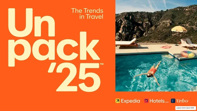
More like this


Keep what you find
A free account saves references to boards and can send you a weekly email of picks based on what you save.
To see every result, go Pro.