Preview image. Unlock full-res
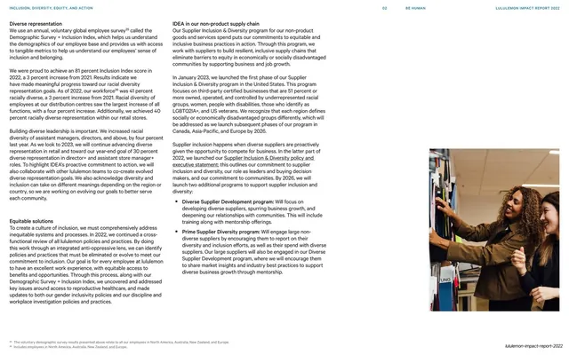
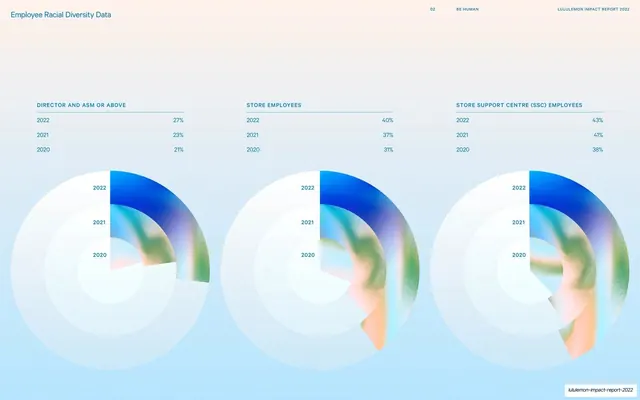
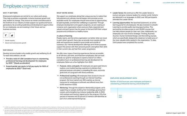
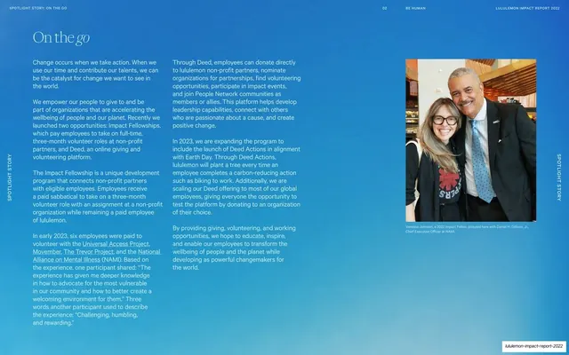
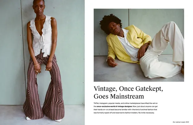
A section opener pairing a sunlit portrait and a tilted typographic resale graphic at right with an italic-serif title and intro copy at left.
Summary
An "A year of progress and learning" opener: the right column stacks a sunlit seated portrait over a tilted, oversized "LIKE NEW / FOR THE PLANET" typographic graphic, with the italic-serif title and intro copy at left.
Visual description
The right two-thirds is split horizontally: above, a warm golden-hour photo of a young woman seated and laughing in grass; below, a graphic panel of oversized grey display type set on a tilt, repeating "LIKE NEW", "FOR THE PLANET" and "lululemon", with a thin ticker strip of the same words between the two. The left third is cream; "A year of progress and learning" runs across the top with the trailing words in italic serif, and two short paragraphs of body copy anchor the bottom-left. The header overlays the upper photo.
Key takeaway
Stacking a lifestyle photo over a bold typographic graphic in the same right column, so the opener carries both a human image and a piece of brand campaign typography. The tilted, cropped display lettering adds energy that a straight photo alone would not.
Reuse notes
A livelier variant of the deck's standard opener for a section with a campaign or product story to tell. The oversized tilted type wants to be a real brand asset, not placeholder. Keep the left text minimal as elsewhere. Good where a chapter benefits from showing a named program (here a resale initiative) as a graphic rather than only describing it.
From this deck: A year of progress and learning opener
View deck