Preview image. Unlock full-res
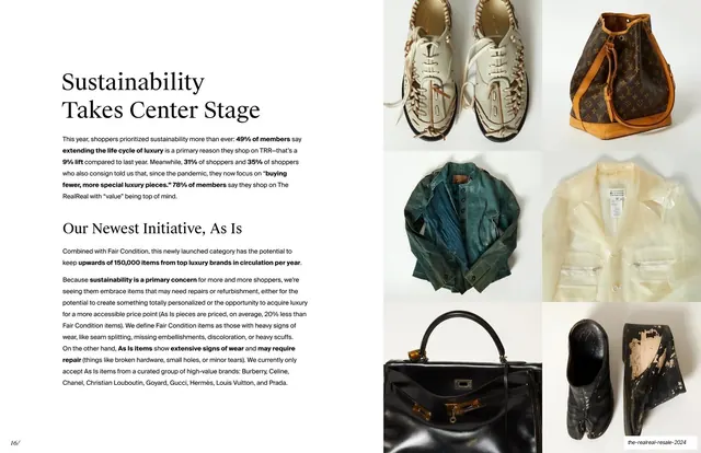
Sustainability story with two stacked serif headlines and dense body copy at left, beside a 2x2 grid of worn and vintage product photos at right.
Summary
The sustainability story: two stacked serif headlines ("Sustainability Takes Center Stage" and "Our Newest Initiative, As Is") with dense body copy at left, beside a 2x2 photo grid of worn and vintage items.
Visual description
A split layout. The left half, on off-white, stacks a large serif headline "Sustainability Takes Center Stage" over a paragraph of small sans-serif body copy with bolded stats, then a second serif headline "Our Newest Initiative, As Is" over two more paragraphs explaining the As Is resale category and which brands qualify. The right half is a 2x2 grid of warm photographs of well-worn and vintage goods: scuffed white sneakers, a Louis Vuitton bucket bag, a teal leather jacket, a cream blouse, a black Hermes Kelly, and a damaged black shoe, each lightly showing wear.
Key takeaway
Pairing a values-and-initiative narrative with a grid of honestly worn product photos rather than pristine catalog shots, which makes the sustainability message feel credible. Stacking two serif headlines lets the slide move from the macro trend to a specific company initiative in one frame.
Reuse notes
Reusable for a mission, ESG, or initiative slide that benefits from supporting imagery. The 2x2 (or larger) product grid is a flexible evidence device. Using imperfect, real-condition photos is the deliberate choice here; swap in clean shots only if the message is aspirational rather than about wear and reuse.