Preview image. Unlock full-res
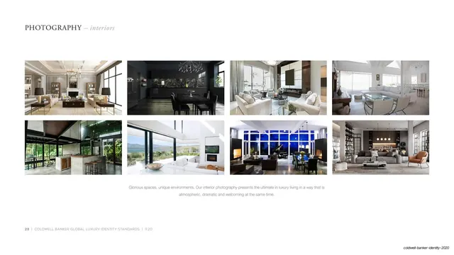
White page showing eight landscape interior property photos in a 4x2 grid under a serif header, with a centered caption below.
Summary
The interior counterpart to the exteriors page: eight landscape interior shots in a four-by-two grid on white, with a serif header above and a centered caption below.
Visual description
White page with the serif small-caps header "PHOTOGRAPHY" and an italic "interiors" top left. Eight equal landscape photographs fill a four-column, two-row grid with even gutters and broad white margins. The images show high-end interiors: a panelled living room with a chandelier, a dark moody dining room, open-plan living spaces with view walls, a kitchen, and atmospheric great rooms, all warmly lit and richly styled. A centered two-line grey caption sits below the grid ("Glorious spaces, unique environments. Our interior photography presents the ultimate in luxury living..."). Hairline rule and page footer at bottom left.
Key takeaway
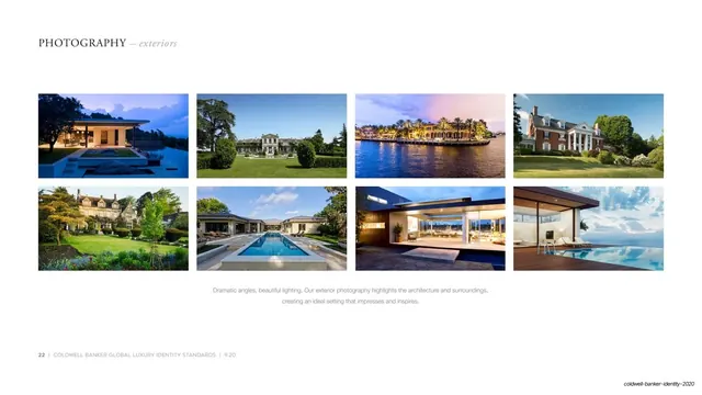
The exact same grid and framing as the exteriors page, reused for interiors: repeating one layout across paired example pages makes the section feel systematic and lets a reader compare categories at a glance. Even crops unify a moody, varied set of rooms.
Reuse notes
Pairs directly with the exteriors example page; use the matching grid for any set of paired categories (interior/exterior, day/night, product lines) in a guideline. Keep the caption format and grid identical between the paired pages so the consistency itself becomes a design statement.
From this deck: Photography interiors grid
View deck