Preview image. Unlock full-res
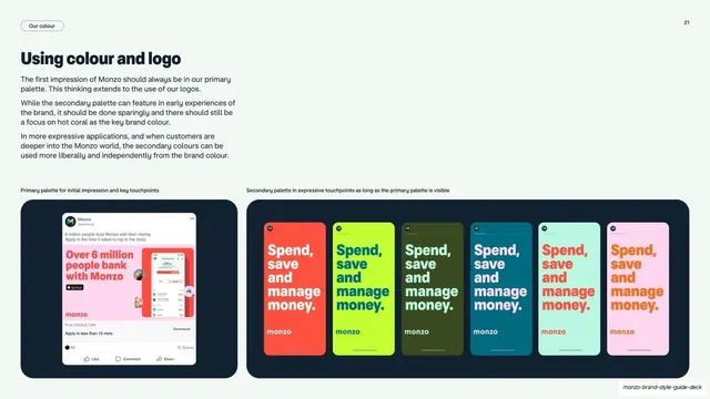
Light guideline page on when to use primary versus secondary colour, pairing one coral social ad with a row of six recoloured app-store ad mockups.
Summary
A light page explaining the rule that first impressions use the primary palette while deeper, expressive touchpoints can use secondary colours more freely.
Visual description
Off-white background. Left column: a "Using colour and logo" heading over three short paragraphs of guidance. Below sits a dark rounded card captioned "Primary palette for initial impression and key touchpoints" holding a single Monzo social ad. The right two-thirds, captioned "Secondary palette in expressive touchpoints," shows a dark rounded card containing six tall phone-ad mockups, each running the same "Spend, save and manage money." headline and "monzo" wordmark in a different palette colour (coral, neon yellow, khaki, teal, pale blue, pink). A "Our colour" pill sits top-left.
Key takeaway
Teaching a usage rule by showing the same ad recoloured six ways in one row, so the "first impression vs. expressive" distinction is visible rather than just described. Grouping mockups inside dark rounded cards keeps a busy comparison tidy.
Reuse notes
Ideal for the colour-application page of a brand guideline where a primary colour must stay dominant but a secondary set is allowed. The repeated-ad-in-six-colours device is reusable for any palette demonstration. Needs real mockups to land.
From this deck: Monzo using colour and logo
View deck


















More like this

Keep what you find
A free account saves references to boards and can send you a weekly email of picks based on what you save.
To see every result, go Pro.