Preview image. Unlock full-res
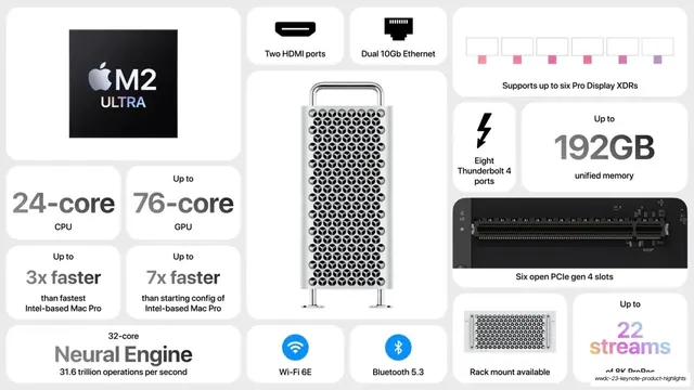
White bento spec wall with the silver Mac Pro tower as the tall center tile and gray spec figures plus I/O icons around it.
Summary
The Mac Pro spec slide: a tall silver Mac Pro tower render anchors the center while white tiles around it carry gray-toned spec figures, I/O glyphs, and connectivity badges.
Visual description
Light-gray field of white rounded tiles. The center is a tall portrait tile with a photoreal silver Mac Pro tower (the lattice "cheese-grater" enclosure with handle and feet). Top-left a black M2 Ultra chip tile repeats the silver-Apple "M2 ULTRA" lockup. Spec tiles set their numbers in solid gray (not gradient here): "24-core CPU", "76-core GPU", "Up to 3x faster than fastest Intel-based Mac Pro", "Up to 7x faster than starting config of Intel-based Mac Pro", "32-core Neural Engine / 31.6 trillion operations per second", "Up to 192GB unified memory". I/O and feature tiles use icons: "Two HDMI ports", "Dual 10Gb Ethernet", "Supports up to six Pro Display XDRs" (six pink port glyphs), a lightning-bolt "Eight Thunderbolt 4 ports", a black "Six open PCIe gen 4 slots" tile showing a slot photo, a blue Wi-Fi "Wi-Fi 6E", a blue Bluetooth "Bluetooth 5.3", "Rack mount available" (rack-render), and a bottom-right "Up to 22 streams of 8K ProRes" tile. Type is SF Pro, oversized gray numerals over small dark labels. Palette is almost entirely silver, white, and gray with two blue connectivity icons and pink port glyphs.
Key takeaway
The vertical hero render as a literal center column that the spec tiles orbit, a clean way to make one product the anchor of a busy bento. Restraint in color: holding the numerals to solid gray (versus the gradient numerals elsewhere in the deck) keeps a pro-hardware slide sober. Iconifying every I/O port and radio as its own small tile.
Reuse notes
Best for a pro or workstation-class hardware slide where ports, expansion, and raw specs all matter and the product itself deserves a tall hero crop. Reusable as a connectivity / I/O wall on any device page. The grayscale numerals read more serious than gradient ones; pick whichever matches the product's tone. Needs a clean, well-lit product render to carry the center column.
From this deck: Mac Pro tower spec bento
View deck
More like this







Keep what you find
A free account saves references to boards and can send you a weekly email of picks based on what you save.
To see every result, go Pro.