Preview image. Unlock full-res
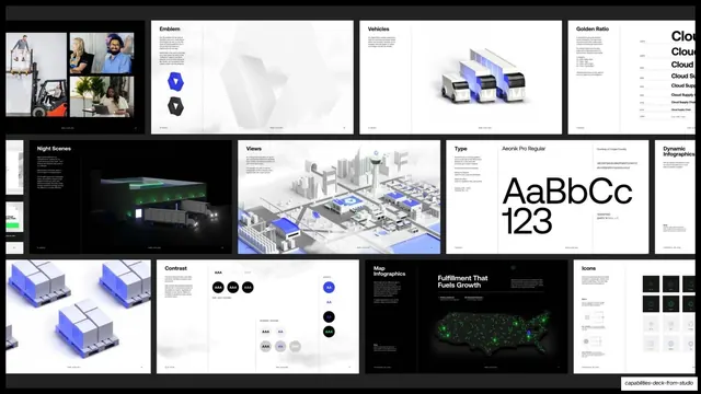
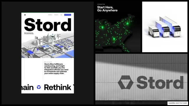
A tiled wall of Stord brand-guideline spreads, covering emblem, vehicles, golden ratio, type, contrast, map infographics, and icons.
Summary
A tiled overview of the Stord brand-guidelines document, showing roughly a dozen spreads from emblem construction and type specimens to map infographics and icon sets.
Visual description
A grid of small guideline spreads arranged in three rows over a soft light ground, each a miniature page with a header and diagram. Visible spreads include a team-photo block, "Emblem" with faceted logo geometry, "Vehicles" renders, a "Golden Ratio" construction page, "Night Scenes", isometric "Views", a "Type" specimen showing "AaBbCc 123" in Aeonik Pro Regular, blue 3D crate renders, a "Contrast" page of accessibility swatch pairs, "Map Infographics", a dark "Fulfillment That Fuels Growth" dot-map spread, and an "Icons" sheet. The effect is a contact sheet of an entire identity system. Detail text is too small to read but the structure is clearly legible.
Key takeaway
Presenting the whole guidelines book as one tiled contact sheet signals rigor and depth without making the viewer read a single page. The labeled spread headers act as a visual table of contents for the brand system.
Reuse notes
Ideal for the "we built the system" beat near the end of a branding case study. Resolution matters: the grid only impresses if each thumbnail is crisp enough to recognize. Keep the page headers readable even when the body copy is not.
From this deck: Stord brand guidelines spreads grid
View deck





























More like this






Keep what you find
A free account saves references to boards and can send you a weekly email of picks based on what you save.
To see every result, go Pro.