
Preview image. Unlock full-res
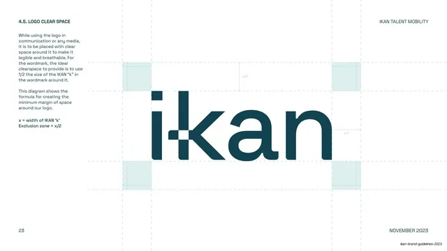
The "i-kan" wordmark shown large and centered with construction guides, explained by a body-copy column at left.
Summary
The primary wordmark page: the "i-kan" logotype set large and centered with faint construction guide lines, alongside a left column of copy explaining the custom letterforms and the "window" in the k.
Visual description
Warm cream background. A "4.1. OUR WORDMARK" header and two body paragraphs sit in the left column, describing the custom typography, rounded edges, and the "window in the letter K". The right two-thirds holds the dark-teal "i-kan" wordmark set very large and centered, framed by thin mint construction guide lines (a baseline, cap line, and side margins) that imply the grid the mark is built on. The "k" shows its signature square notch where the crossbar meets the stem. Page "14" and "NOVEMBER 2023" footer.
Key takeaway
Pairing a large, clean specimen of the wordmark with light construction guides communicates "this is custom and considered" without a busy geometry overlay. The explanatory copy stays out of the way in a single side column.
Reuse notes
A standard wordmark/logo construction page for an identity guideline. The faint-guides-plus-side-copy layout is directly reusable. Keep the guide lines subtle so the mark, not the scaffolding, reads first.
From this deck: IKAN wordmark construction
View deck


























More like this






Keep what you find
A free account saves references to boards and can send you a weekly email of picks based on what you save.
To see every result, go Pro.