Preview image. Unlock full-res
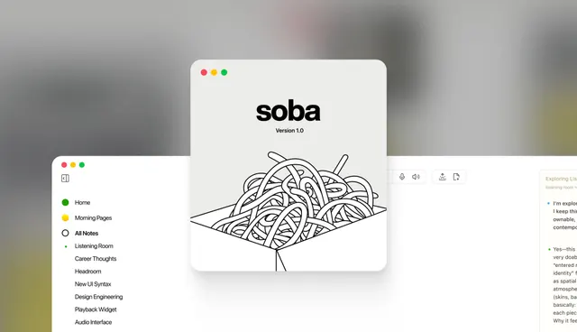
Soba journaling app desktop UI featuring a minimalist left sidebar navigation, an oversized organic line-art knot illustration, and clean typography on a light background.
Summary
Soba is a minimalist journaling app UI featuring a clean left sidebar with navigation items, a centered organic line-art knot illustration, and supportive copy about exploring listening and thoughts on a white background.
Visual description
The interface is split into three sections: a narrow left sidebar with macOS-style window controls (red, yellow, green dots) and a bulleted navigation list (Home, Morning Pages, All Notes, Listening Room, Career Thoughts, etc. in black sans-serif); a large central white card containing a hand-drawn continuous-line knot shape in black ink labeled "soba Version 1.0" at the top; and a right column showing partial text content with green bullet points discussing journaling and self-discovery. The overall palette is white, warm grays, and black on a soft blurred background suggesting an outdoor natural setting. Typography is clean, modern sans-serif with generous whitespace throughout.
Key takeaway
The use of a single, bold organic illustration as the visual anchor without distraction; the minimal sidebar navigation keeping focus on the primary content card; and the calm, open layout that invites thoughtful engagement rather than action-oriented clicking.
Reuse notes
Excellent reference for mental-health, journaling, or reflection-focused apps where calm and introspection are the emotional goal. The organic line-art illustration humanizes the interface without being cute or playful. The structure scales well to longer navigation lists and pairs naturally with supportive body copy.