Preview image. Unlock full-res
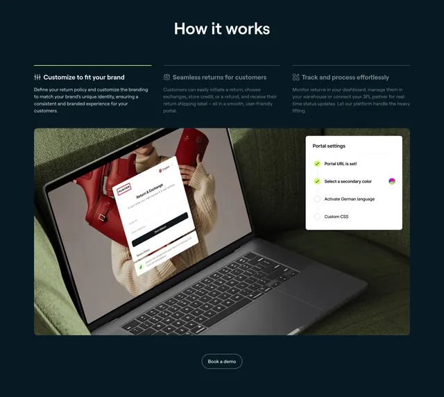
Dark how-it-works band with three numbered text steps above a large product photo composite of a branded returns portal over a laptop on a sofa.
Summary
A dark "How it works" section that stacks three short labeled steps above one large product image, where a branded returns-portal UI is composited over a real photo of a laptop. The defining trait is the lifestyle-plus-interface composite carrying the explanation.
Visual description
Centered white heading "How it works" sits on a deep teal-black background. Beneath it, three columns each lead with a small icon and a bold step title (Customize to fit your brand, Seamless returns for customers, Track and process effortlessly) followed by muted grey copy; the first column is underlined by a thin green active bar. Below spans a wide rounded image: a photo of a person on a green sofa holding a laptop, with a white branded "Return & Exchange" form floating over the screen and a "Portal settings" checklist card with green checkmarks overlaid at the right. A centered ghost "Book a demo" pill closes the section.
Key takeaway
Compositing a clean UI card and a checklist over a warm real-world photo makes an abstract workflow feel tangible and in-use. The thin green underline marking the active step adds a quiet sense of progression across the three columns.
Reuse notes
Good for explaining a setup-and-run flow where seeing the product inside a real context matters. Needs a convincing photo-plus-UI composite, which is production-heavy. On dark backgrounds keep the secondary step copy from dropping too low in contrast.
More process sections
See all


More like this



Keep what you find
A free account saves references to boards and can send you a weekly email of picks based on what you save.
To see every result, go Pro.