Preview image. Unlock full-res
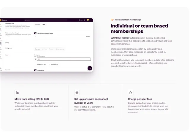
Light feature-detail section pairing a left product screenshot with a right text block, over a three-column supporting point row beneath.
Summary
A light feature-detail block that places a product settings screenshot on the left and a descriptive paragraph on the right, then reinforces the point with a three-column row of small supporting benefits underneath. It is a clean split-plus-trio layout for explaining one capability in depth.
Visual description
On the left, a rounded product screenshot shows an Outseta settings panel with a dark top bar, a left icon rail, and form sections for registration mode (Individual/Team toggle), maximum number of people, pricing model (Standard/One time/Per user options), monthly rate, and a free-trial toggle. On the right, an oversized two-line aubergine headline "Individual or team based memberships" sits above several short paragraphs of muted body copy explaining selling to both individuals and organizations. A thin divider separates this from a lower three-column row, each column a small line icon over a bold short title (Move from selling B2C to B2B, Set up plans with access to X number of users, Charge per user fees) and two lines of gray supporting text. Generous white space throughout.
Key takeaway
The two-tier explanation structure: a deep split (screenshot plus narrative) for the headline capability, then a divider into three lightweight supporting points that elaborate without competing for attention. Showing the real settings UI makes an abstract billing feature concrete.
Reuse notes
Good for explaining a single nuanced feature that benefits from both a product view and a few framing sub-points. Needs a legible, well-cropped settings screenshot. The light, generously spaced layout suits a calm B2B SaaS narrative; the three-column row scales down cleanly on smaller screens.
More feature detail sections
See all


More like this

Keep what you find
A free account saves references to boards and can send you a weekly email of picks based on what you save.
To see every result, go Pro.