Preview image. Unlock full-res
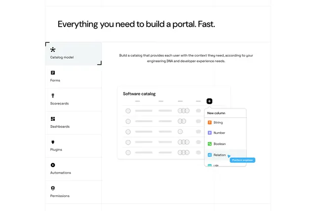
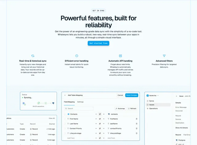
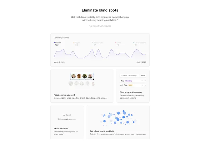
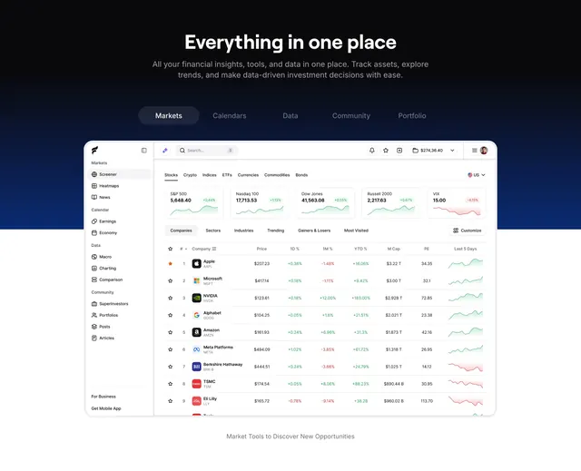
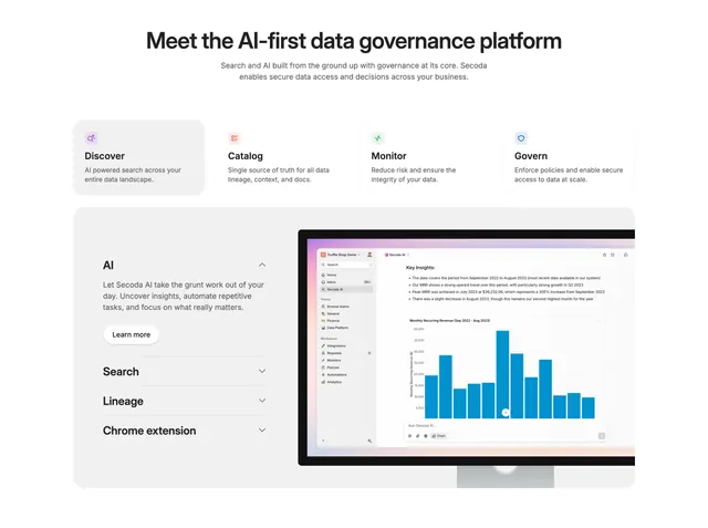
Light features section pairing a four-card feature row with an accordion-driven product screenshot on a desktop monitor.
Summary
A light features section that stacks a four-up icon-card row over a large interactive panel: an accordion of feature labels on the left swaps the product screenshot shown inside a desktop monitor on the right. The pairing of a quick scannable overview with a deep interactive demo is the defining move.
Visual description
White background with a centered oversized headline "Meet the AI-first data governance platform" and two lines of muted sub-copy. Four equal cards follow, each with a small rounded color icon, a bold title (Discover, Catalog, Monitor, Govern) and one line of description; the first card has a light grey fill, the rest sit in outlined boxes. Below, a large rounded grey panel holds an accordion on the left (AI expanded with body copy and a "Learn more" pill, plus collapsed Search, Lineage, and Chrome extension rows) and, on the right, a desktop monitor showing the Secoda app with a sidebar, a "Key Insights" list, and a blue bar chart of monthly recurring revenue.
Key takeaway
Two-tier feature storytelling in one section: a fast four-card summary up top, then an accordion that drives a single evolving product shot below. Showing the screenshot inside a desktop monitor frames it as a real app and adds depth without extra chrome.
Reuse notes
Best for a data or analytics product with several capabilities that each deserve a screenshot. The accordion keeps the section compact while letting users self-select what to see. Needs polished product UI to fill the monitor convincingly.