Preview image. Unlock full-res
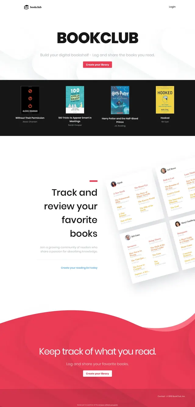
A clean, book-tracking landing page with a centered hero, featured book covers, and a bold red call-to-action section.
Summary
A clean, book-tracking landing page with a centered hero, featured book covers, and a bold red call-to-action section.
Visual description
The page opens on a white hero with a small logo at top left, a login link at top right, and a large centered BOOKCLUB headline. Beneath it is a short tagline and a red primary button, followed by a dark strip showcasing four book cover cards in a row with titles and authors underneath. Lower sections repeat the book-card motif, introduce a split content area with large centered text and angled book-list mockups, and end with a wide red wave-shaped CTA band.
Key takeaway
The layout uses strong contrast between a minimal white hero and dark content bands to make the book covers feel prominent. The oversized central headline plus a single primary CTA gives the landing page a simple, focused conversion path.
Reuse notes
Use this pattern for consumer reading, library, or collection apps that need a polished but approachable landing page. The book-grid sections and red footer CTA are especially reusable for products that want to showcase content items before asking users to sign up.