Preview image. Unlock full-res
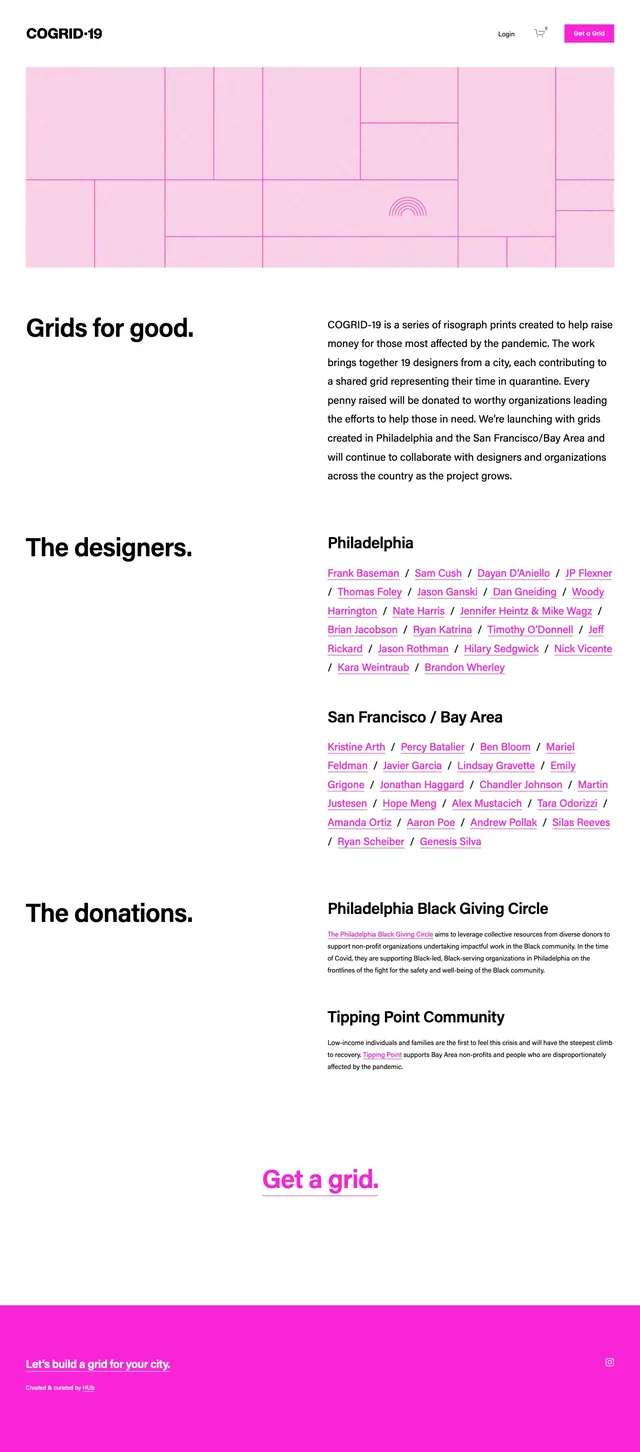
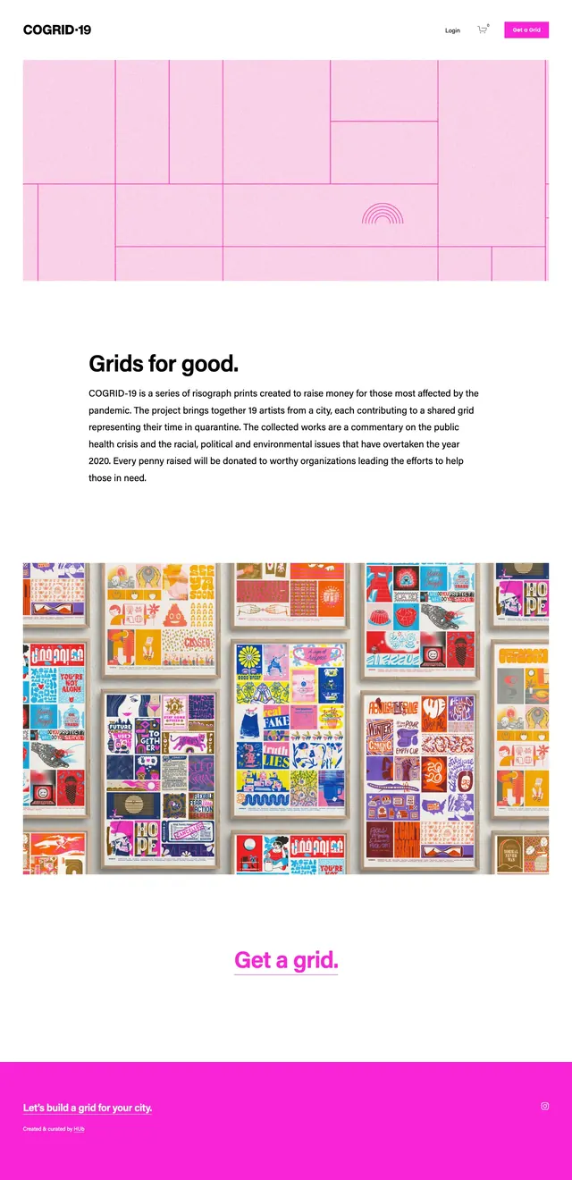
A clean, editorial nonprofit landing page built around a pale pink grid hero, repeated mission copy, a poster gallery, and a bright magenta call-to-action footer.
Summary
A clean, editorial nonprofit landing page built around a pale pink grid hero, repeated mission copy, a poster gallery, and a bright magenta call-to-action footer.
Visual description
The page opens with a sparse top navigation and a large full-width hero image made of soft pink grid panels with thin magenta lines. Below it are two nearly identical text blocks with a large bold heading and a short paragraph in left-aligned sans-serif type. Farther down, the layout shifts to a dense gallery of colorful poster thumbnails arranged in a tight grid, followed by a centered text CTA and a solid hot-pink footer band.
Key takeaway
The strongest move is the contrast between the airy white editorial layout and the vivid pink campaign imagery. Repeating the headline and using a large image gallery creates a simple, memorable nonprofit storytelling pattern.
Reuse notes
Use this structure for cause-driven landing pages that need a calm, credible introduction followed by a proof-heavy visual section. It works best when the brand can support a single bright accent color and a gallery of strong imagery or artwork.