Preview image. Unlock full-res
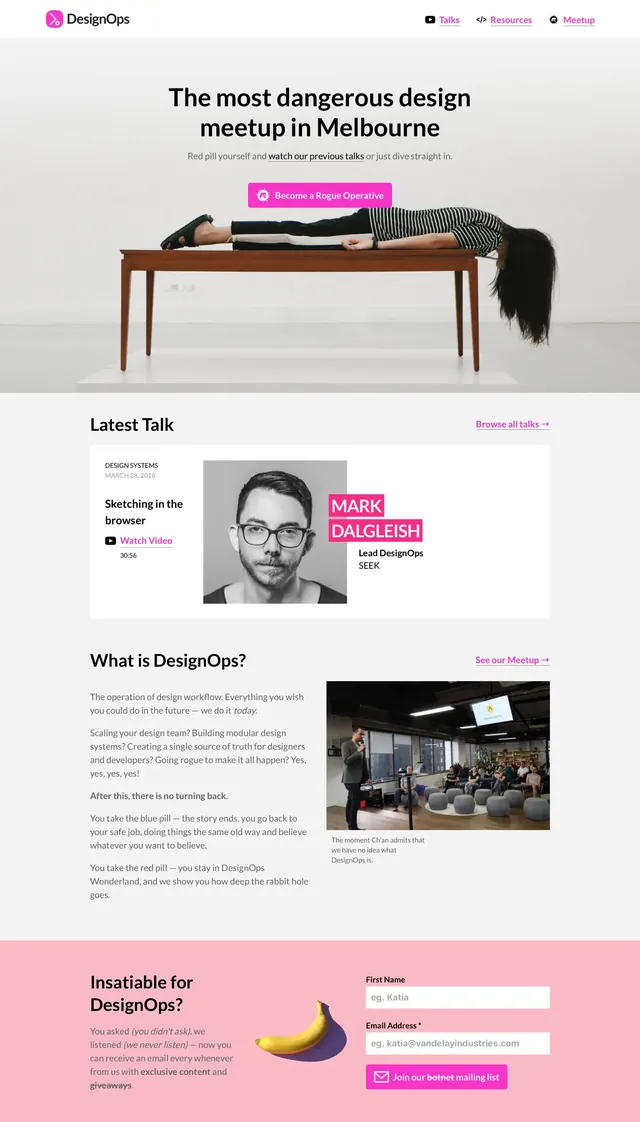
A minimalist event landing page for DesignOps with a centered hero, article-style content blocks, and a bright newsletter CTA band.
Summary
A minimalist event landing page for DesignOps with a centered hero, article-style content blocks, and a bright newsletter CTA band.
Visual description
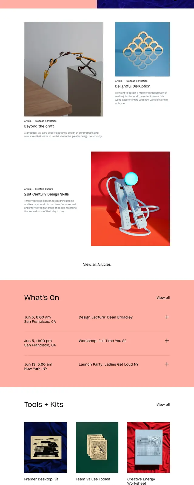
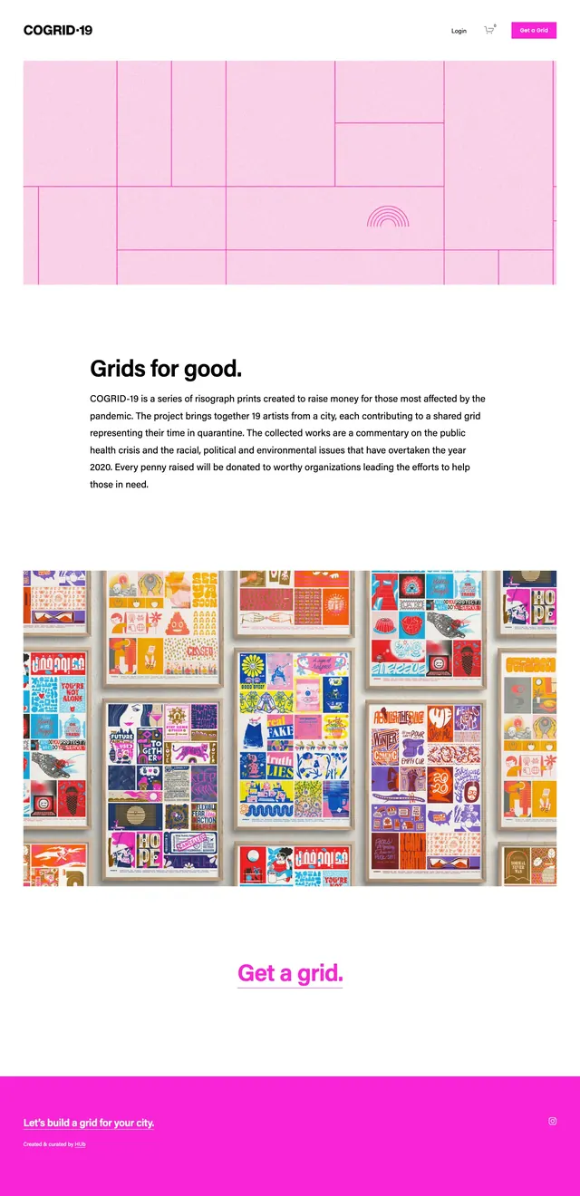
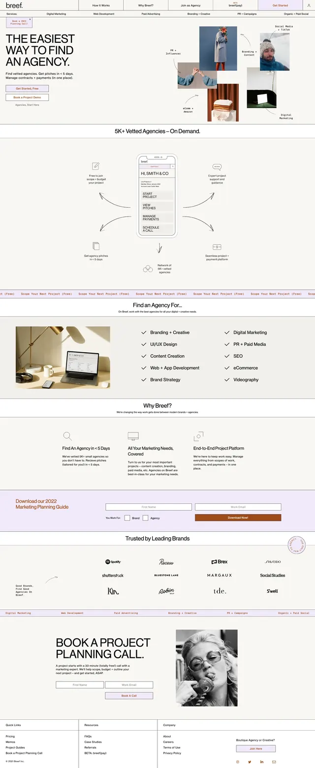
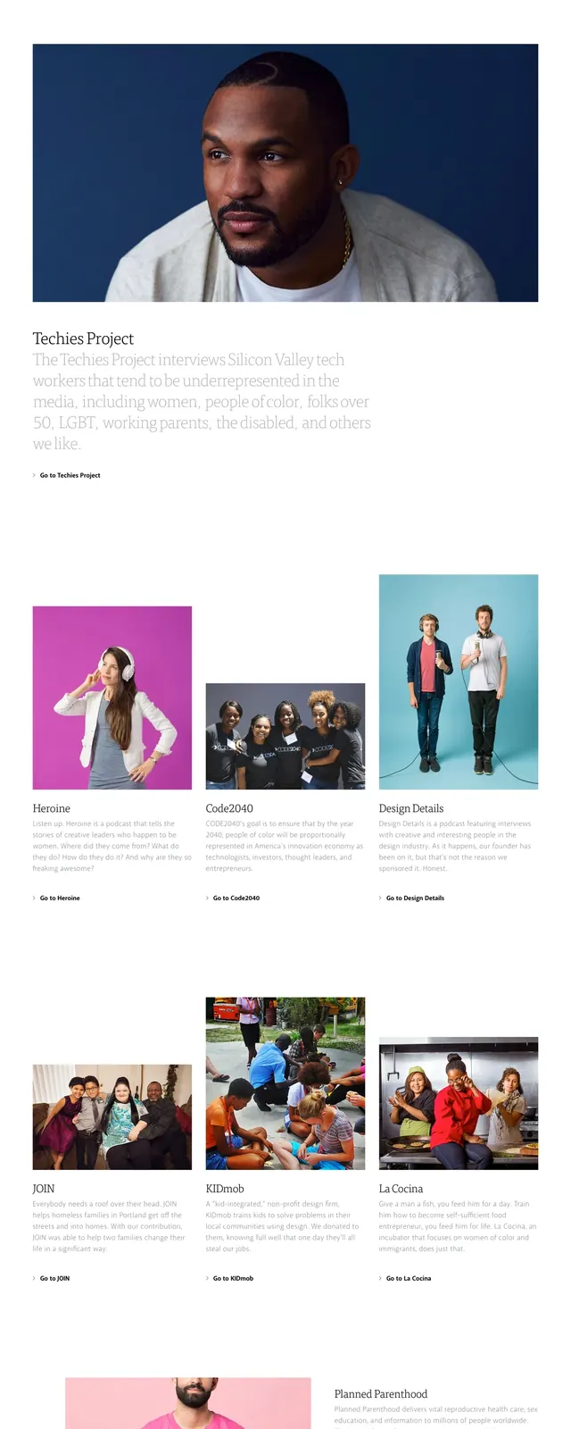
The page starts with a thin top navigation bar, a small logo on the left, and a few text links on the right. The hero is centered with a large bold headline, a short subheading, and a bright pink primary button above a wide photographic image of a person lying across a table. Lower sections switch to a clean white layout with a featured talk card, a two-column about section, and a pink newsletter signup band with two input fields and another CTA button.
Key takeaway
The design combines a stark, editorial layout with a strong photographic hero and a single high-contrast accent color. It keeps the interface simple while using section changes and generous spacing to create a clear content hierarchy.
Reuse notes
Useful for community event sites, meetup pages, and editorial-style landing pages that need to feel polished without heavy UI chrome. The pink accent and centered typography work best when paired with strong photography and short, direct copy.