Preview image. Unlock full-res
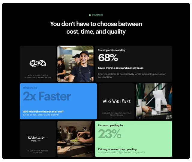
Dark customer-proof bento that pairs client logo cards and kitchen photos with oversized percentage stats on blue and green accent tiles.
Summary
A dark value-proposition section that proves itself through a bento grid of customer results, mixing client logo cards, kitchen photos, and oversized percentage stats. The defining move is pairing each named restaurant brand with one big outcome number on a colored tile.
Visual description
A green "CUSTOMERS" eyebrow sits above a centered two-line headline, "You don't have to choose between cost, time, and quality", in white sans-serif on near-black. Below is a bento of rounded tiles across roughly three columns. Cells alternate between dark logo cards (MOXX, Wiki Wiki Poke, Kaimug) with small grey location captions, warm photos of cooks at work, and stat tiles: "68%" and "23%" in large numerals plus supporting lines, one in white-on-dark, one on a mint-green panel. A blue tile reads "Onboarding 2x Faster". Tile sizes vary to create the bento rhythm.
Key takeaway
The bento that interleaves three asset types, logo, photo, and stat, so social proof and metrics live in one grid. Using one saturated accent tile (blue, green) per row to spotlight the headline number against the dark field.
Reuse notes
Ideal for a customers or results section where you have per-account metrics and recognizable logos. Needs real numbers and logos to land; placeholders would look thin. The dark base makes the accent tiles pop, so it depends on the dark treatment.
More value proposition sections
See all



More like this


Keep what you find
A free account saves references to boards and can send you a weekly email of picks based on what you save.
To see every result, go Pro.