Preview image. Unlock full-res
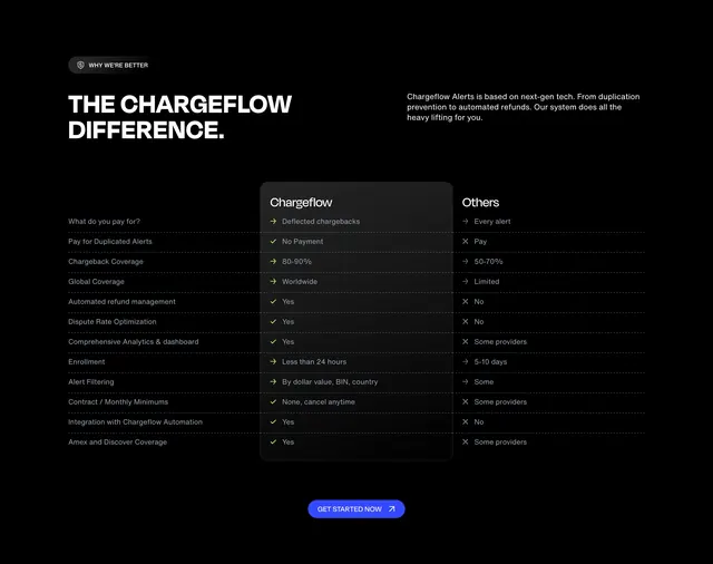
Dark comparison section with shield badge, mega headline, and twelve-row Chargeflow versus Others table in a raised center column.
Summary
Why we are better block pairing a bold headline with a three-column feature matrix highlighting Chargeflow wins over generic providers.
Visual description
Black background. Top left dark pill badge with shield icon and WHY WE ARE BETTER label. Large white caps THE CHARGEFLOW DIFFERENCE headline with gray explanatory paragraph to the right. Comparison table with dashed row dividers: left column lists twelve features from payment model through Amex coverage; center Chargeflow column sits on dark gray rounded card with checkmarks and favorable values; right Others column shows X marks and weaker outcomes. Bottom centered blue GET STARTED NOW pill button with arrow.
Key takeaway
Raised center column visually anchors your product in a comparison grid. Check versus X iconography makes skimming a long matrix fast on dark UI.
Reuse notes
Use when competitive differentiation is the pitch. Rows must stay factually defensible; table width needs horizontal scroll on mobile.