Preview image. Unlock full-res
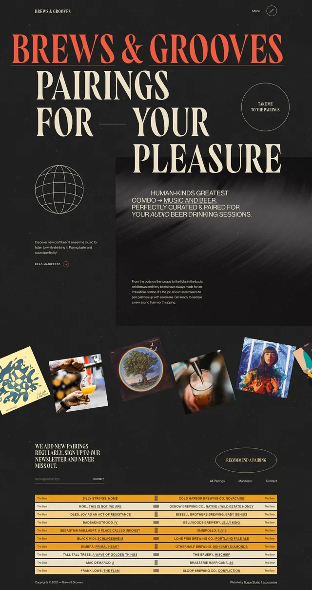
Dark editorial landing page for a music-and-beer pairing concept with oversized serif type, minimal navigation, and a curated content grid below.
Summary
Dark editorial landing page for a music-and-beer pairing concept with oversized serif type, minimal navigation, and a curated content grid below.
Visual description
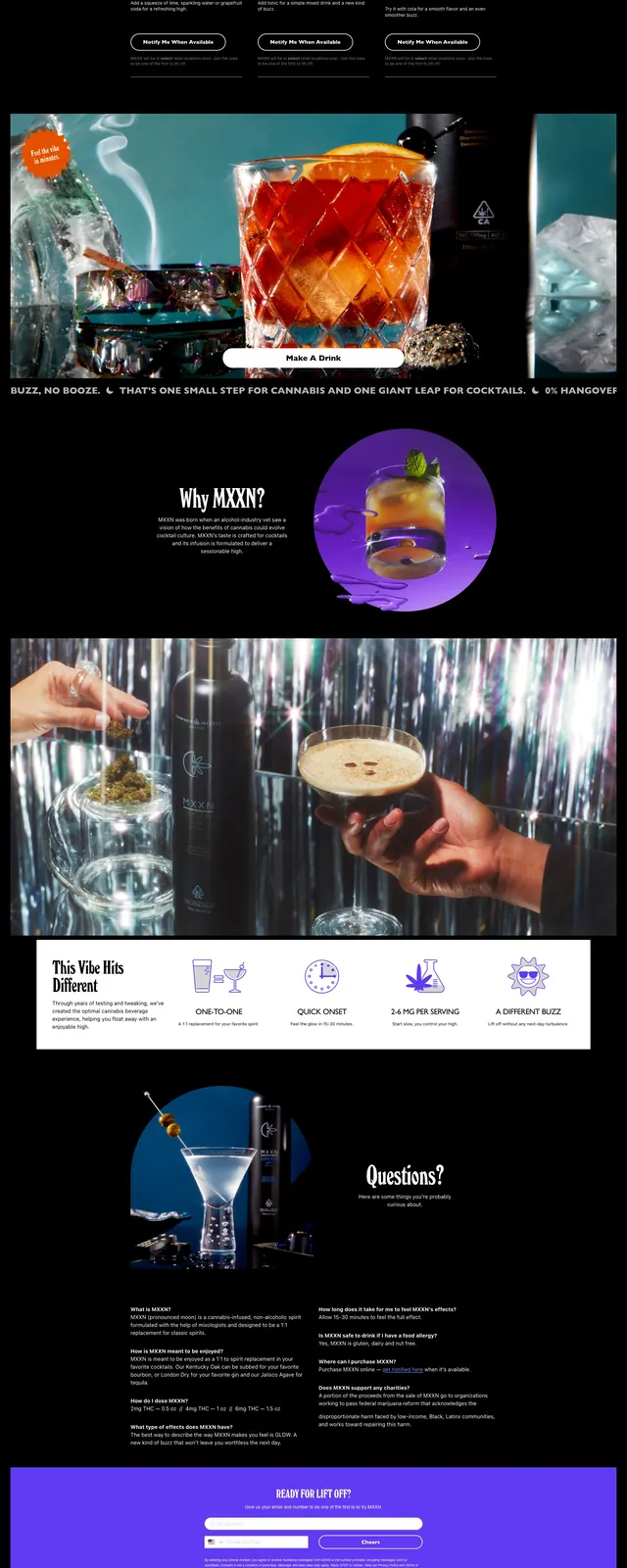
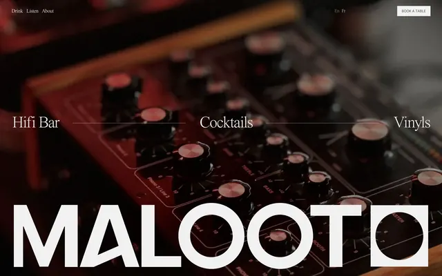
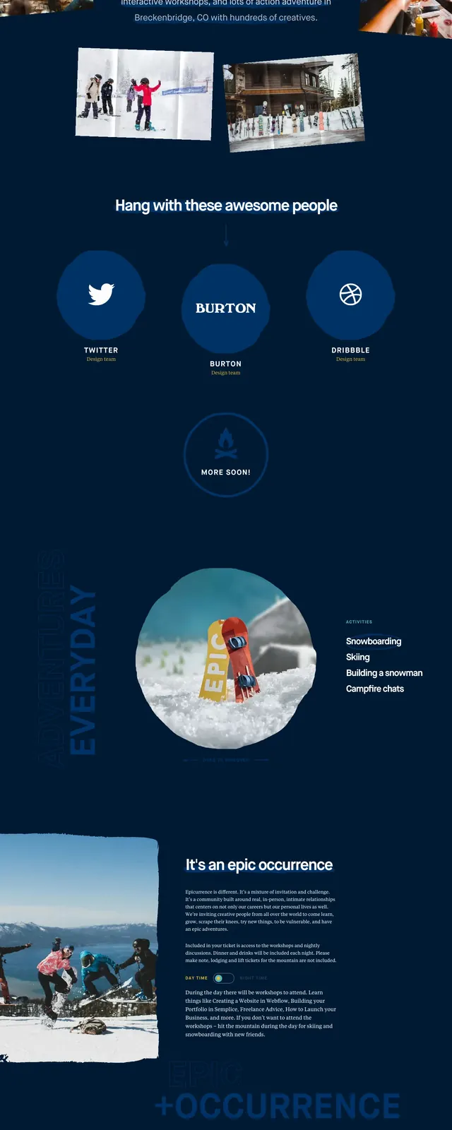
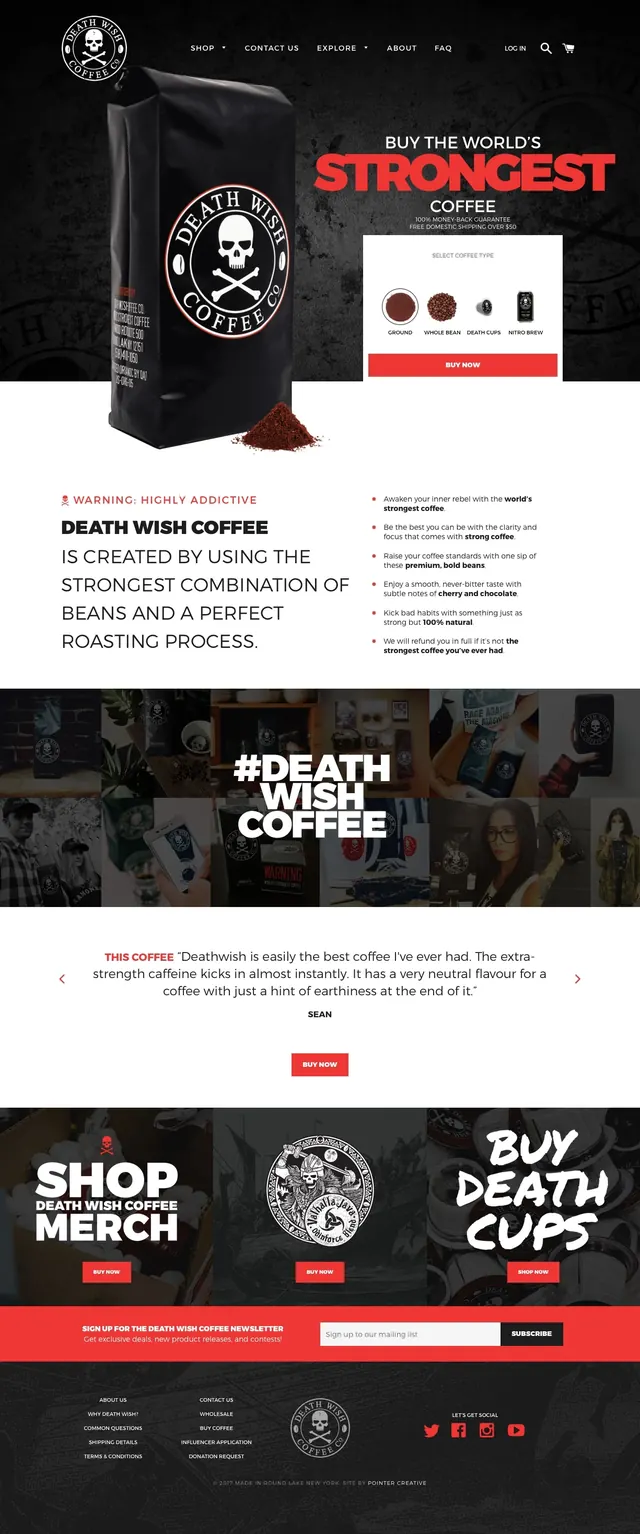
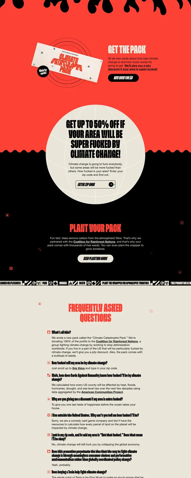
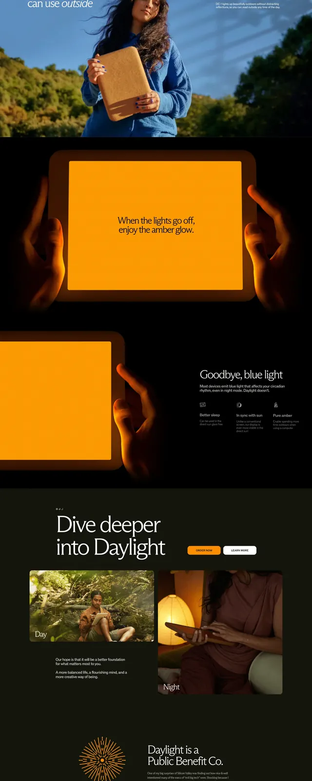
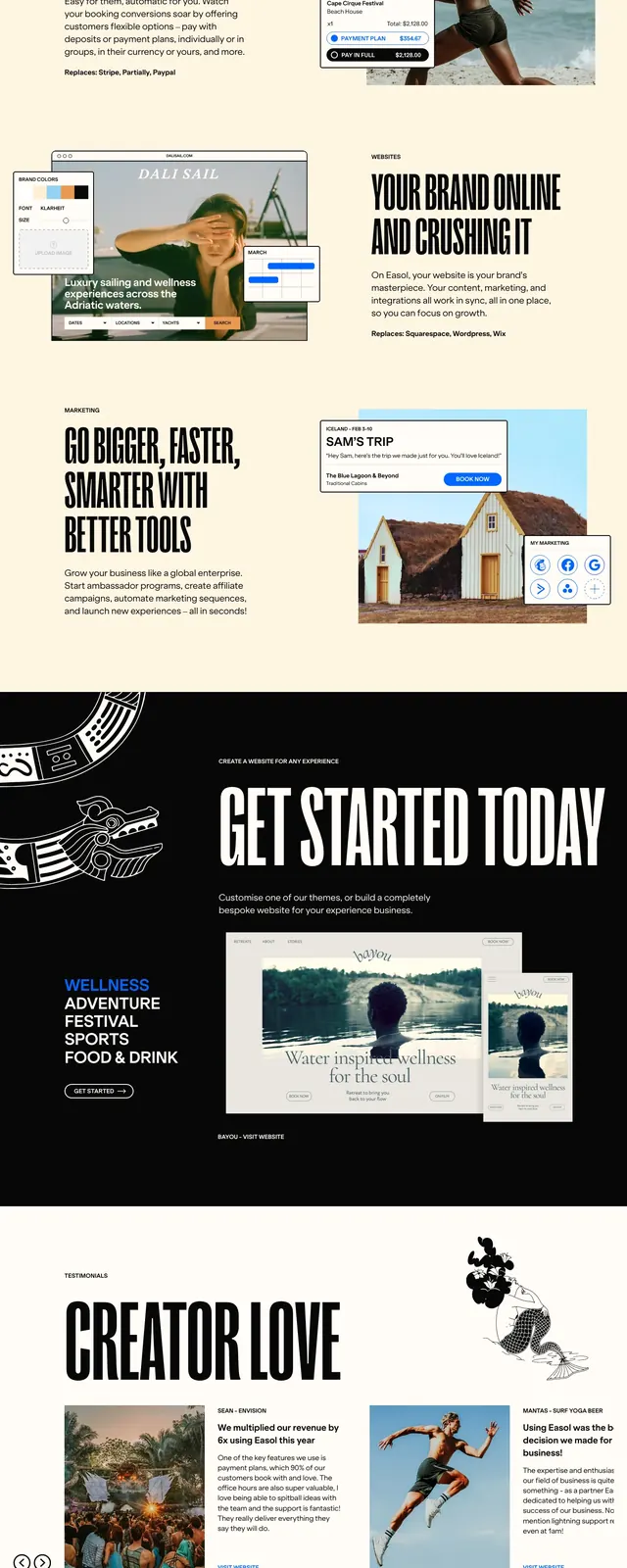
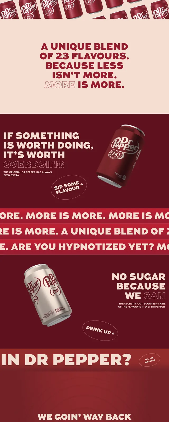
The page opens on a black textured background with a small wordmark and simple top navigation, then a massive serif headline in cream and orange fills most of the first screen. A circular outline CTA sits to the right, while a wireframe globe illustration and a short manifesto-style text block sit on the left. Lower sections continue the dark editorial treatment with a wide content panel, a diagonal row of album-style image cards, a newsletter signup area, and a dense pairing table at the bottom.
Key takeaway
The strongest move is the combination of oversized serif typography with a moody black background and restrained accent color. It feels like a print poster translated into a landing page, with enough structure to support a curated content experience.
Reuse notes
Use this approach for cultural brands, event pages, or curated product stories that benefit from a poster-like hero. It works best when the brand has strong imagery and a narrow concept; the layout depends on bold type and high contrast rather than dense utility navigation.