Preview image. Unlock full-res
A tall editorial-style landing page for Britomart combining oversized typography, grid-based photography, and strong section contrast.
Summary
A tall editorial-style landing page for Britomart combining oversized typography, grid-based photography, and strong section contrast.
Visual description
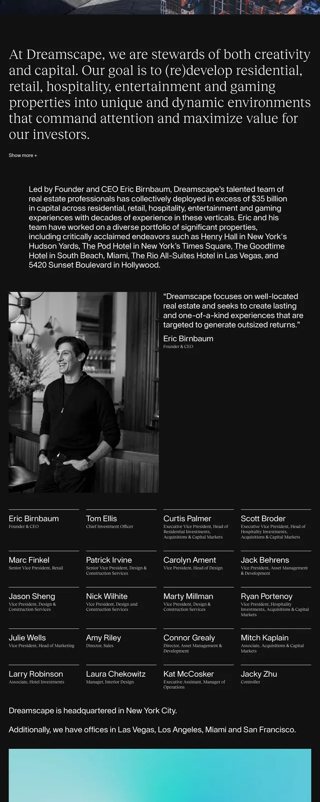
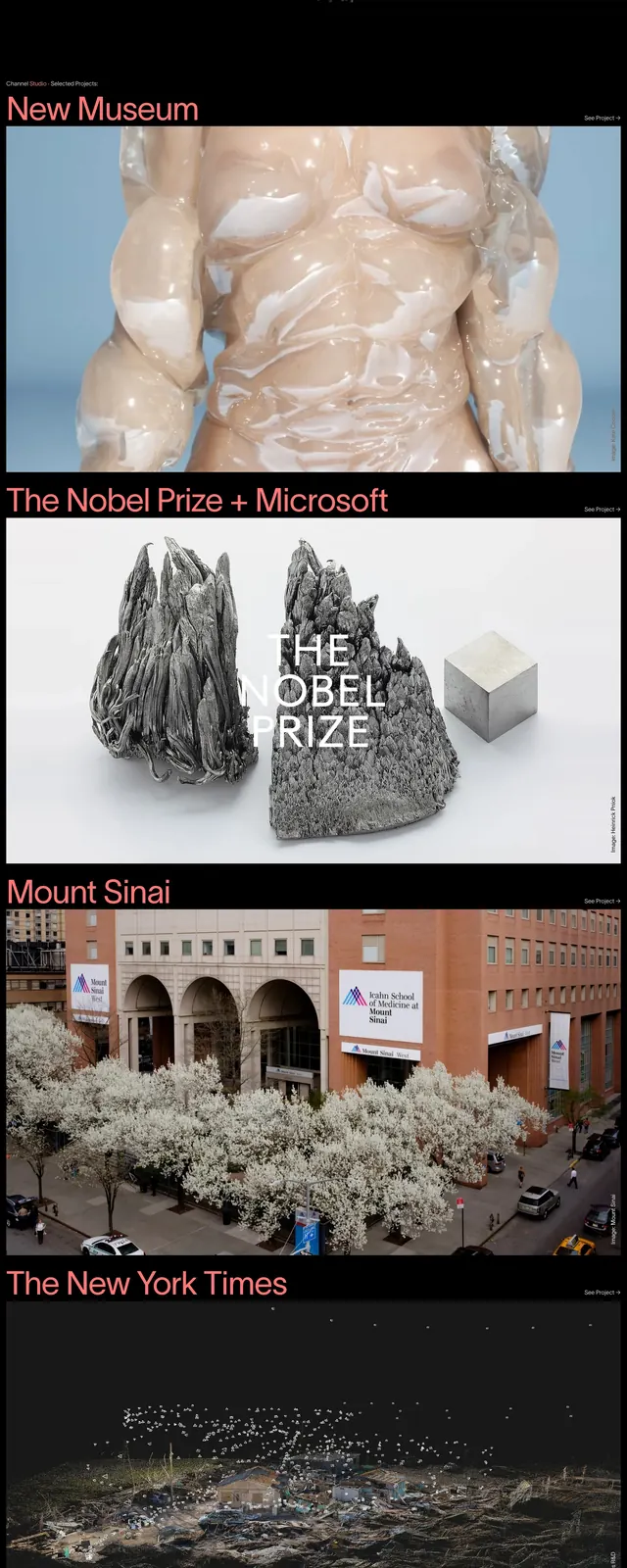
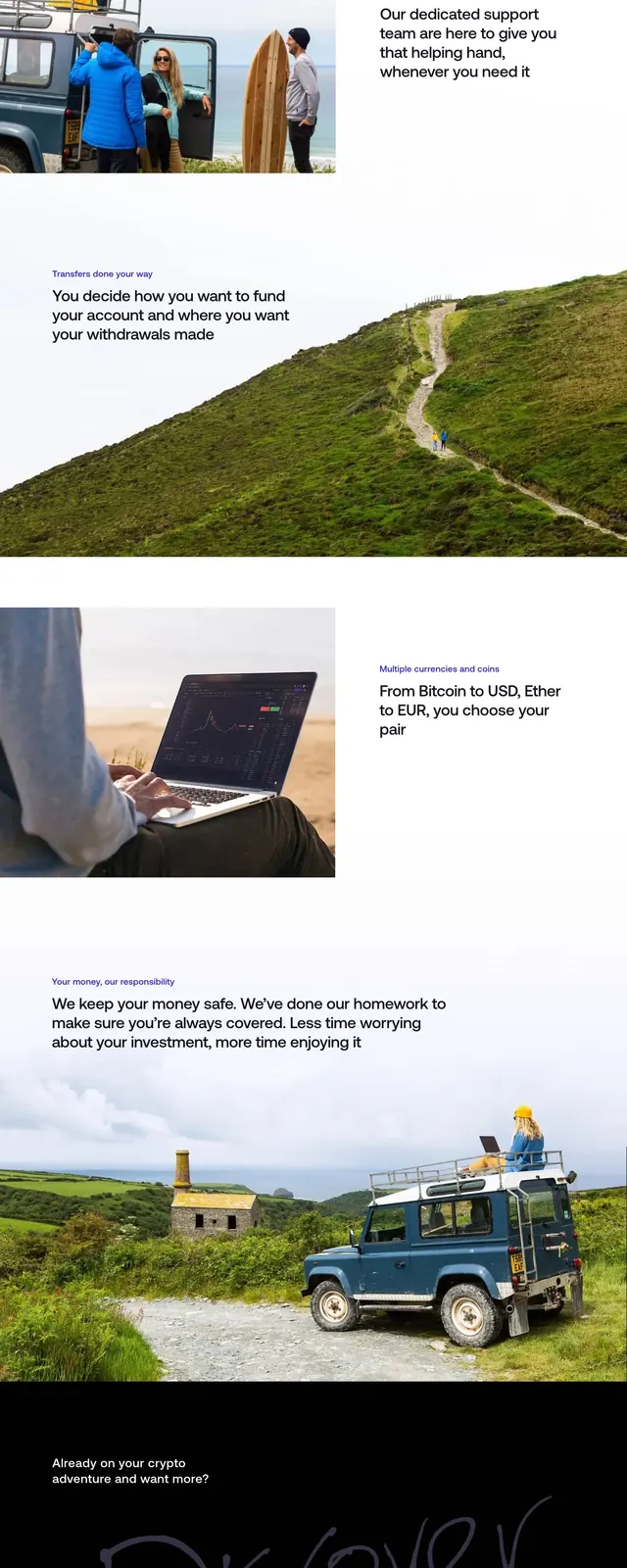
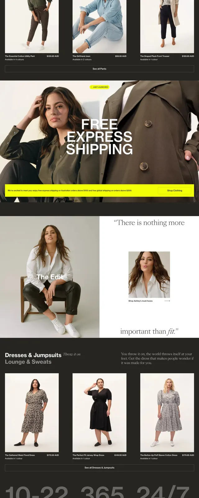
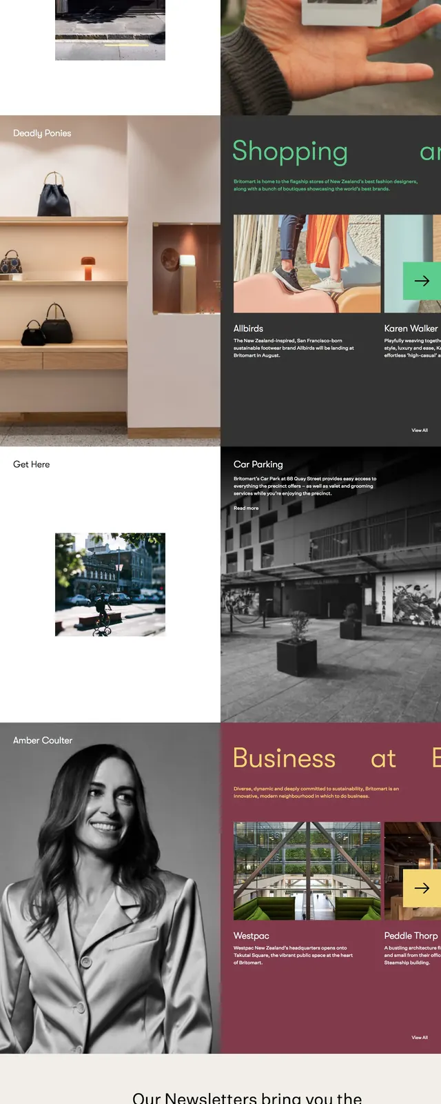
The page opens with a split hero: a black left panel with very large white headline text and a pale peach right panel with a small top-right navigation label and hamburger icon. Below, the layout continues as a stacked editorial grid of large photographic blocks, alternating color and black-and-white imagery with short labels and captions. Farther down, a wide teal text section uses spaced, large body copy across the width of the page, followed by a compact footer area with the Britomart wordmark and social icons.
Key takeaway
The strongest move is the contrast between oversized, sparse typography and tightly curated photo blocks. It feels like a district magazine and a destination guide at the same time.
Reuse notes
Use this structure for place-based brands, cultural precincts, hospitality, or retail destinations that need an editorial feel. It works best when you have strong photography and concise section labels rather than product-heavy content.