Preview image. Unlock full-res
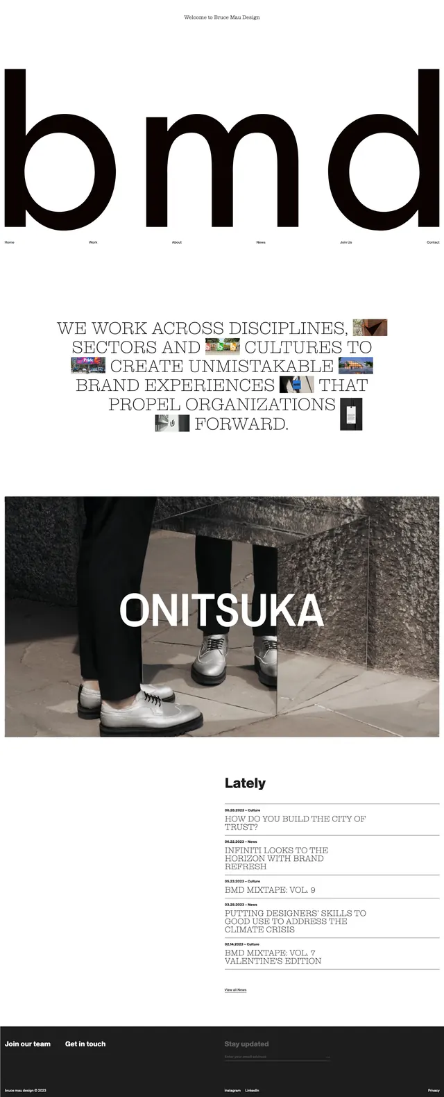
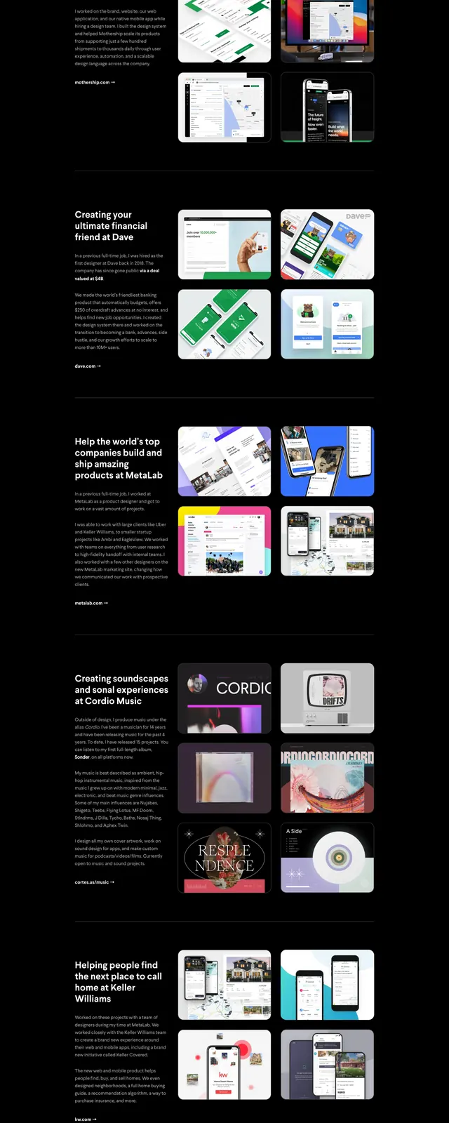
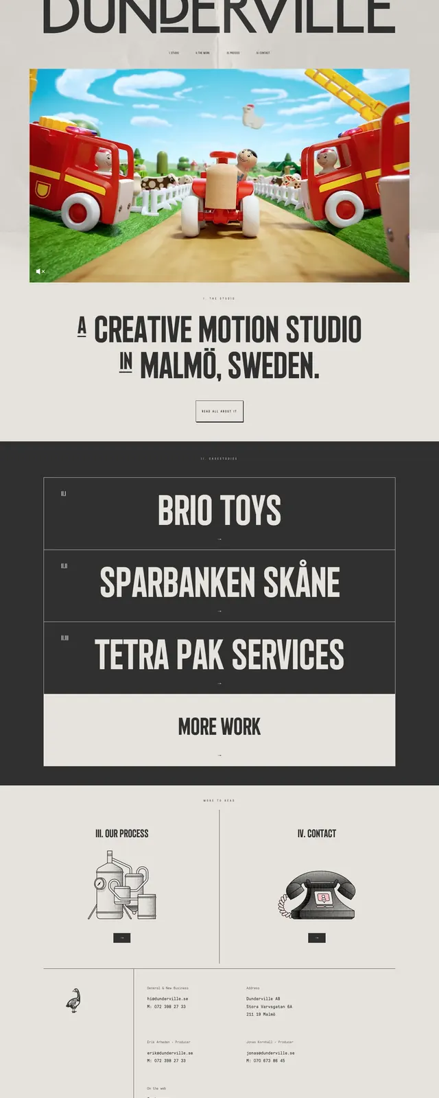
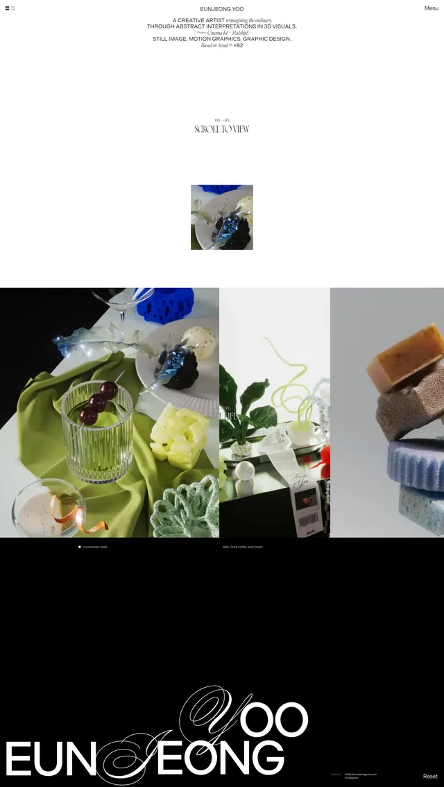
A monochrome, editorial portfolio homepage with oversized typography, immersive imagery, and stacked project showcases.
Summary
A monochrome, editorial portfolio homepage with oversized typography, immersive imagery, and stacked project showcases.
Visual description
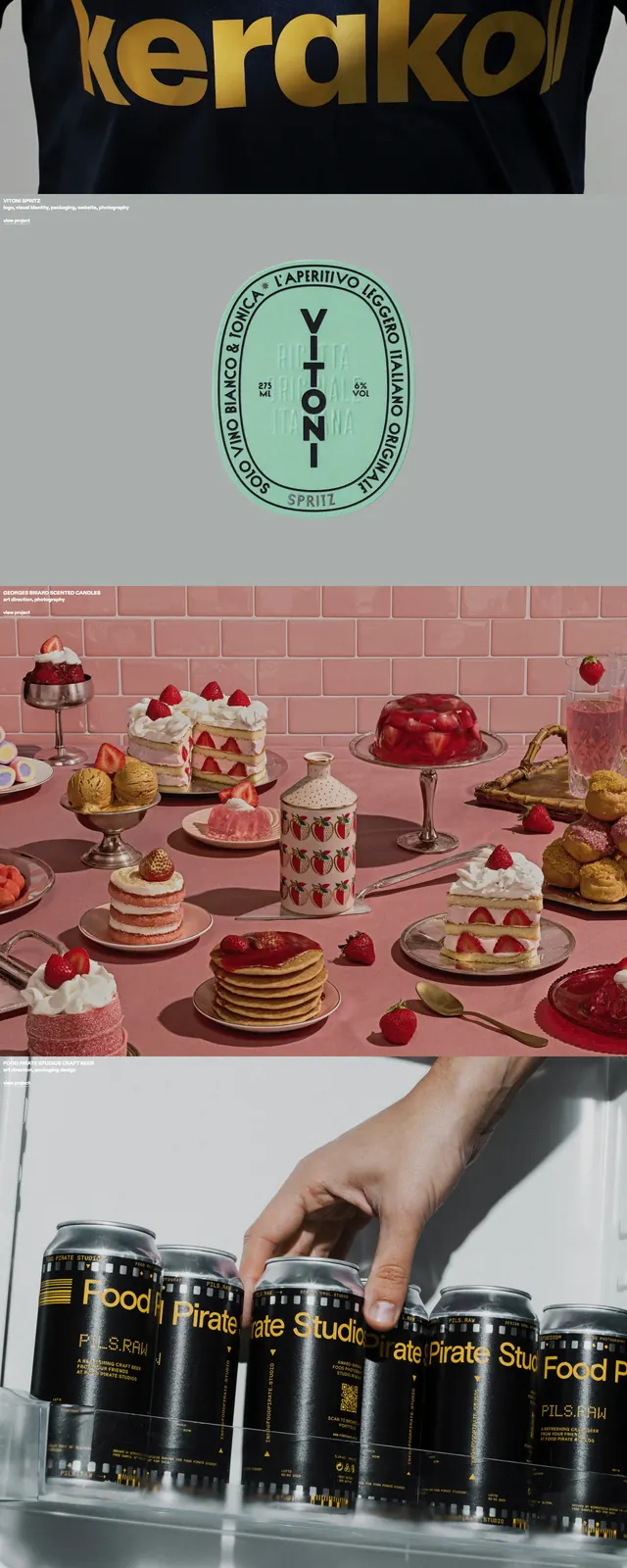
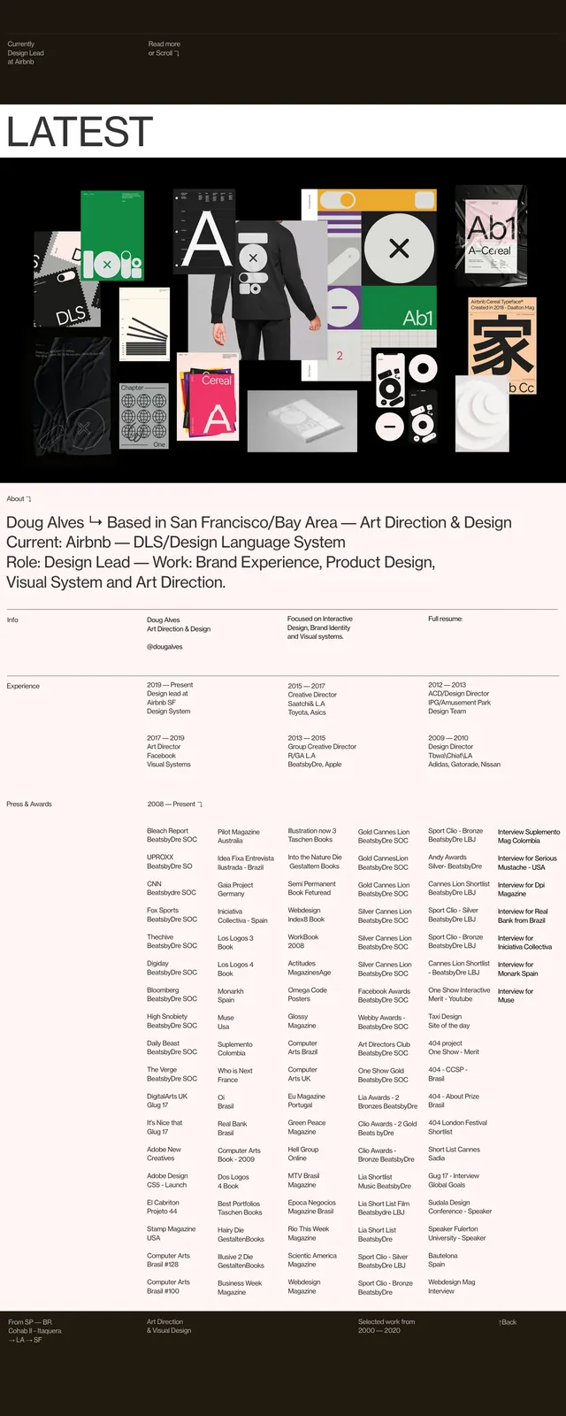
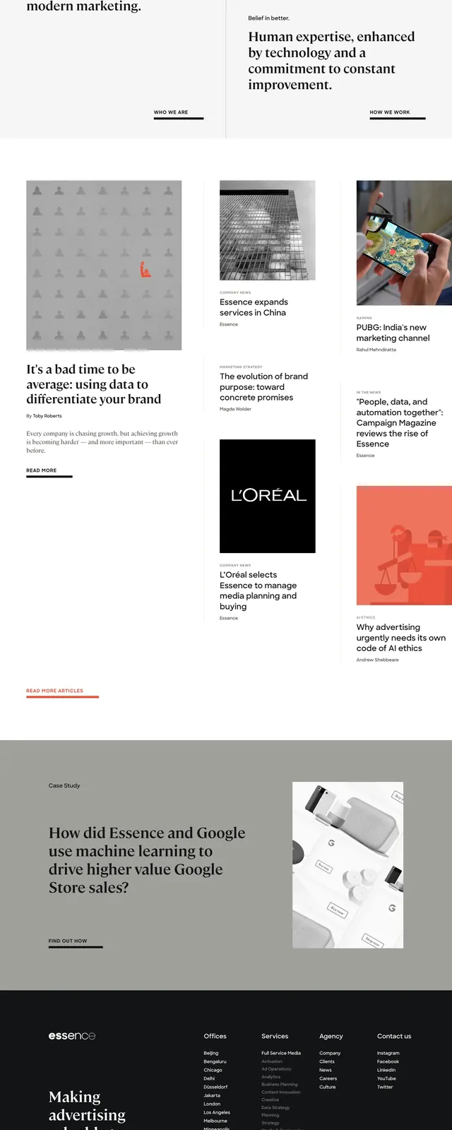
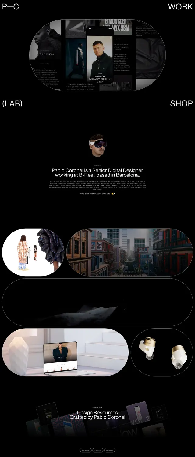
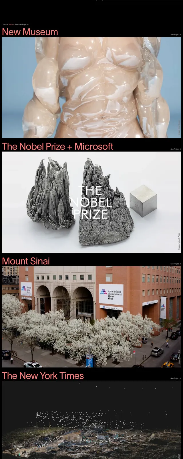
The page opens with a large grayscale hero area featuring a compact top navigation and a multi-line oversized headline. Below, the layout shifts into a dark section with a short value proposition, client logos, and an abstract particle-like visual. Further down are full-width project highlights with strong image-led composition, pink accent section titles, and simple text links such as project and see-all actions.
Key takeaway
Use a restrained monochrome palette, oversized type, and strong image hierarchy to make an agency or studio site feel editorial and high-end. The stacked sections create a rhythm that works well for portfolio storytelling and case-study browsing.
Reuse notes
This pattern is best reused for creative studios, design agencies, and portfolio sites that need a premium feel without heavy interface chrome. Keep the navigation compact and let typography plus imagery carry most of the visual weight.