Preview image. Unlock full-res
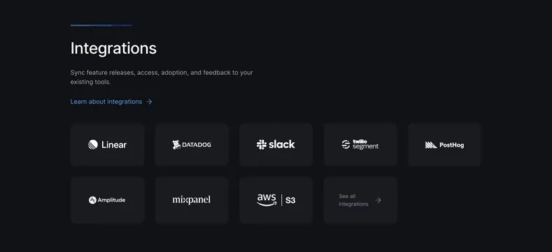
Dark integrations section with a left-aligned heading and a tidy grid of monochrome logo cards ending in a See all integrations tile.
Summary
A dark integrations section pairing a simple left-aligned heading with a grid of rounded cards, each holding one monochrome partner logo. The defining move is the uniform white-on-dark logo treatment plus a final "See all integrations" card.
Visual description
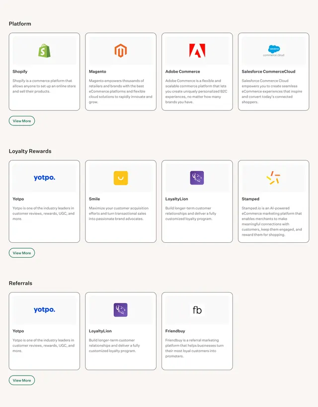
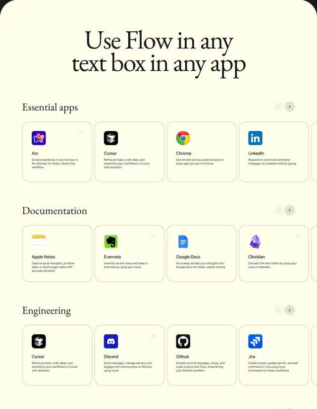
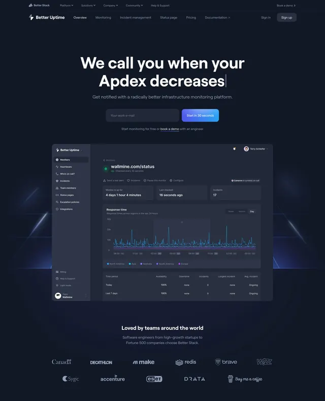
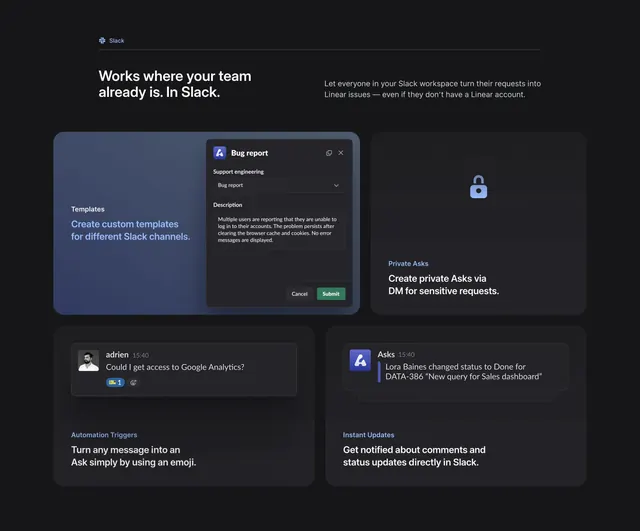
"Integrations" sits as a large white heading under a short gradient tick, with a two-line muted subhead about syncing to existing tools and a blue "Learn about integrations" link with an arrow. Below is a grid of dark rounded cards, five across on the top row (Linear, Datadog, Slack, Twilio Segment, PostHog) and four on the second (Amplitude, Mixpanel, AWS S3, and a "See all integrations" link tile). Every logo is rendered in flat white, centered in its card, giving a consistent look despite different source brands. The cards have subtle borders and sit on a near-black field.
Key takeaway
Normalizing every partner logo to a single white treatment so a mixed set of brand marks looks like one cohesive system. The trailing "See all integrations" card as the natural overflow affordance inside the same grid.
Reuse notes
Good for a developer tool or platform with many integrations to show without listing them all. Recoloring third-party logos to monochrome keeps it clean but can clash with strict brand guidelines, so check usage rights. Depends on the dark background for the white logos to read.
More integrations sections
See all



More like this



Keep what you find
A free account saves references to boards and can send you a weekly email of picks based on what you save.
To see every result, go Pro.