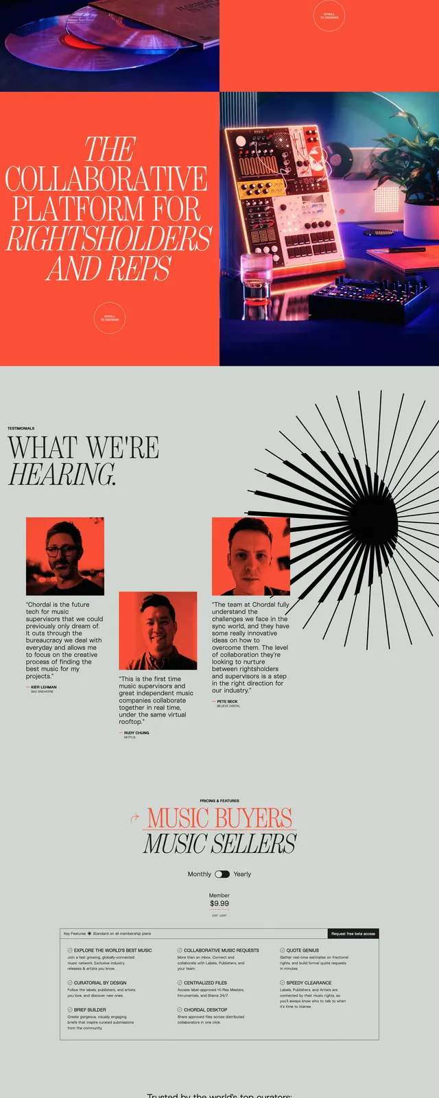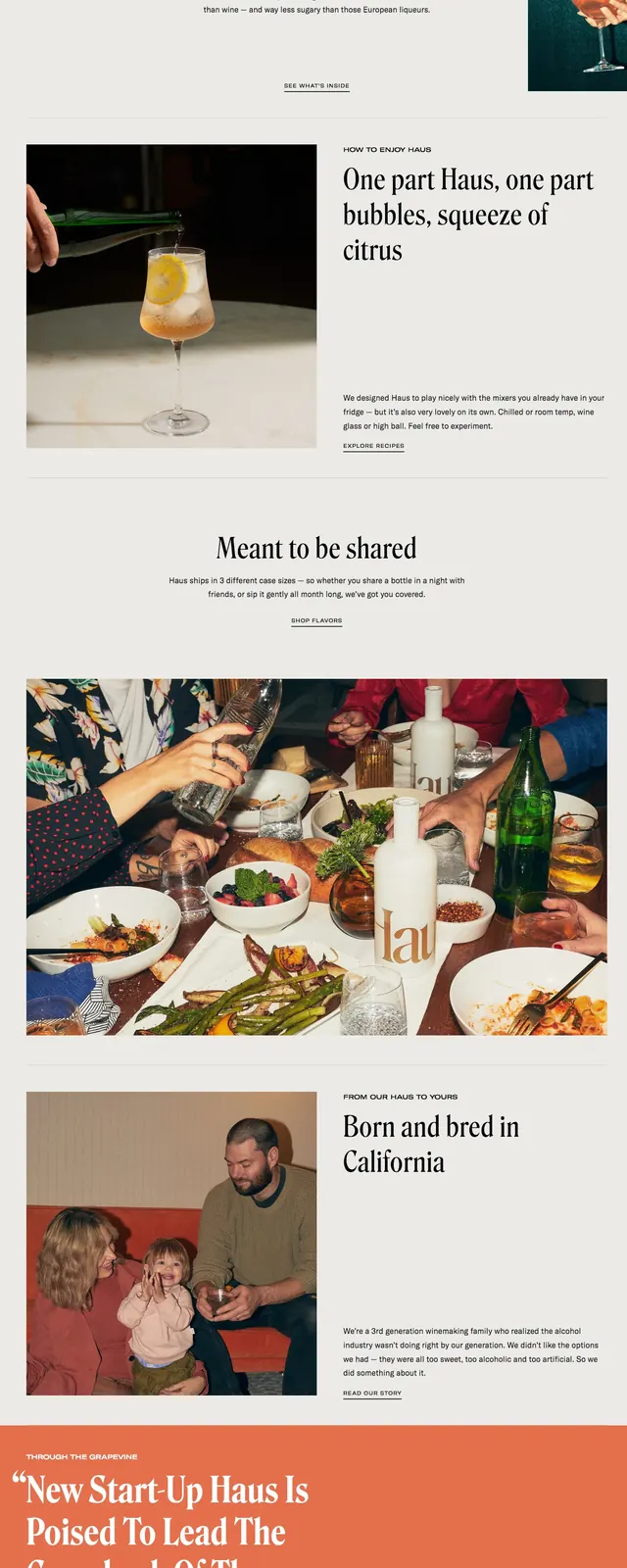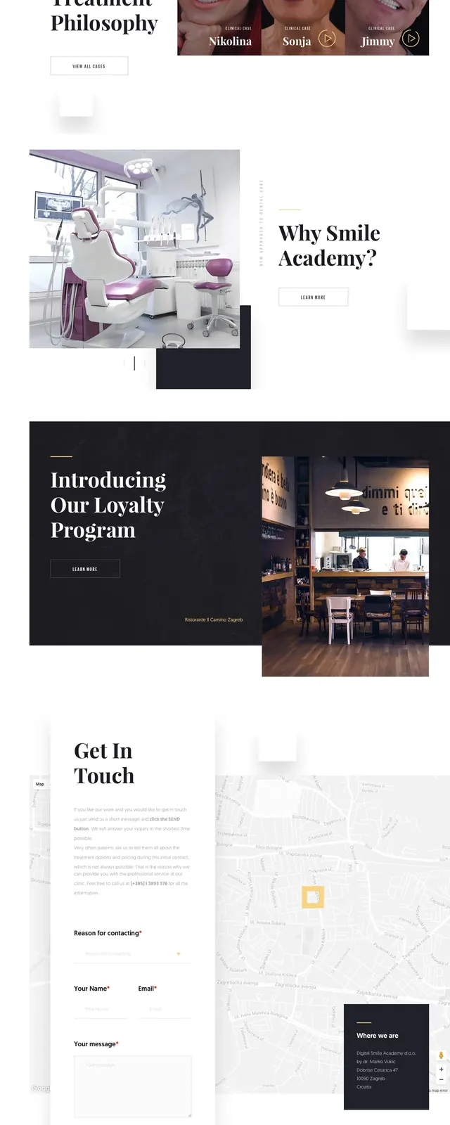
Preview image. Unlock full-res
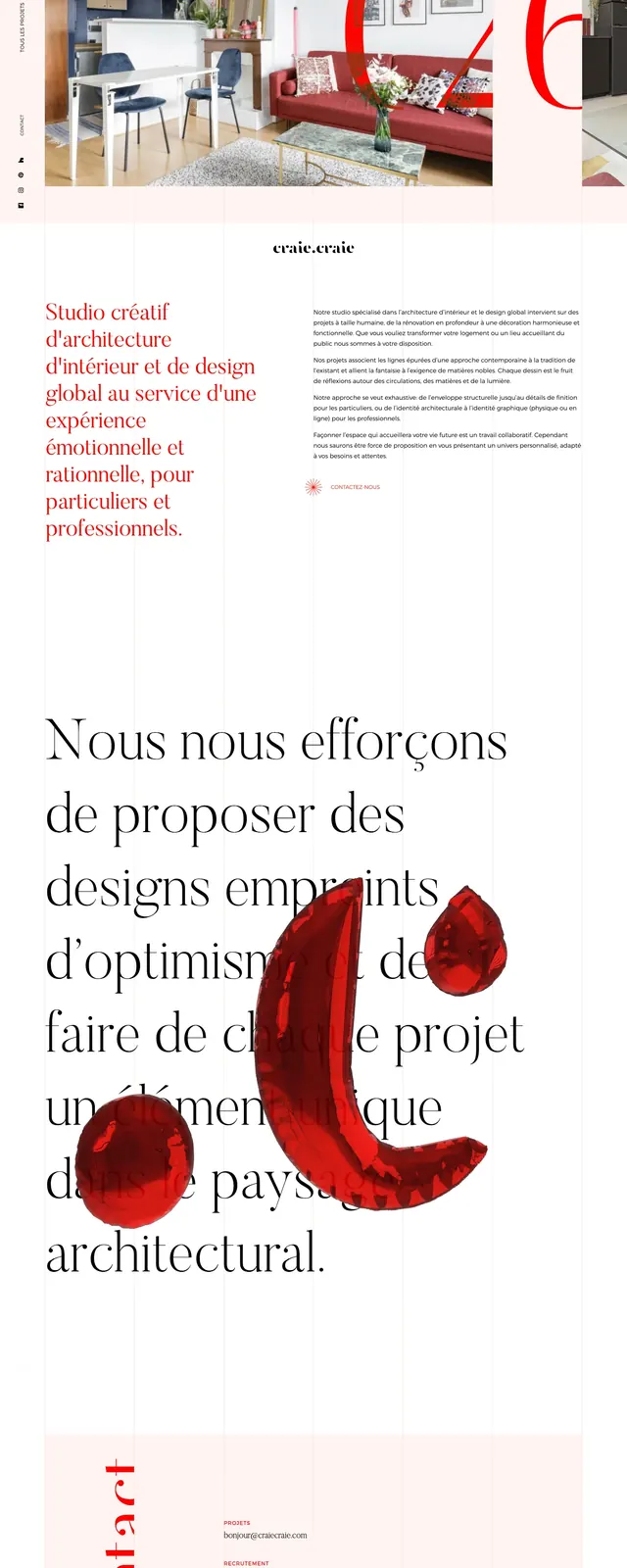
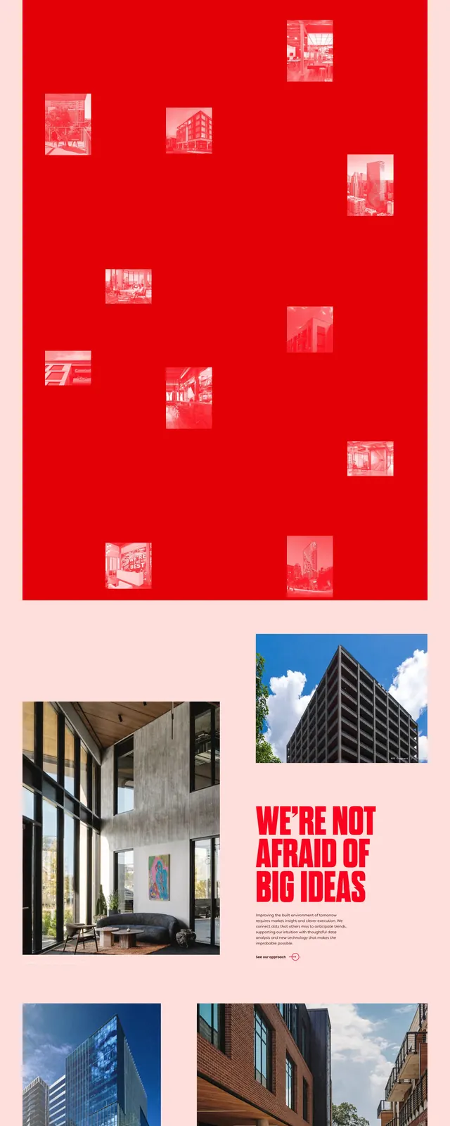
A bold real-estate landing page with oversized serif branding, pale pink backgrounds, and saturated red section accents.
Summary
A bold real-estate landing page with oversized serif branding, pale pink backgrounds, and saturated red section accents.
Visual description
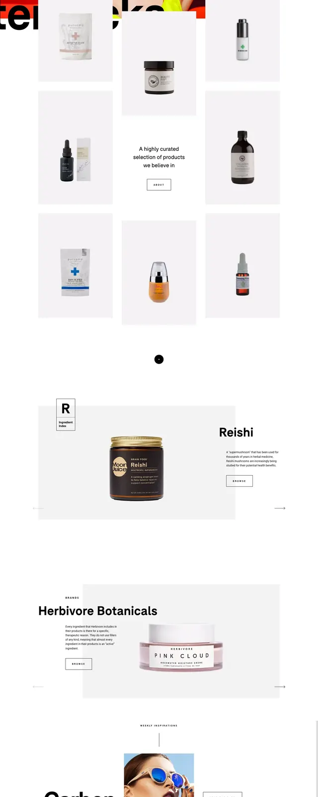
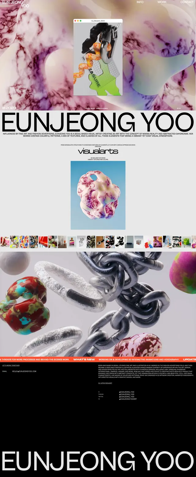
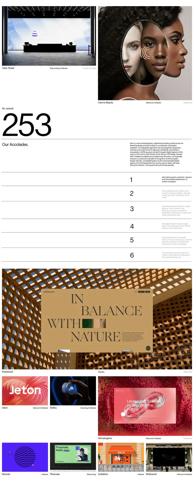
The page uses a pale blush background with very large red serif headline text reading Blue Yonder at the top and again near the footer. The layout alternates between text blocks, large architectural photography, and a bold red image grid section with small inset thumbnails. Later sections include more real-estate imagery, a contact form with multiple text inputs, and a small primary button in the same red style.
Key takeaway
The strongest reusable idea is the combination of oversized editorial serif type with minimal pale backgrounds and one intense accent color. The large image blocks and red interstitial panel create strong rhythm in a long-scroll format.
Reuse notes
Works well for premium real-estate, architecture, or place-based brands that want a fashion-editorial feel. Best reused when you have strong imagery and can support the design with very large type and sparse copy.