Preview image. Unlock full-res
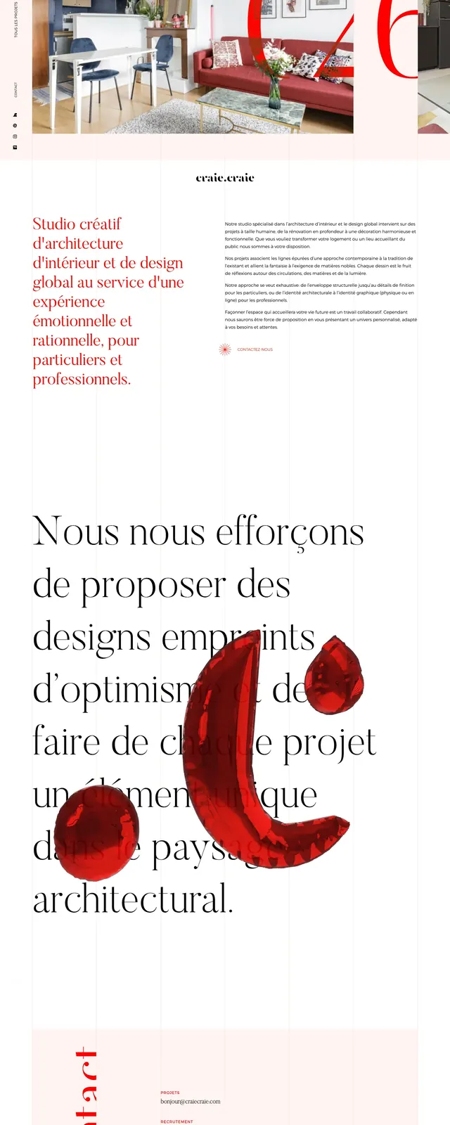
An editorial, image-led architecture and interior design homepage with oversized serif type, pale blush backgrounds, and bold red accent numerals.
Summary
An editorial, image-led architecture and interior design homepage with oversized serif type, pale blush backgrounds, and bold red accent numerals.
Visual description
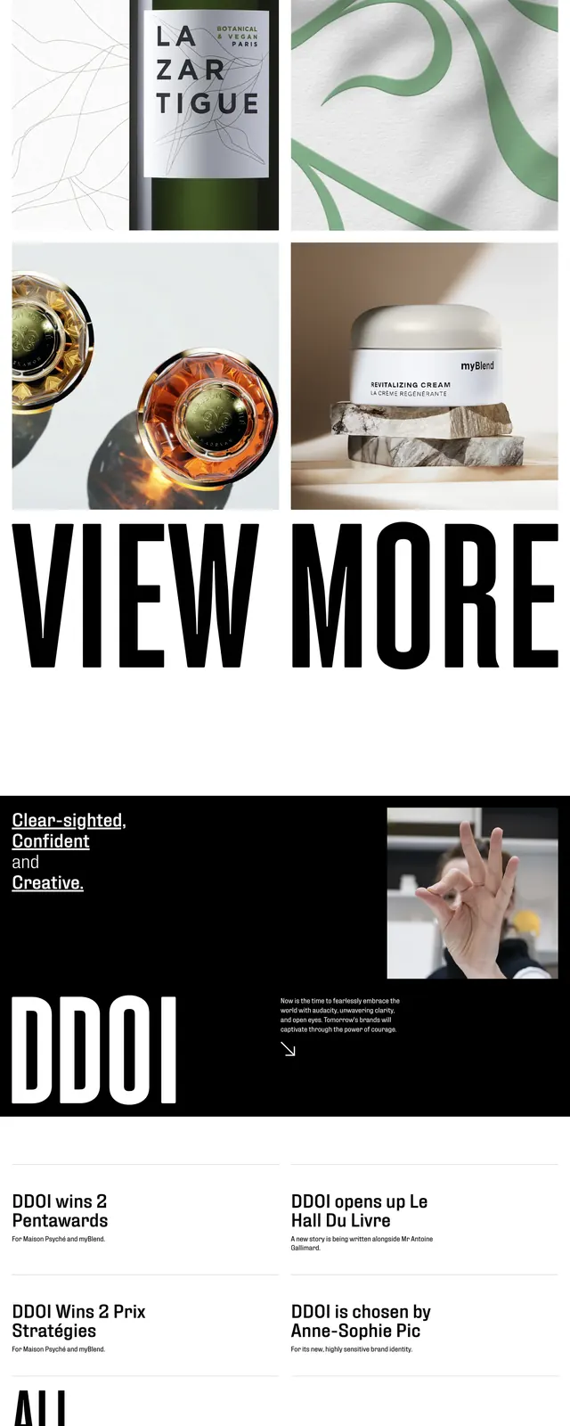
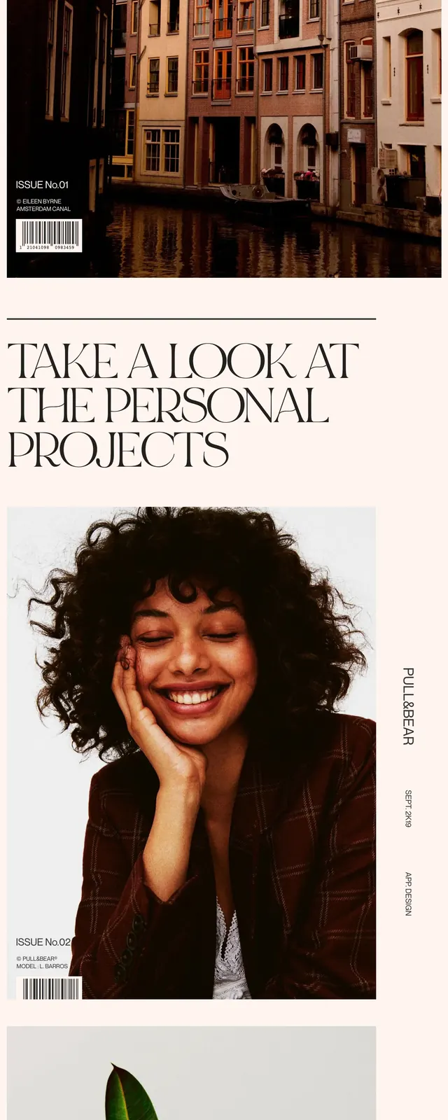
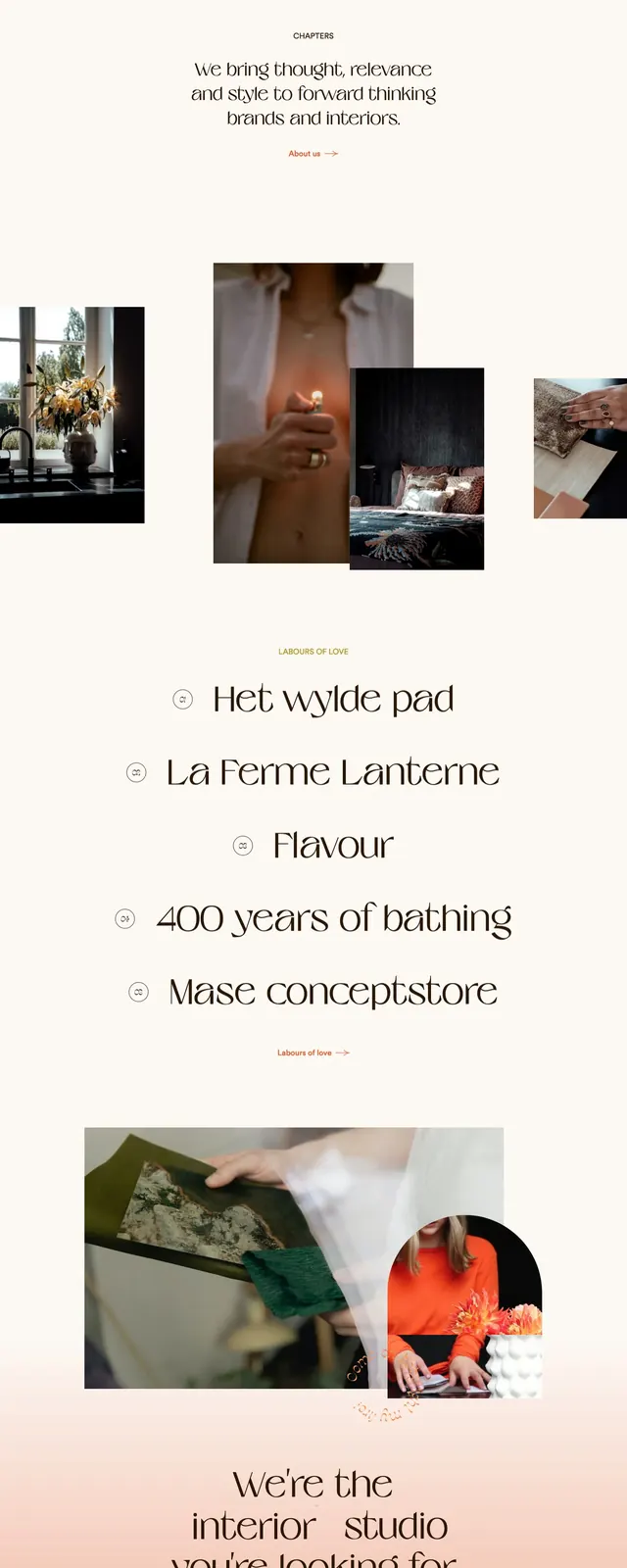
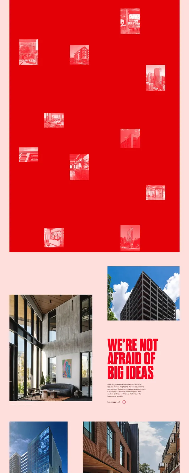
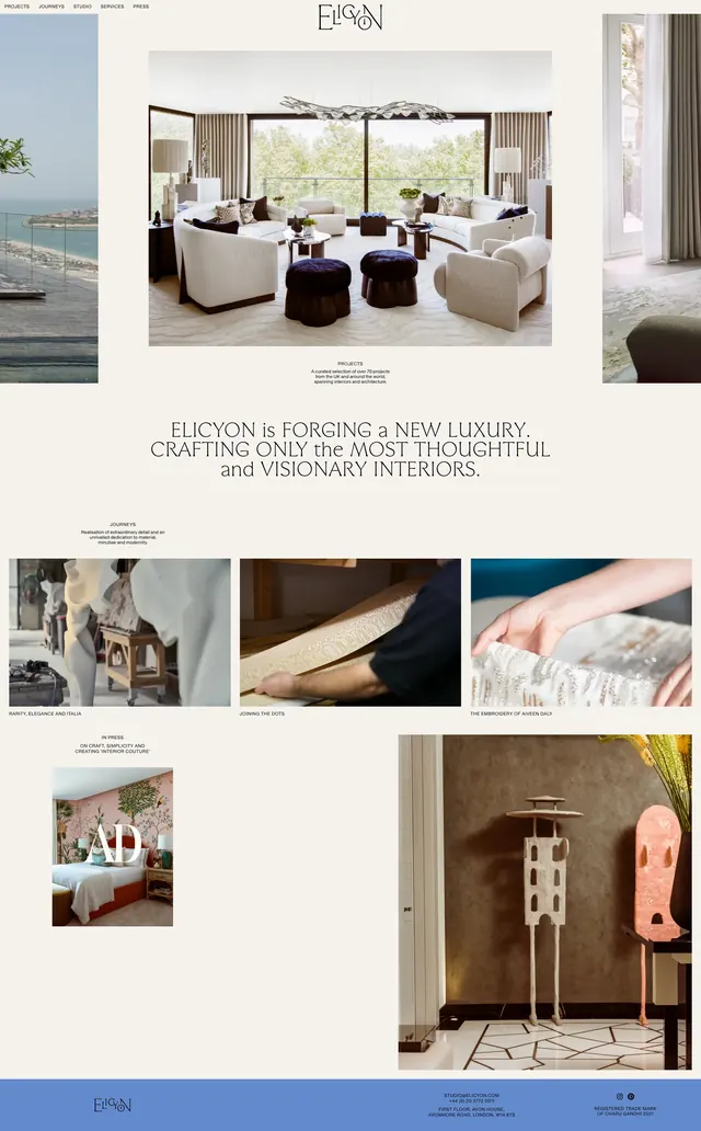
The page uses a soft blush background with thin vertical grid lines and a highly editorial composition. Large serif headlines dominate the page, paired with small body copy and oversized red numerals layered over interior photography. The top section features a large lifestyle image, while the lower visible sections include an about-style text block and a pale contact/footer band with vertical red branding. The overall look is refined, spacious, and heavily typographic.
Key takeaway
This design relies on contrast between delicate serif typography and strong red graphic accents to create a premium studio identity. Large photography and generous whitespace make the layout feel like a fashion magazine adapted for an architecture practice.
Reuse notes
Reuse this pattern for boutique agencies or studios that want an elegant, high-end editorial presence. It works best when paired with a few strong images, minimal navigation, and one or two striking accent graphics.