Preview image. Unlock full-res
A bright Cabify landing page with a split hero, illustrated city artwork, purple accent blocks, and stacked promotional sections below.
Summary
A bright Cabify landing page with a split hero, illustrated city artwork, purple accent blocks, and stacked promotional sections below.
Visual description
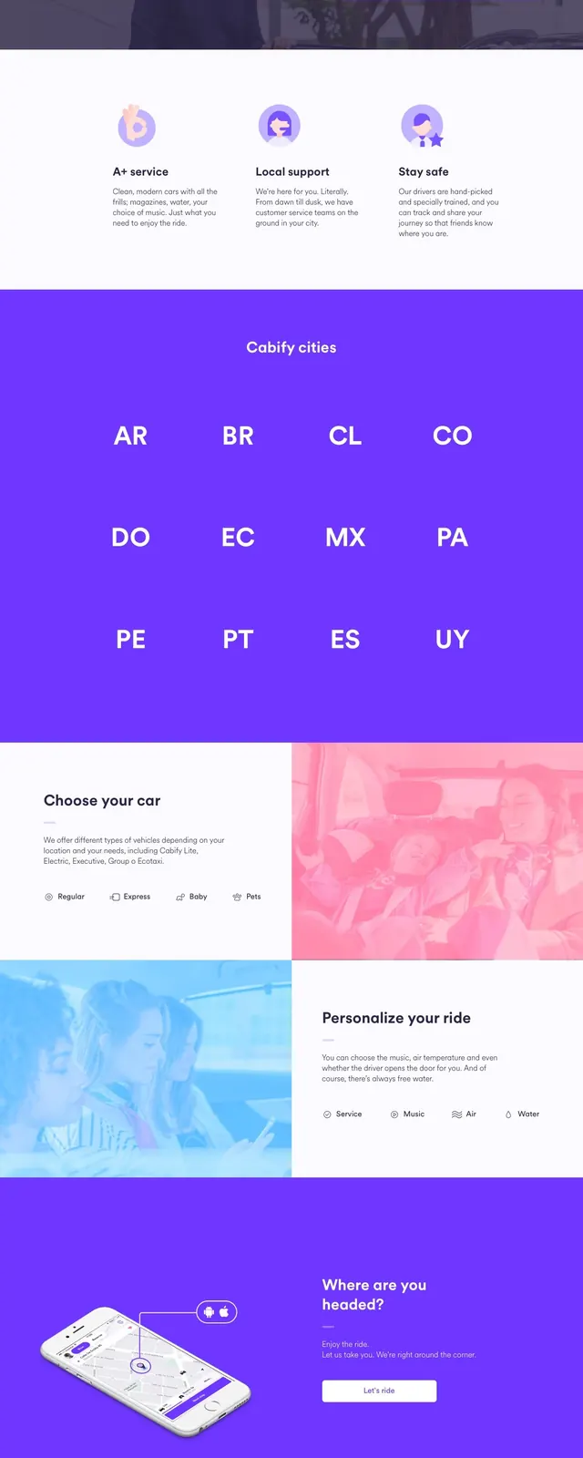
The page opens with a clean white navbar and a left-aligned hero headline, short supporting copy, and a bordered call-to-action button. To the right is a soft illustrated city scene in Cabify purple and pastel blues. Below the hero, a dark testimonial band is partially covered by a floating purple driver-recruitment card, followed by a wide purple country-code strip, a split car-feature section, a mobile-app promo band, a centered team CTA, and a dark footer.
Key takeaway
The design relies on strong purple branding, generous whitespace, and playful illustration to keep the ride-hailing message approachable. Floating cards and large full-width color blocks create clear section breaks without feeling crowded.
Reuse notes
Use this structure for consumer apps that need both rider acquisition and partner recruitment on the same landing page. The illustrated hero and floating promo card work best when the brand has a recognizable accent color and a friendly tone.