Preview image. Unlock full-res
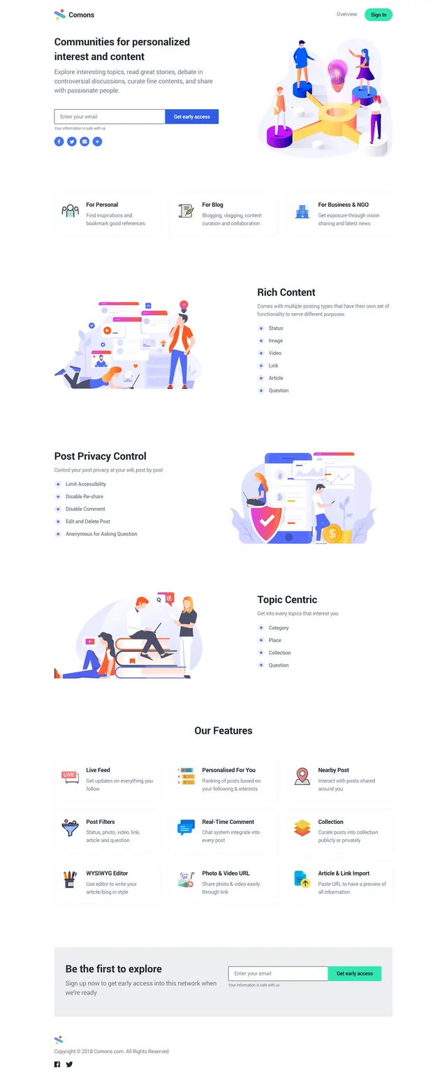
Light, illustrated community landing page with a split hero, feature cards, and multiple stacked explanatory sections.
Summary
Light, illustrated community landing page with a split hero, feature cards, and multiple stacked explanatory sections.
Visual description
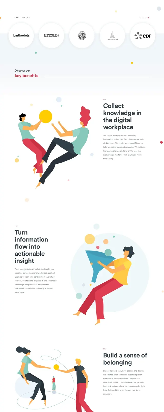
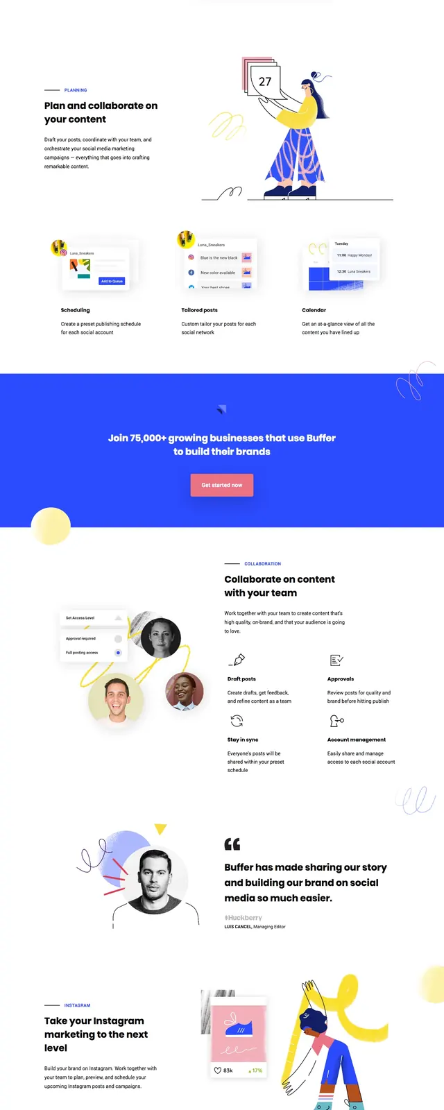
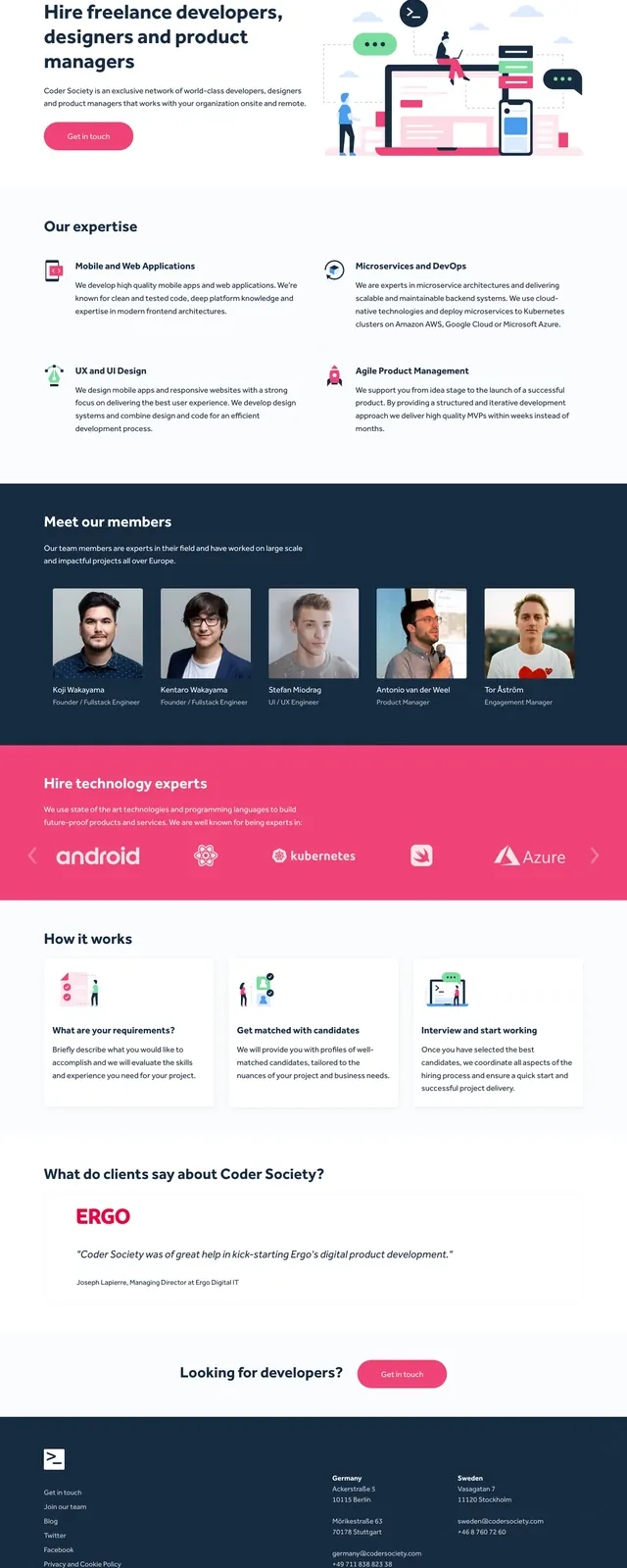
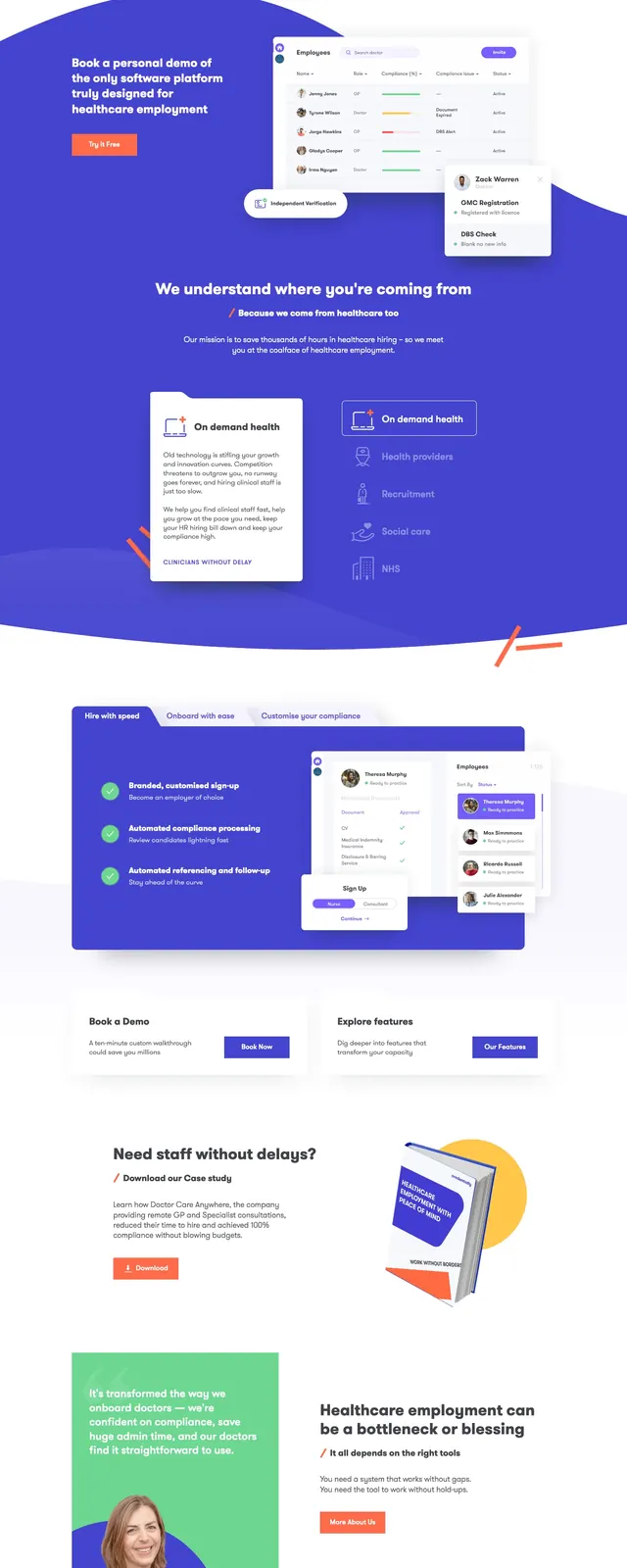
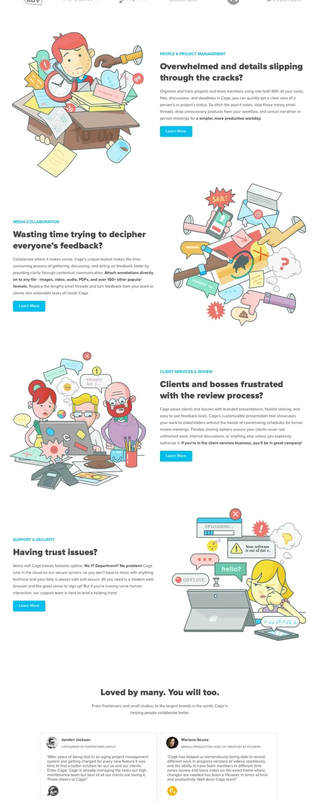
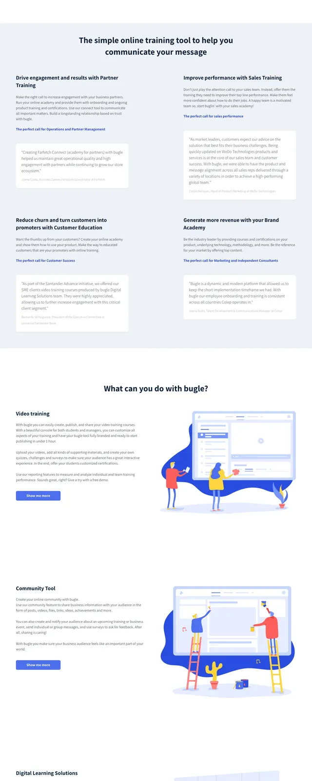
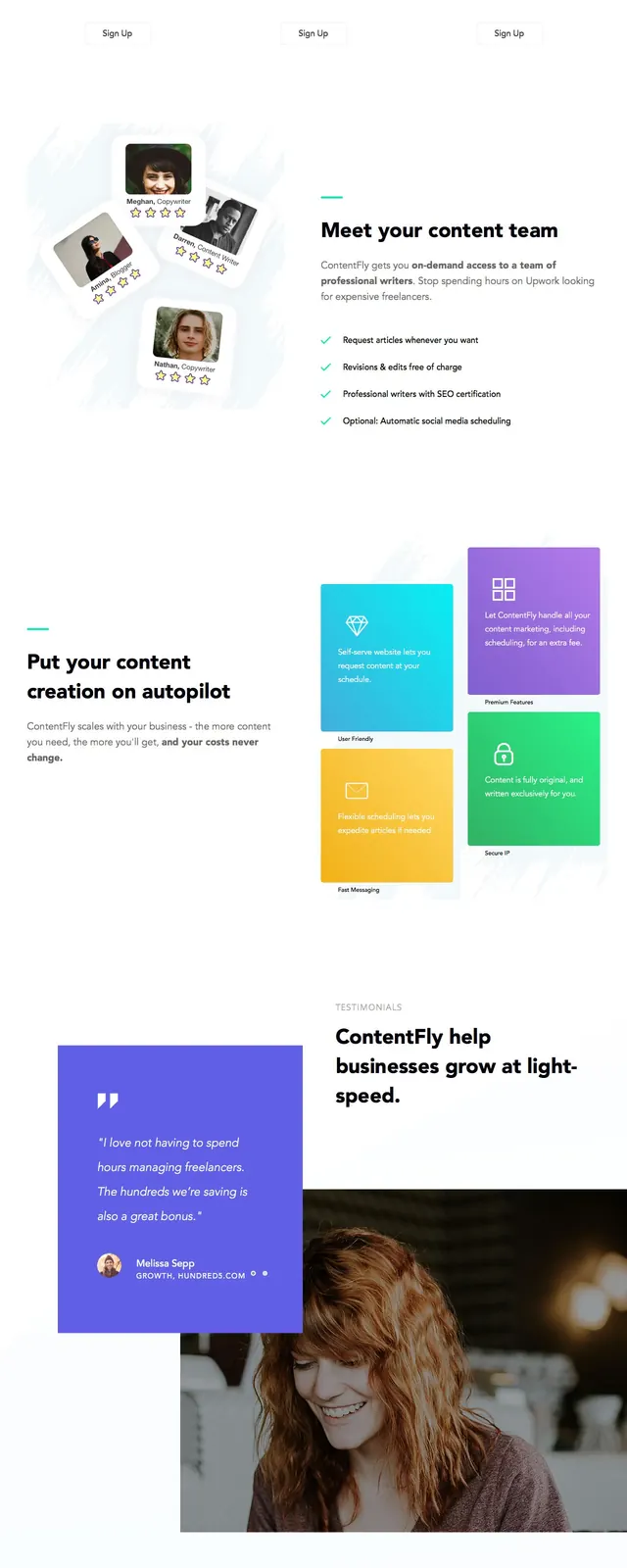
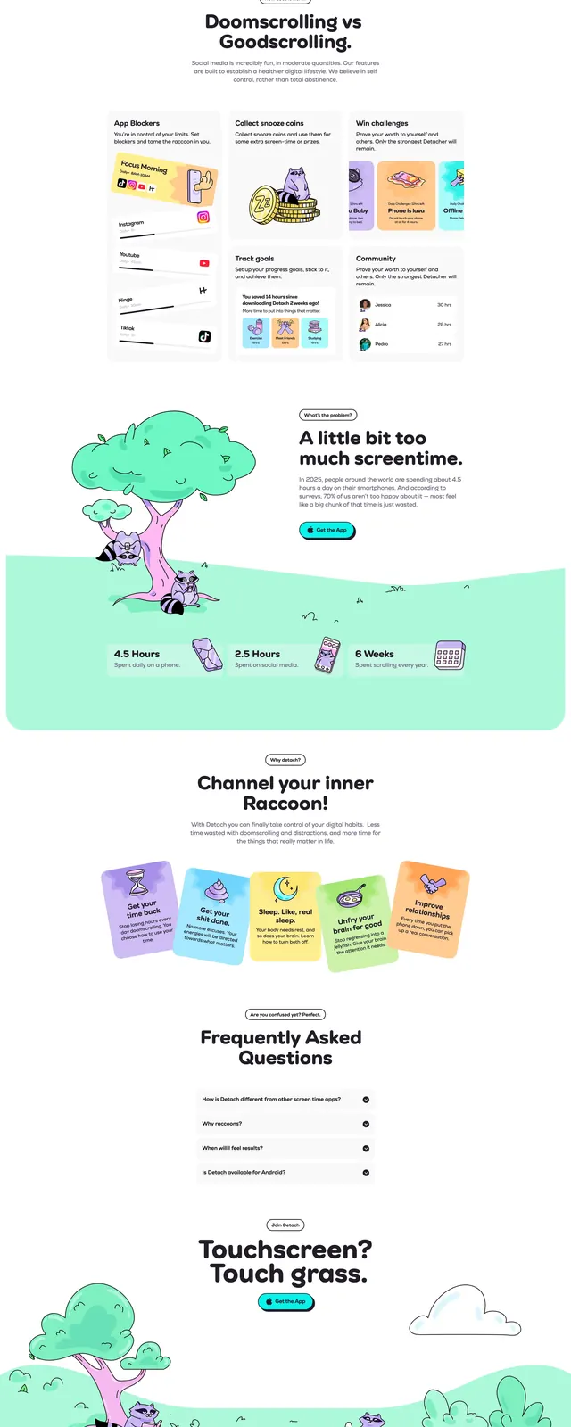
The page uses a bright white background with dark headline text and colorful flat illustrations. The first screen is a split hero with a logo and minimal top navigation on the left, a large CTA form and social icons beneath, and a community-themed illustration on the right. Below that are three small feature cards, then several alternating split sections with illustrations on one side and short bullet lists on the other, followed by a dense features grid and a bottom newsletter-style CTA bar.
Key takeaway
The layout pairs generous whitespace with playful illustrations to keep a community product feeling approachable. The repeated split sections and feature grids make the page easy to scan while still covering a lot of product detail.
Reuse notes
Use this structure for consumer community, forum, or creator-platform landing pages that need both emotional appeal and explanatory depth. It works best when you have multiple illustrations or feature blocks to support a long-scrolling sales page.