Preview image. Unlock full-res
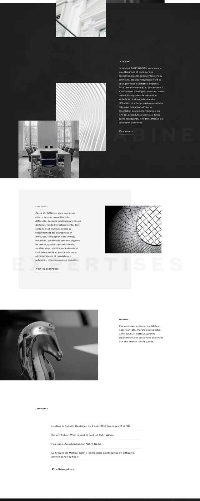
A monochrome legal firm homepage with airy editorial spacing, large brand wordmark, and stacked image-led sections.
Summary
A monochrome legal firm homepage with airy editorial spacing, large brand wordmark, and stacked image-led sections.
Visual description
The page opens on a mostly white hero with the Cahn Wilson wordmark on the left and a compact intro paragraph on the right, plus a minimal hamburger menu and language switcher in the top-right corner. Below the hero, large grayscale images are arranged in an overlapping, offset composition with strong negative space and dark horizontal bands separating sections. Further down, a pale content block pairs dense text with a square image, followed by a smaller text-and-image area and a dark footer-like section with the logo, navigation links, contact details, and a map texture in the background.
Key takeaway
The strongest move is the restrained monochrome palette combined with editorial spacing and layered imagery. It feels premium and institutional without becoming heavy or ornate.
Reuse notes
Useful for legal, consulting, and other trust-heavy firms that want a refined brand presence. The composition works best when you have strong photography and concise copy, since the layout depends on visual rhythm rather than dense content.