Preview image. Unlock full-res
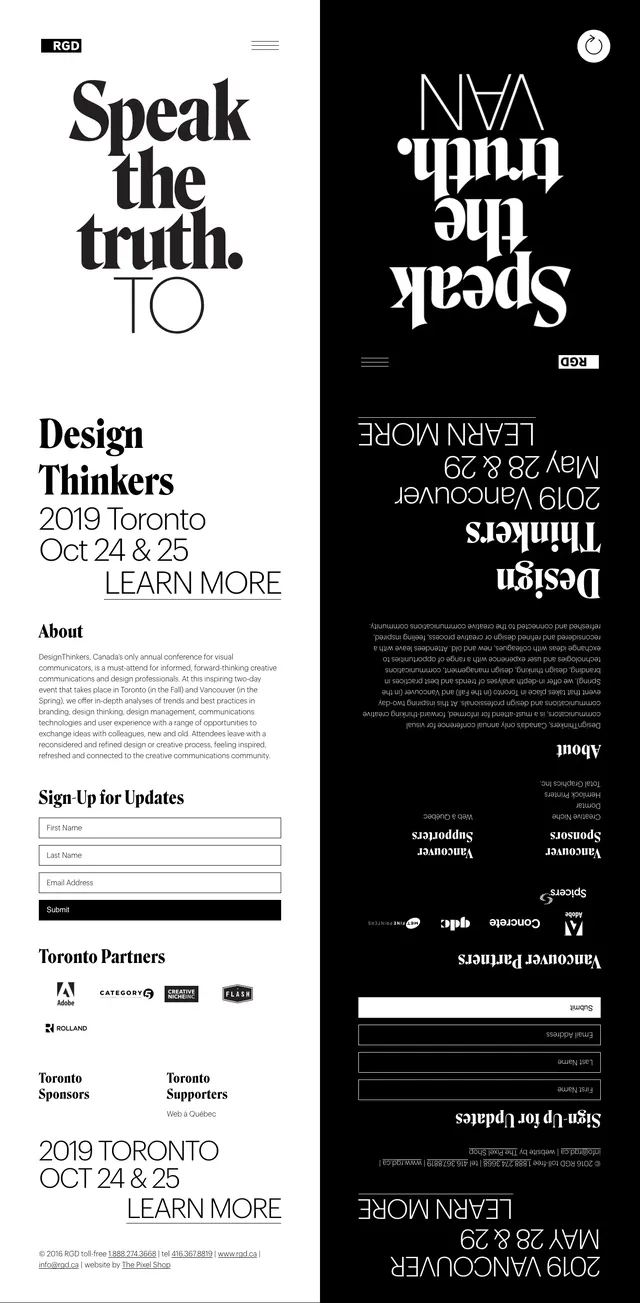
A high-contrast event landing page built from bold serif typography, mirrored black-and-white panels, and editorial poster aesthetics.
Summary
A high-contrast event landing page built from bold serif typography, mirrored black-and-white panels, and editorial poster aesthetics.
Visual description
The page uses a stark split-screen composition with a white left side and black right side, both dominated by oversized serif headlines. The top view presents the event title and date alongside a simple hamburger menu and small brand mark, while the mirrored black panel shows the same content inverted and rotated. Lower slices reveal supporting sections with an about paragraph, newsletter signup form fields, partner logo rows, and a footer-like information block. The overall layout feels like a poster translated into a long-form website.
Key takeaway
The strongest pattern here is the use of large editorial type as the primary visual system, supported by extreme contrast and mirrored symmetry. It is a good reference for event pages that want to feel cultural, design-forward, and memorable without relying on imagery.
Reuse notes
Reuse the split monochrome canvas, oversized serif hero headline, and sparse navigation for a refined event landing page. The inverted secondary panel can be adapted as a dramatic scroll transition or alternate-state hero treatment.