Preview image. Unlock full-res
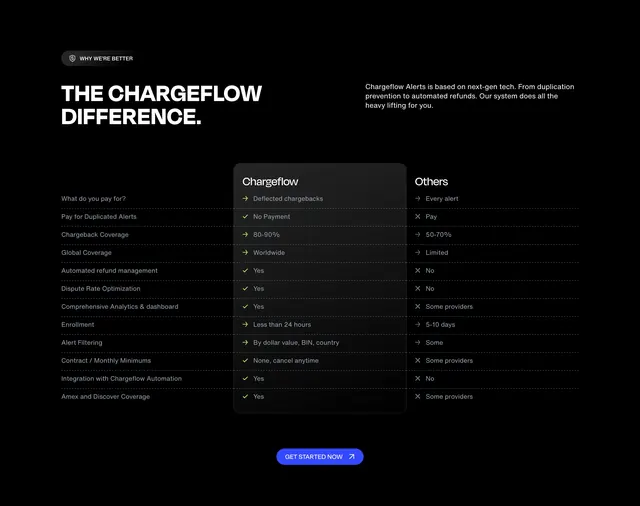
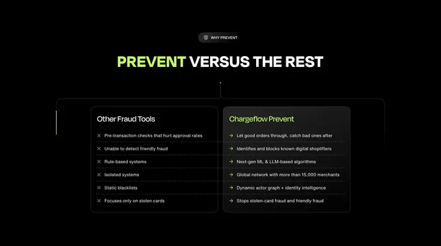
Dark two-column comparison pitting Other Fraud Tools with gray X bullets against Chargeflow Prevent with lime arrow bullets under a split-color headline.
Summary
A "Prevent versus the rest" comparison with two dark cards listing six contrasting points each, connected by dotted lines to a central Why Prevent badge.
Visual description
Black background. Center top: dark pill badge with shield icon "Why prevent." Headline "Prevent versus the rest" with "Prevent" in lime green and remainder white. Two large dark gray rounded cards below connected by dotted lines to center. Left card titled "Other fraud tools" with gray X icons beside six negatives on approval rates, friendly fraud, rules, isolation, blacklists, and stolen-card focus. Right card titled "Chargeflow Prevent" in lime with green arrow icons beside six positives on post-transaction catching, shoplifters, ML/LLM, global network, dynamic identity graph, and both fraud types. Horizontal dotted lines align row pairs across cards.
Key takeaway
Aligned horizontal dotted rules turn a feature list into a row-by-row duel readers can scan in seconds. Lime accent reserved for your product column title and positive markers only.
Reuse notes
Classic competitive comparison for product launch pages. Keep lists equal length for alignment; six rows is about the max before density. Dark cards on black need sufficient gray contrast.