Preview image. Unlock full-res
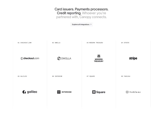
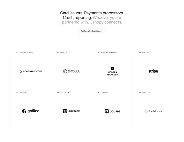
Light integrations block with a centered multi-line statement, a pill CTA, and a numbered four-column grid of partner logos.
Summary
A light integrations section that opens with a centered two-tone statement and a single pill CTA, then lists eight partner logos in a numbered four-column grid separated by thin vertical rules. The numbered, monospace-labeled logo grid is the defining device.
Visual description
White background. Centered at top, a three-line headline mixes a black emphasis ("Card issuers. Payments processors. Credit reporting.") with a grey continuation ("Whoever you're partnered with, Canopy connects."). A light-grey "Explore all integrations" pill with chevron sits centered below. Beneath, a four-column grid holds eight partner logos in two rows; each cell is labeled top-left with a monospace index and name (01 CHECKOUT.COM, 02 DWOLLA, 03 MODERN TREASURY, 04 STRIPE, 05 GALILEO, 06 INTERCOM, 07 SQUARE, 08 TABLEAU). Logos render in flat black on white, centered in generous whitespace, with thin vertical divider lines between columns.
Key takeaway
Numbering and monospace-labeling each logo cell, which turns a generic logo wall into a structured, almost catalog-like index. The two-tone headline (black statement, grey resolution) creates hierarchy in a single sentence without size changes.
Reuse notes
Best for fintech, payments, and B2B SaaS that want to flaunt integration partners credibly. Needs clean monochrome logo files to keep the grid uniform. Light, Swiss-leaning treatment; the vertical dividers and monospace labels are what differentiate it from a plain logo strip, so keep them.
More integrations sections
See all





More like this





Keep what you find
A free account saves references to boards and can send you a weekly email of picks based on what you save.
To see every result, go Pro.