Preview image. Unlock full-res
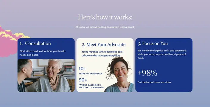
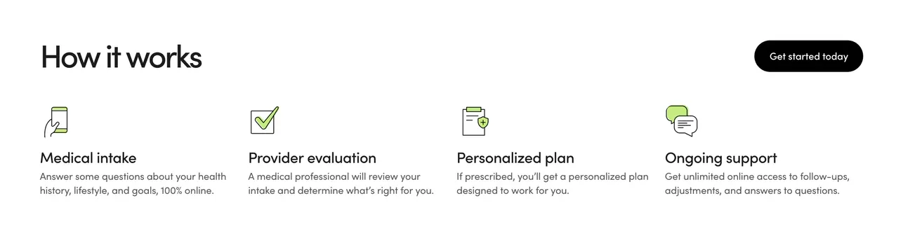
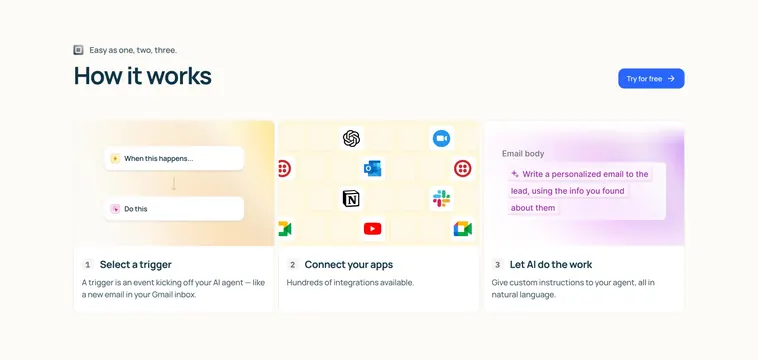
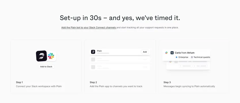
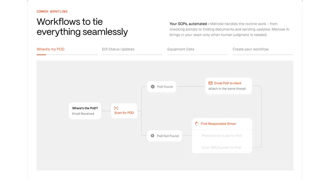
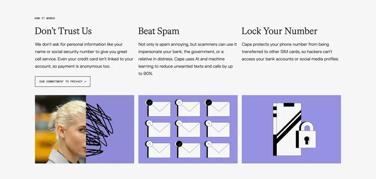
Three-column process section with serif headlines, sans body copy, bordered CTA, and square lavender illustration tiles below each column.
Summary
How-it-works row explaining three privacy pillars with matching square illustration tiles in shared lavender backgrounds.
Visual description
Off-white field with small monospaced HOW IT WORKS label. Three equal columns each with large serif headline and gray sans paragraph. First column "Don't Trust Us" includes a bordered all-caps button linking to privacy commitment. Bottom row holds square tiles on lavender: split photo with black scribble redacting a face; 3x3 grid of white envelopes with check and X markers; smartphone outline with large padlock overlay.
Key takeaway
Scribble redaction on a real portrait extends the brand texture language into feature icons. Envelope grid communicates spam filtering without copy. One outlined text button per section keeps CTAs subtle among three stories.
Reuse notes
Best for explaining three distinct value props with equal weight. Illustrations share a color block for cohesion; changing one breaks the set. Columns need stacking on mobile with tiles following their headline.