Preview image. Unlock full-res
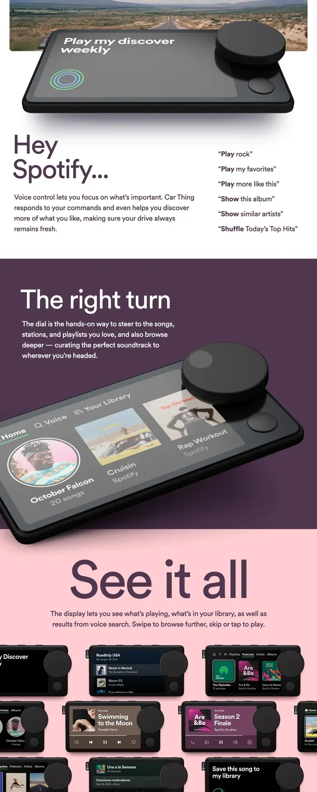
A playful product landing page for Spotify Car Thing with a pink-and-plum palette, oversized headline text, and large product photography.
Summary
A playful product landing page for Spotify Car Thing with a pink-and-plum palette, oversized headline text, and large product photography.
Visual description
The page opens with a black top navigation bar, a large pink hero area, and a bold left-aligned headline beside a short product description and a rounded call-to-action button. A wide product photo spans most of the first screen, followed by a four-column feature grid with short headings and body copy. Lower sections switch to a deep plum background with a large device render and a centered pricing-style card, then end with a dark footer containing the Spotify logo and link columns.
Key takeaway
The strongest move is the contrast between soft pastel panels and dark product-focused sections, which makes the hardware feel premium and approachable at the same time. The layout reuses simple blocks, but the oversized type and large imagery give it strong presence.
Reuse notes
Use this structure for consumer hardware launches that need to explain a product quickly while keeping the page light and approachable. The mix of hero, feature grid, and pricing callout works best when you have strong product photography and a simple CTA.