Preview image. Unlock full-res
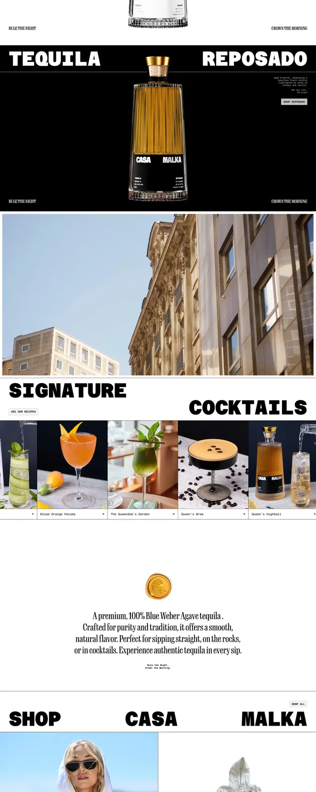
A bold tequila brand homepage with oversized black typography, minimal white space, and product-led lifestyle imagery.
Summary
A bold tequila brand homepage with oversized black typography, minimal white space, and product-led lifestyle imagery.
Visual description
The page opens with a stark white hero featuring a centered tequila bottle and huge split headline text reading across both sides of the product. A thin top navigation sits above the hero, with small utility links and the Casamalka wordmark centered. Below, the page continues in stacked full-width slices with large section headings, product and cocktail imagery, a merch block, and a social/gallery strip.
Key takeaway
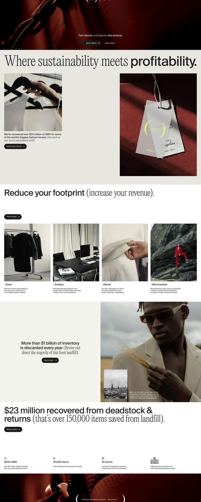
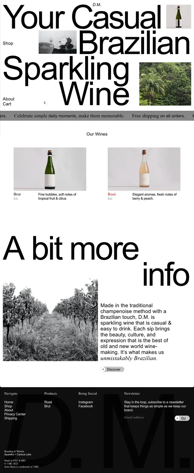
The design relies on extreme typography scale, clean spacing, and high-contrast product photography to make a premium spirits brand feel loud and memorable. The layout is simple but highly branded, with each section acting like a poster panel.
Reuse notes
Useful for luxury food or beverage sites that want a bold editorial identity without heavy UI complexity. The strongest pattern to reuse is the oversized split headline paired with centered product imagery and sparse navigation.