Preview image. Unlock full-res
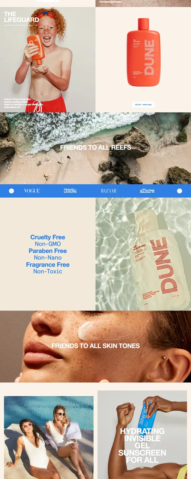
A bold Dunes Uncare ecommerce landing page built around full-bleed beach photography, oversized all-caps messaging, and bright cobalt section breaks.
Summary
A bold Dunes Uncare ecommerce landing page built around full-bleed beach photography, oversized all-caps messaging, and bright cobalt section breaks.
Visual description
The page opens with a full-bleed hero image of an orange sunscreen bottle floating in rippled water, topped by a thin horizontal navigation and a small circular menu icon. Large white headline text sits over the image at lower left with a subtle button beneath it, then the layout continues into stacked bands of bright blue typography, beach imagery, logo strip, ingredient-style claims, product photography, and a large footer with a newsletter input. The overall composition uses strong contrast between warm product imagery, pale sand tones, and saturated blue blocks.
Key takeaway
The main reusable idea is the high-contrast mix of luxury product photography and oversized campaign-style copy. The blue interruption bands and repeated brand messaging give the page a memorable editorial rhythm.
Reuse notes
Works well for beauty, skincare, or lifestyle ecommerce brands that want a campaign-heavy landing page instead of a standard product grid. Best reused when you have strong photography and short punchy claims to carry the page visually.