Preview image. Unlock full-res
An editorial ecommerce landing page for a Brazilian sparkling wine brand with oversized typography, sparse product photography, and a refined monochrome grid.
Summary
An editorial ecommerce landing page for a Brazilian sparkling wine brand with oversized typography, sparse product photography, and a refined monochrome grid.
Visual description
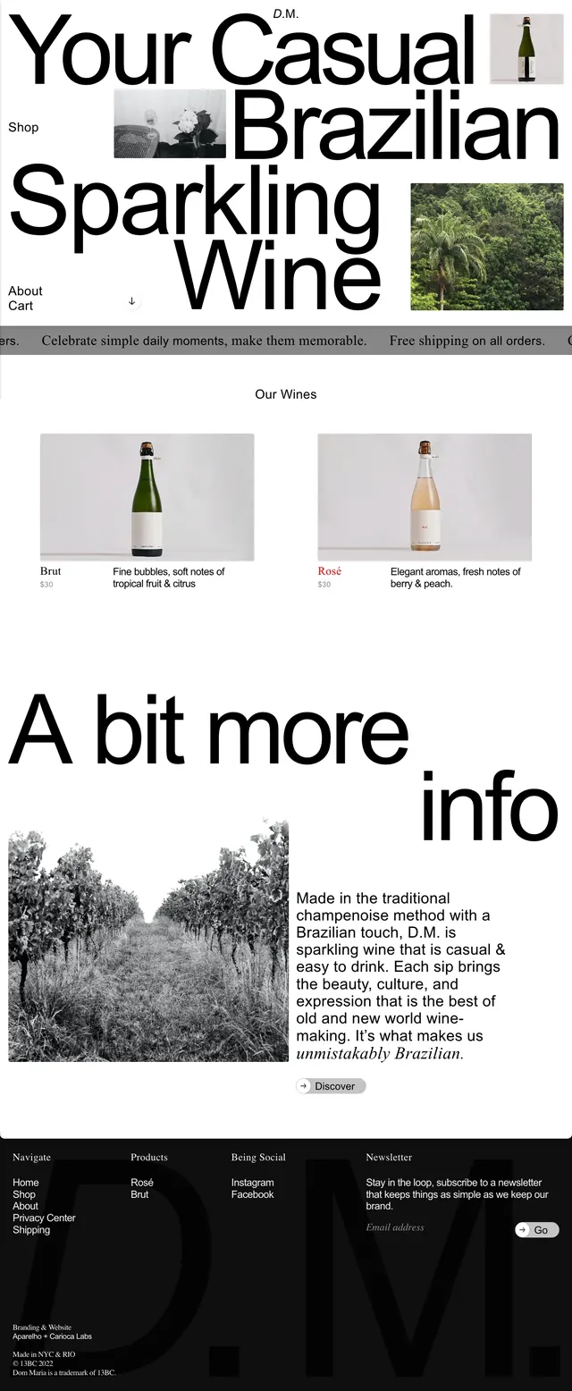
The page opens with a huge typographic hero reading "Your Casual Brazilian Sparkling Wine" surrounded by small product and lifestyle images. Below, a simple product showcase presents Brut and Rosé in a two-column grid with bottle photography, short descriptions, and prices. Farther down, a large "A bit more info" section pairs black-and-white vineyard imagery with a text block and a small discover button, followed by a dark footer with navigation, social links, and newsletter signup. The overall composition is spacious, minimal, and editorial, with strong contrast and lots of white space.
Key takeaway
The design relies on oversized type and minimal product imagery to make a premium wine brand feel casual but sophisticated. It is especially reusable for lifestyle ecommerce pages that want a fashion-editorial tone rather than a standard storefront layout.
Reuse notes
Reuse the hero formula for brands that need immediate identity impact: oversized headline, tiny supporting images, and lots of negative space. The product grid and split info section can translate cleanly to other premium consumer goods with simple photography and concise copy.