Preview image. Unlock full-res
A light, editorial agency landing page that pairs oversized black typography with playful illustration and bold black-and-yellow CTA blocks.
Summary
A light, editorial agency landing page that pairs oversized black typography with playful illustration and bold black-and-yellow CTA blocks.
Visual description
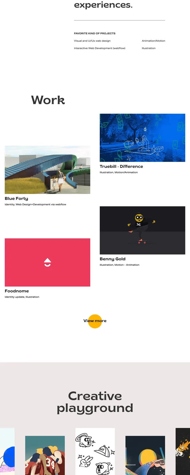
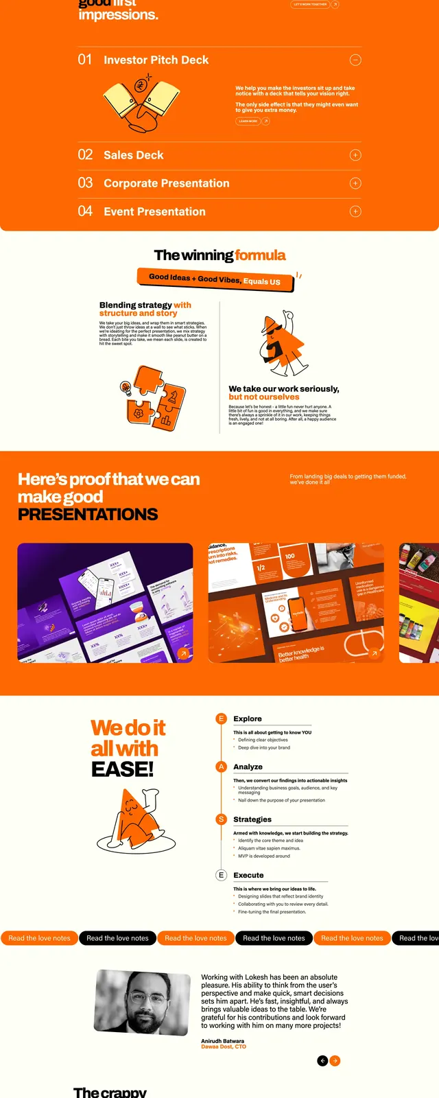
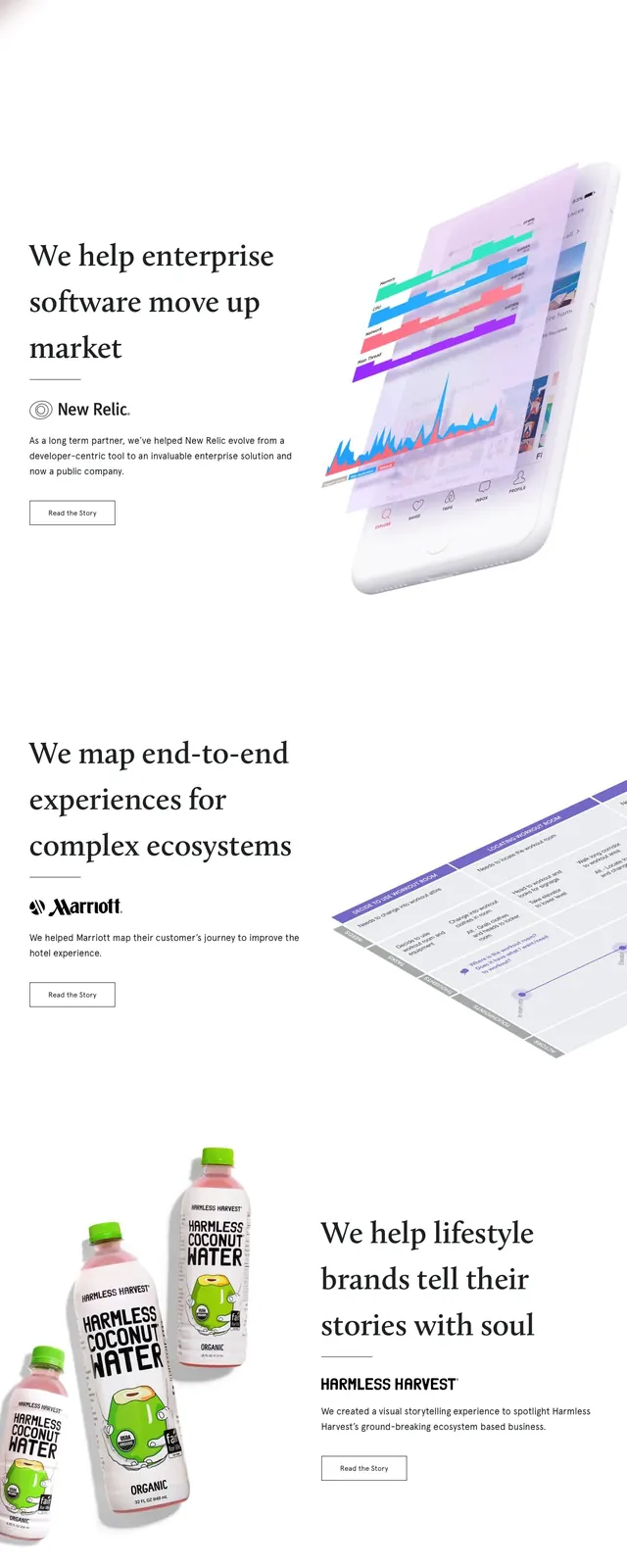
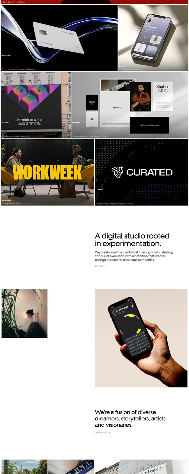
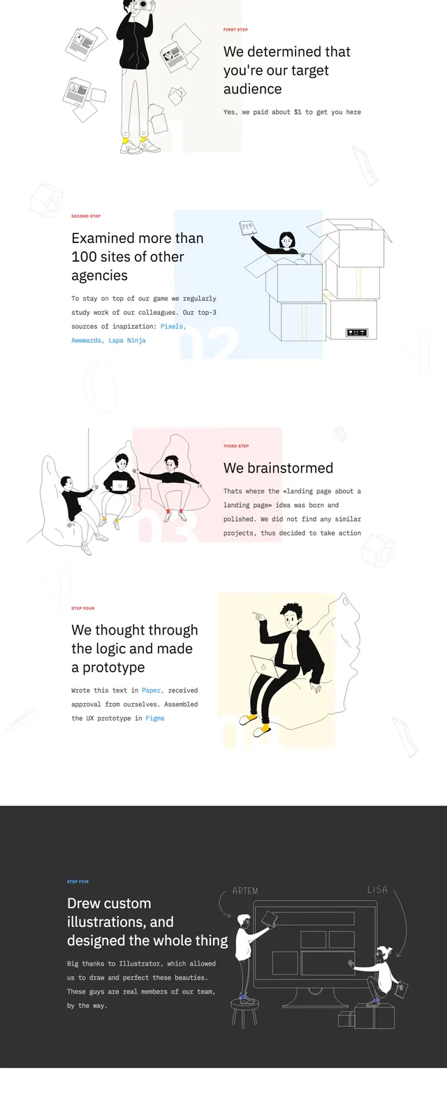
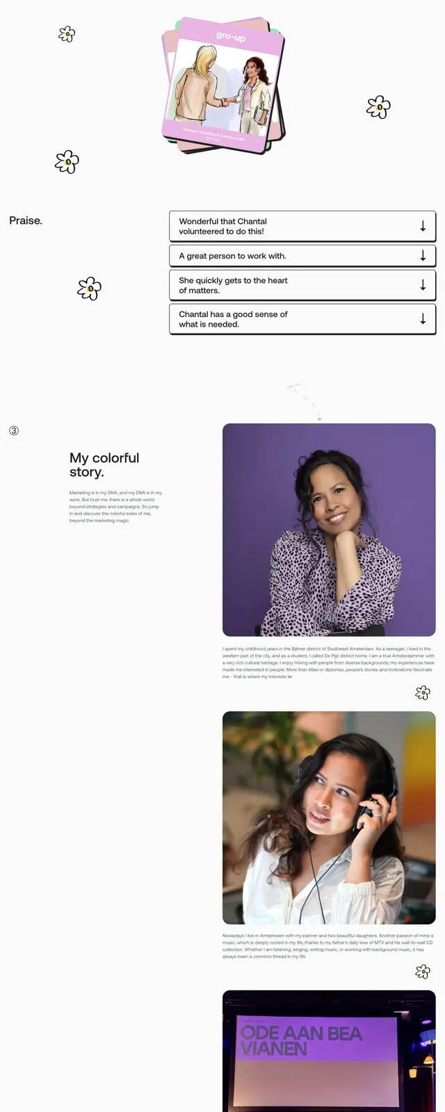
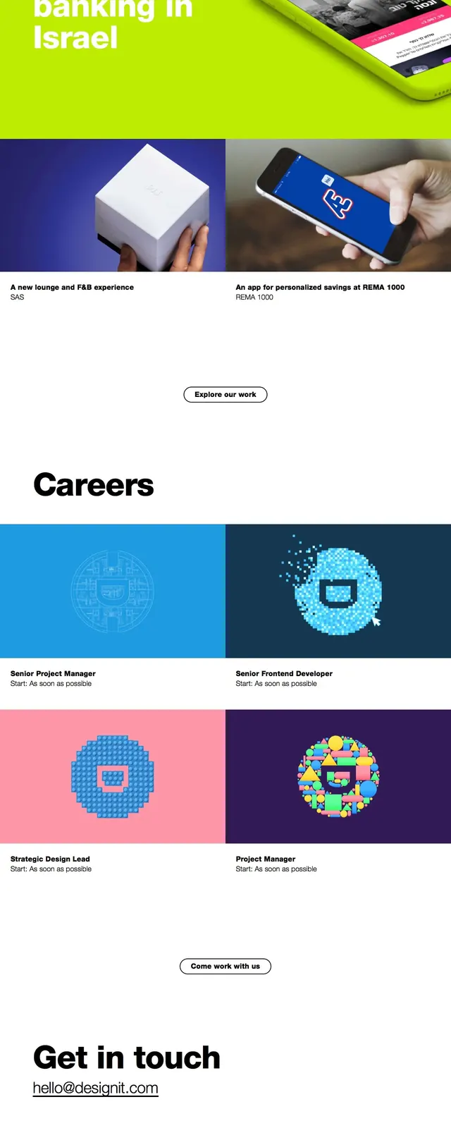
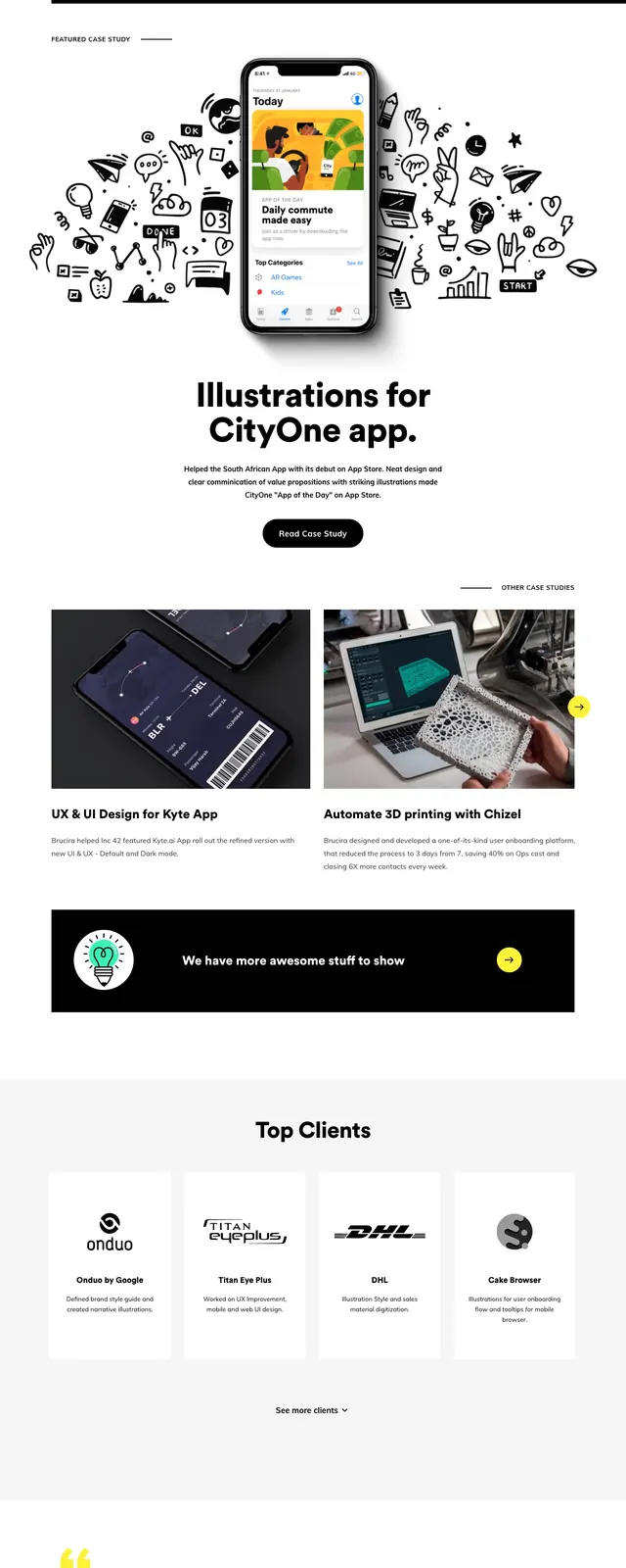
The page opens with a clean split hero: a small wordmark and top-right utility actions above a large bold headline on the left, with a black-outline illustration on the right. The palette stays mostly white and black, punctuated by bright yellow buttons and small mint accents in the illustration and section markers. Below the hero, a wide black services band introduces a two-column service block, followed by a two-card case study grid, a dark promotional banner, a centered testimonial, and a large black footer-style contact section. Throughout, the layout uses generous spacing, heavy type, rounded pill buttons, and simple iconography.
Key takeaway
The strongest reusable move is the contrast between minimal white-space-led sections and occasional full-width black bands for emphasis. Oversized typography plus a whimsical illustration gives the page a distinctive agency personality without losing clarity.
Reuse notes
Works well for creative agencies, studios, and portfolio sites that need both polish and approachability. Reuse the black/yellow CTA treatment and alternating light/dark section rhythm when you want a long page to feel structured without becoming repetitive.