Preview image. Unlock full-res
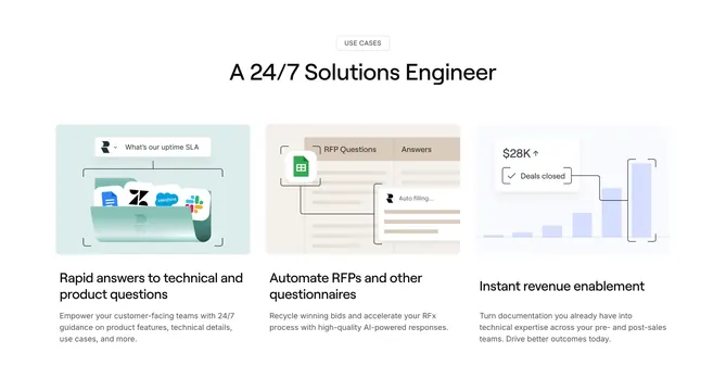
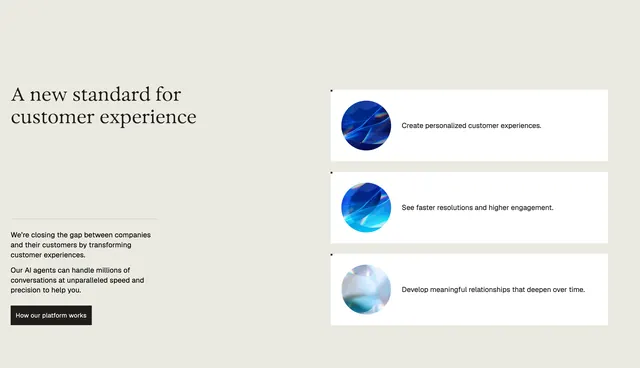
Light three-column feature section where each card holds an illustrated UI vignette above a bold title and short description.
Summary
A three-column feature block where each white card leads with a distinct illustrated product vignette, unified by a split header that puts the title on the left and the supporting paragraph on the right.
Visual description
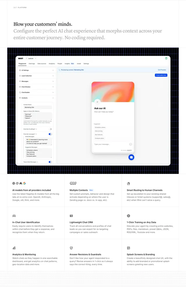
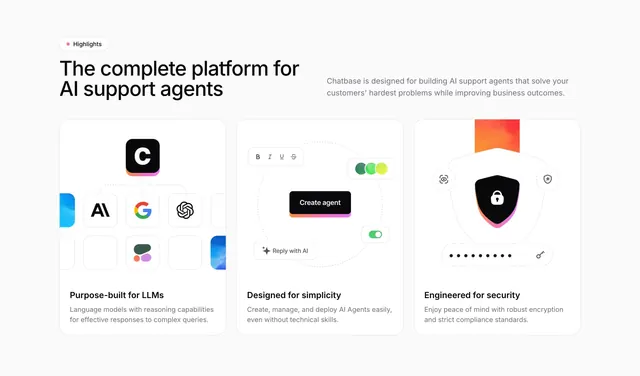
On a very light grey background, a small pink-dotted "Highlights" pill sits above a two-line black headline "The complete platform for AI support agents" on the left; a grey supporting paragraph is set to the right at the same baseline. Below are three equal white rounded cards. The first shows the black Chatbase mark connected by dotted lines to a grid of model logos (Anthropic, Google, OpenAI and others). The second shows a faux editor with a bold toolbar, a black "Create agent" button with a gradient underline, a green toggle and a "Reply with AI" chip. The third shows a black padlock shield with dotted connectors and a row of dots suggesting encryption. Each card has a bold black title ("Purpose-built for LLMs", "Designed for simplicity", "Engineered for security") and two lines of grey copy.
Key takeaway
Each card gets a bespoke mini-illustration built from real UI fragments rather than a generic icon, which makes three abstract benefits feel concrete. The split header (title left, paragraph right) is a tidy way to introduce a row of cards without a tall stacked intro.
Reuse notes
Strong pattern for an AI or developer product that wants to show capability, simplicity and trust in one scan. The illustrated vignettes are the work; without custom art the layout collapses into a plain icon grid.