Preview image. Unlock full-res
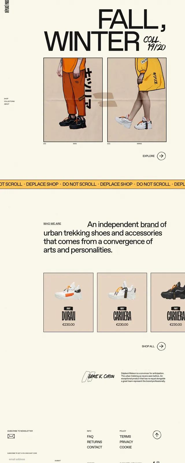
A warm, editorial fashion ecommerce landing page with oversized typography, product imagery, and a minimal cream-toned layout.
Summary
A warm, editorial fashion ecommerce landing page with oversized typography, product imagery, and a minimal cream-toned layout.
Visual description
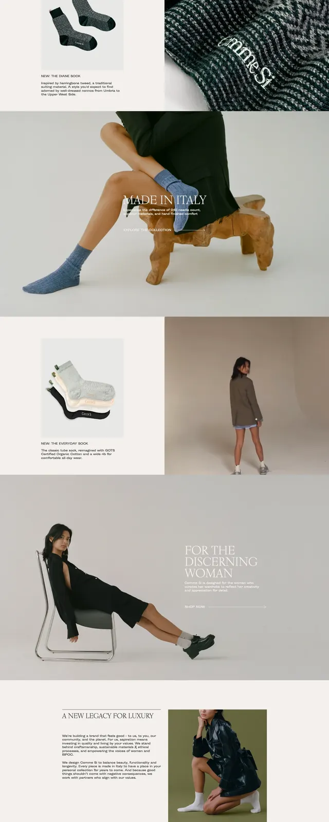
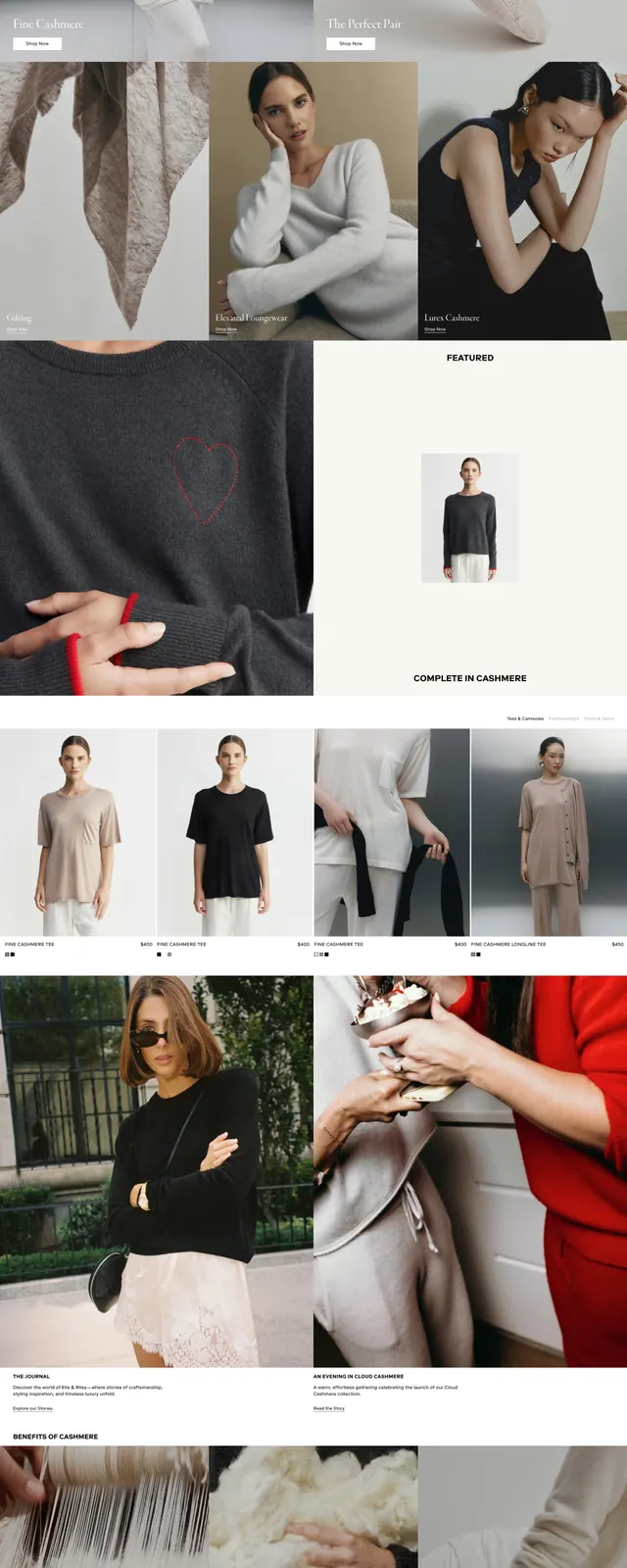
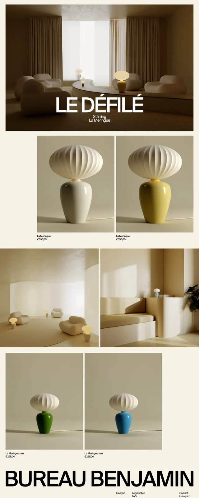
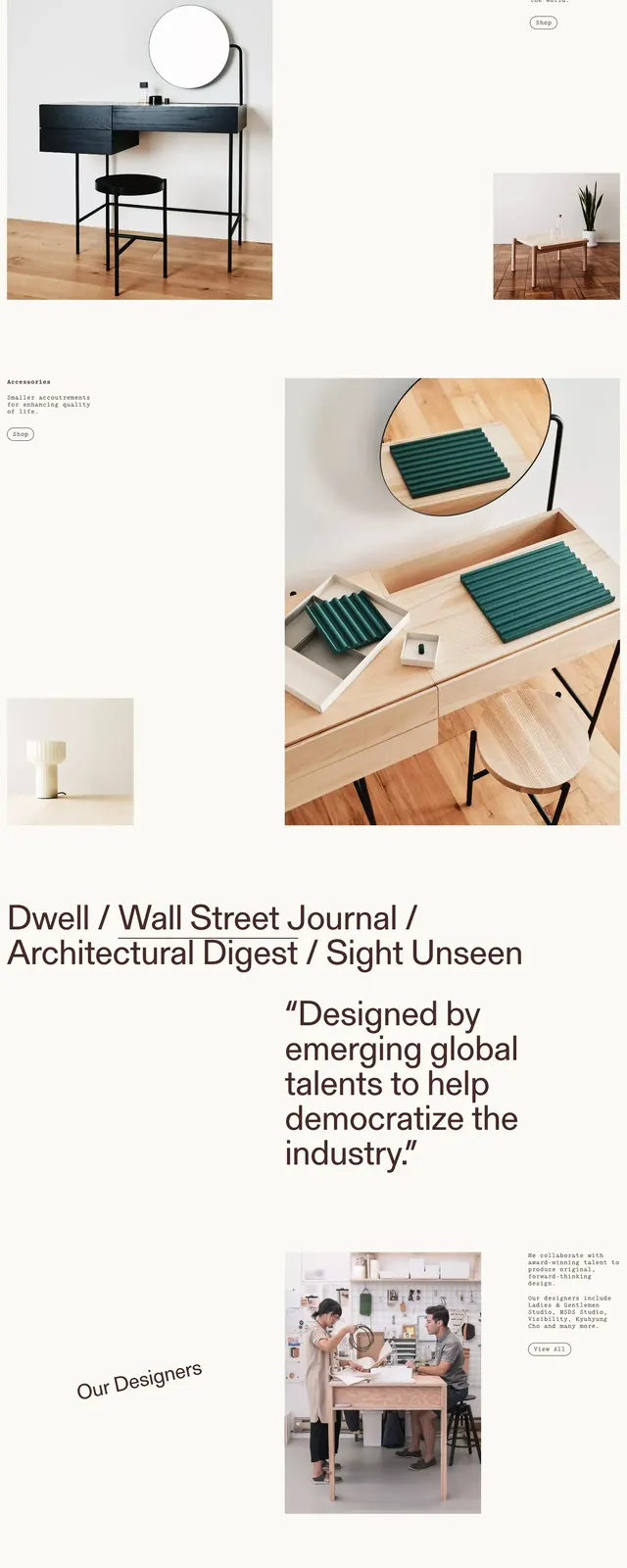
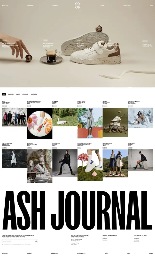
The page uses a soft cream background with a very large black headline at the top reading like a seasonal campaign. Below it are two framed fashion images placed side by side, each showing cropped lower-body model shots with bold clothing colors and handwritten-style labels. The middle of the page includes a thin scrolling-style banner, a large brand statement, a three-card product grid, and a sparse footer with newsletter signup and link columns. Typography is mostly oversized sans-serif with small utility text and a handwritten signature-style mark near the lower section.
Key takeaway
The strongest move is the mix of luxury editorial spacing with ecommerce clarity: big campaign type, framed product imagery, and restrained UI chrome. The warm neutral palette keeps the page feeling premium while letting the garments carry the color.
Reuse notes
Use this structure for fashion or lifestyle brands that want an editorial-first storefront rather than a conventional catalog. It works best when product photography is strong and you want large type and generous whitespace to do most of the branding.