Preview image. Unlock full-res
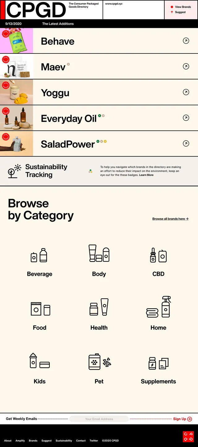
A light, editorial homepage for a consumer packaged goods directory with a latest-additions feed, sustainability badges, and a category browser grid.
Summary
A light, editorial homepage for a consumer packaged goods directory with a latest-additions feed, sustainability badges, and a category browser grid.
Visual description
The page uses a stark black-and-cream layout with a large CPGD wordmark in the top bar and small utility links on the right. Below that, a vertical list highlights recent brands with thumbnail images on the left, large bold names in the center, and circular arrow icons on the right. Midway down, a sustainability tracking callout appears between list items, followed by a large "Browse by Category" section with a grid of simple line icons and category labels. The bottom of the page includes an email signup strip and a compact black footer with text links.
Key takeaway
The strongest idea is the combination of oversized editorial typography with a structured directory interface. The content feels curated and easy to scan while still looking like a brand-forward publication.
Reuse notes
Use this pattern for directories, brand indexes, or curated listings where recent items and category browsing both matter. It works best when the content can support strong thumbnail imagery, simple badge indicators, and a minimal monochrome or warm neutral palette.