Preview image. Unlock full-res
A light, split-layout SaaS landing page for failed payment recovery with oversized hero messaging and layered product-style charts and cards.
Summary
A light, split-layout SaaS landing page for failed payment recovery with oversized hero messaging and layered product-style charts and cards.
Visual description
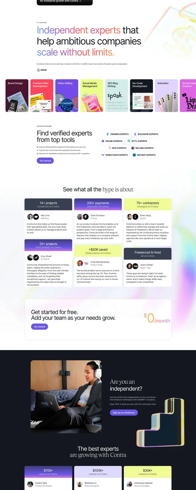
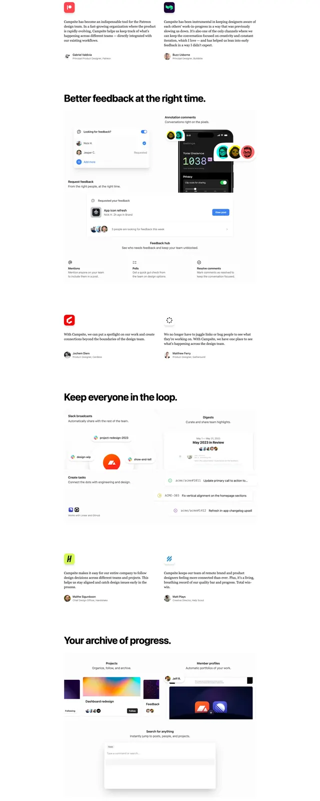
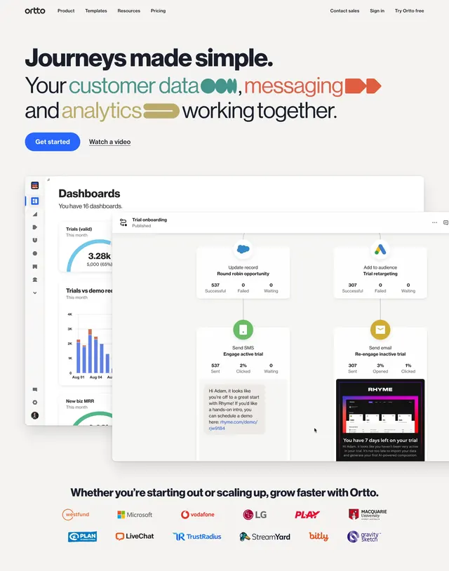
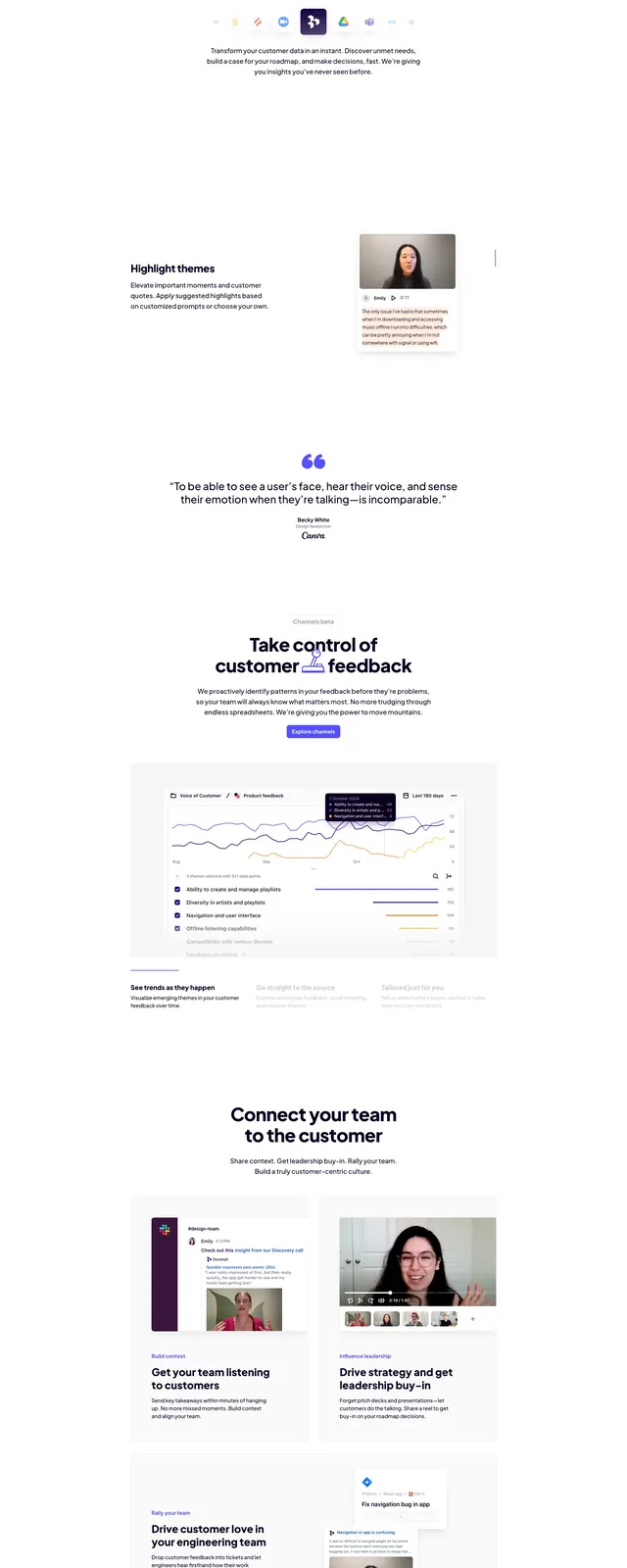
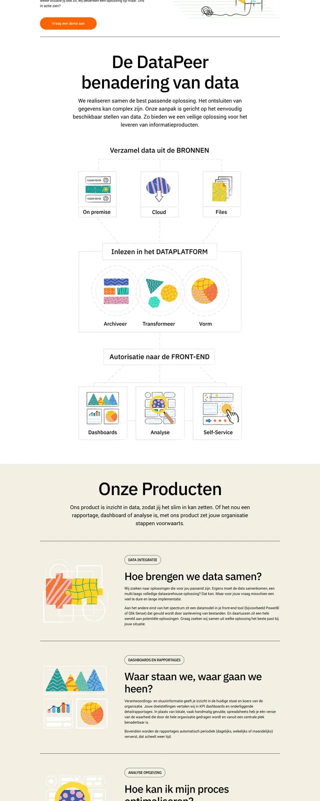
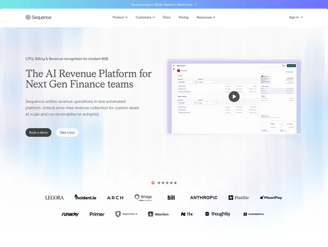
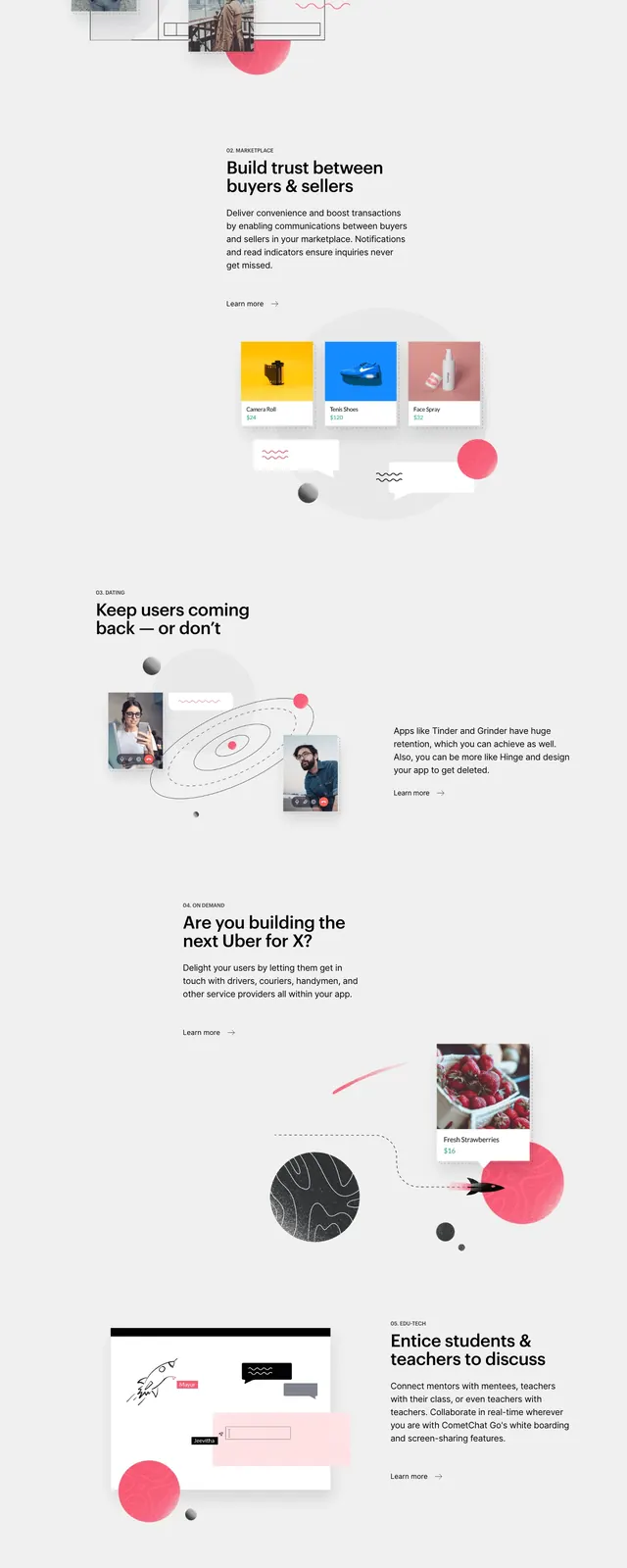
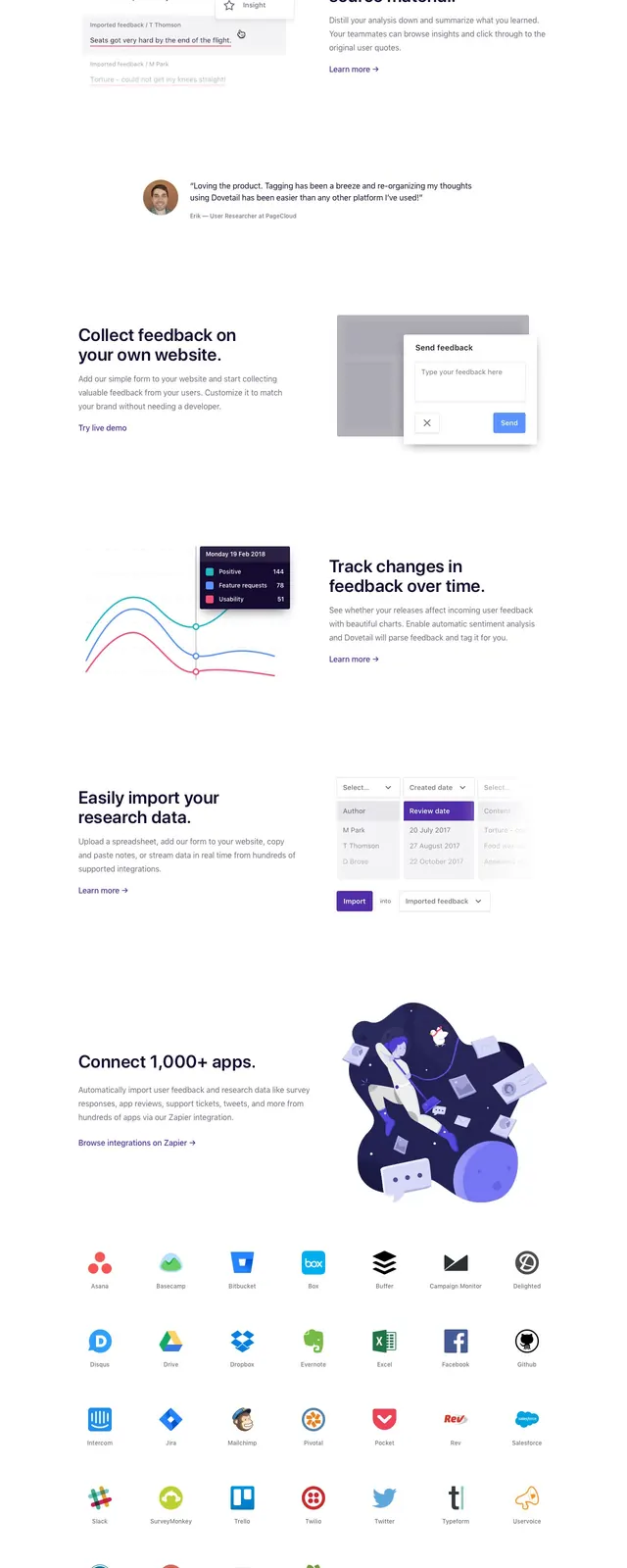
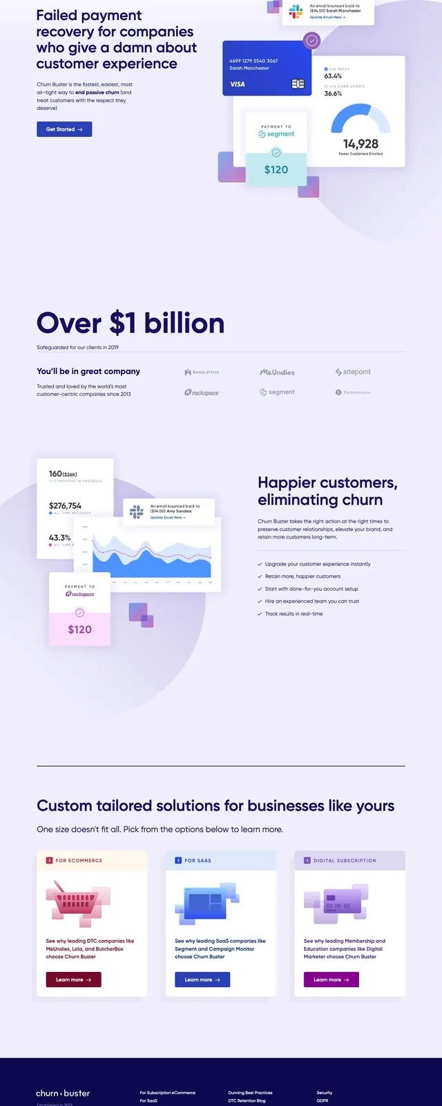
The page opens on a pale lavender background with a top navigation bar, a bold left-aligned headline, short supporting copy, and a single primary CTA button. On the right, layered UI cards, charts, a payment card, and small notification panels create a product-demo collage with soft shadows and rounded corners. Lower slices show a trusted-by logo strip, a feature-detail section with another overlapping analytics composition, a three-card solutions grid, and a dark footer. The overall look stays airy and spacious, with dark navy type and subtle purple-blue accent gradients throughout.
Key takeaway
Use a light SaaS palette with oversized headline text and floating product cards to make a technical service feel approachable. The stacked analytics mockups and trust logos do most of the persuasion work without heavy copy.
Reuse notes
Good for B2B or SaaS landing pages that need to explain a complex backend product in a friendly, visual way. The layout is especially reusable when you have product metrics, customer logos, and feature tiles to support the hero.