Preview image. Unlock full-res
A maximalist food brand homepage with a centered product hero, wavy section dividers, and collage-like recipe and social sections.
Summary
A maximalist food brand homepage with a centered product hero, wavy section dividers, and collage-like recipe and social sections.
Visual description
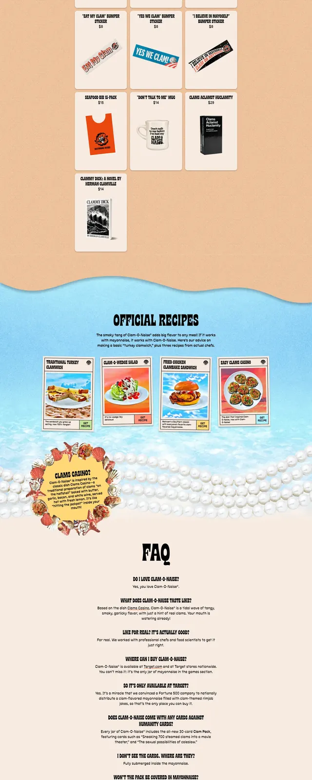
The page opens with a sky-and-clouds hero that centers a jar of Clam-o-Naise beneath arched headline text and a small top navigation. Below it, large orange and blue wavy section dividers separate a promo banner, an official recipes grid with four card-like tiles, and a shell-and-pearl decorative callout. Farther down, a social gallery strip shows small framed images on a peach background, ending in a black footer area with oversized stacked brand lettering.
Key takeaway
The main reusable idea is the highly branded, full-page editorial treatment: centered product hero, bold wavy separators, and dense but playful merchandising sections. It feels more like a campaign poster than a standard ecommerce site.
Reuse notes
Best for food, lifestyle, or novelty consumer brands that want the website to feel like packaging and campaign art at the same time. The layout depends on strong custom illustration, decorative assets, and a very confident brand identity.