Preview image. Unlock full-res
A bright, playful beverage landing page built around oversized typography, pastel colors, and product-led storytelling.
Summary
A bright, playful beverage landing page built around oversized typography, pastel colors, and product-led storytelling.
Visual description
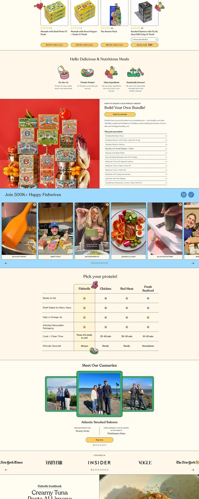
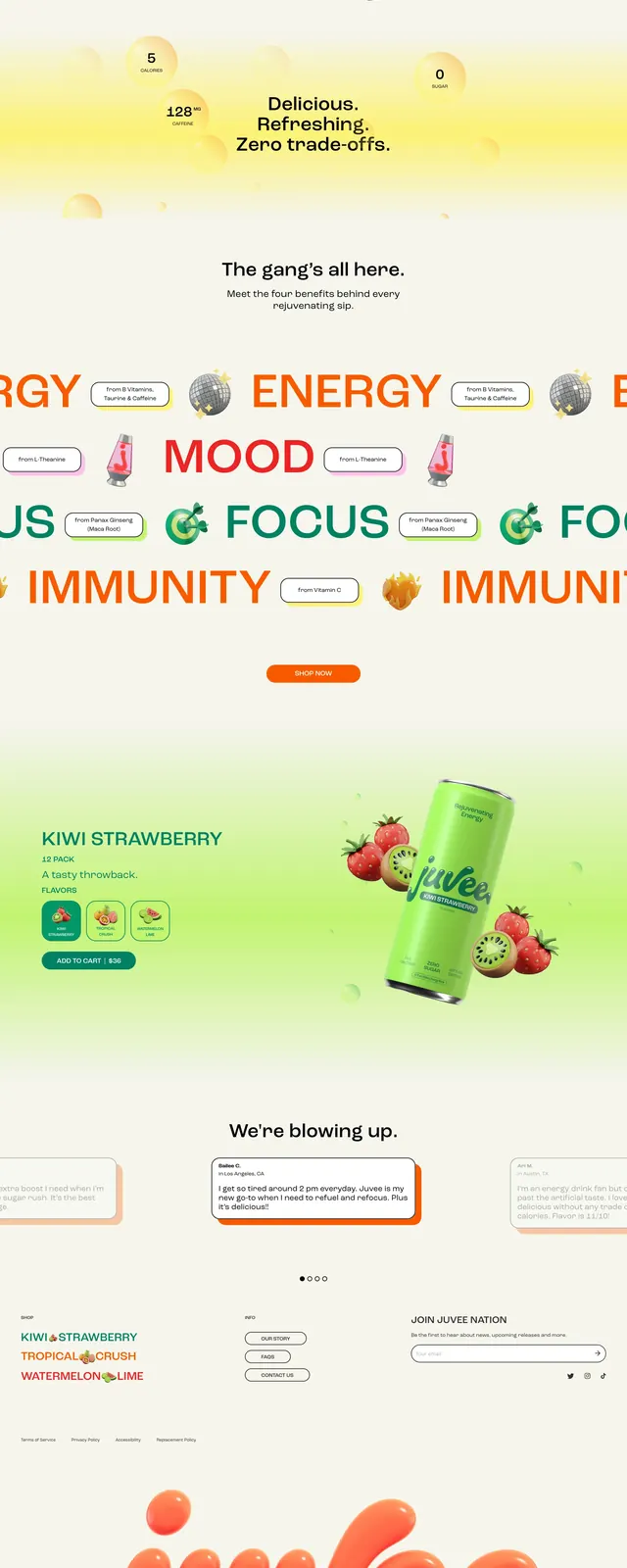
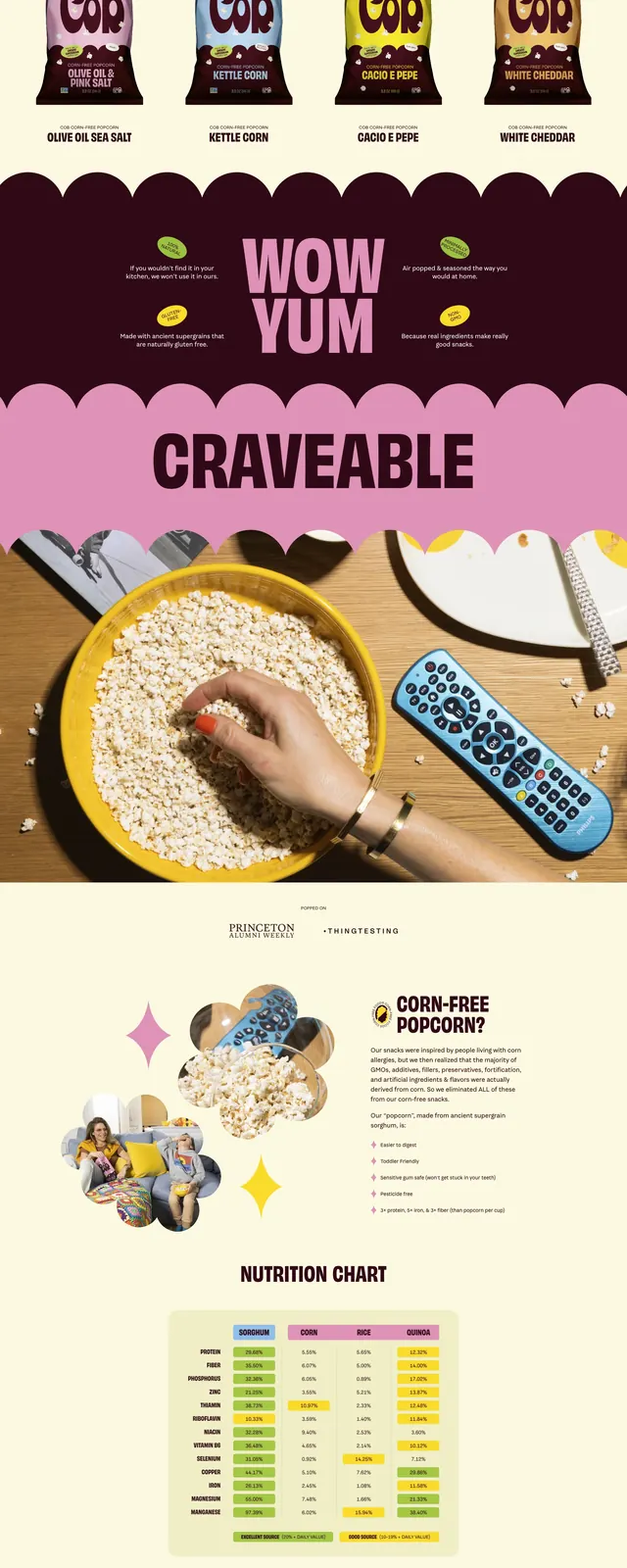
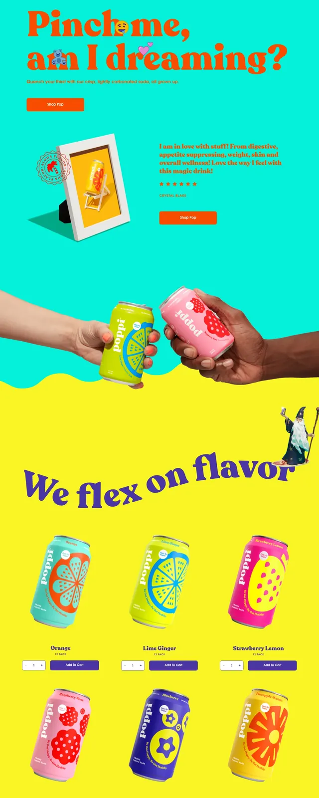
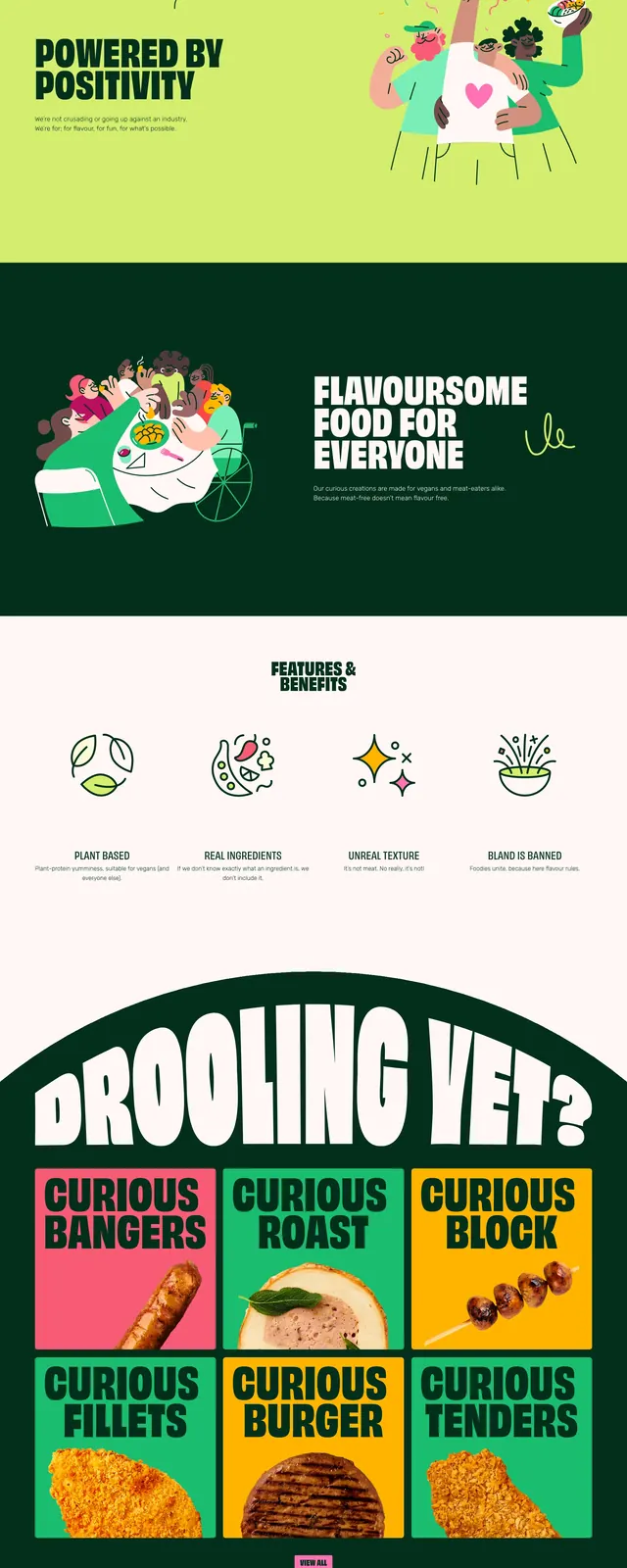
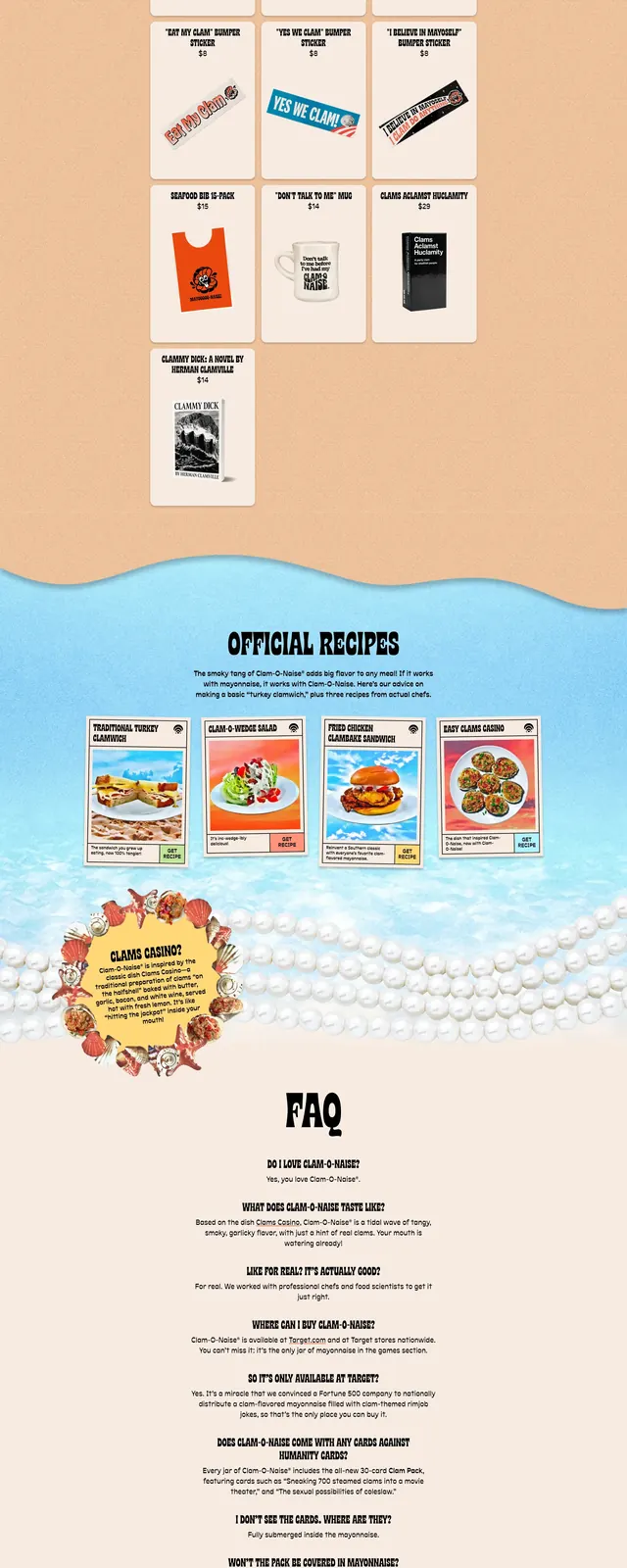
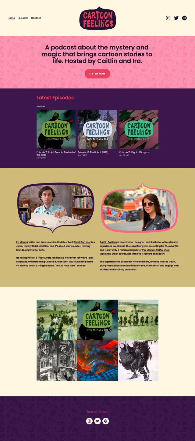
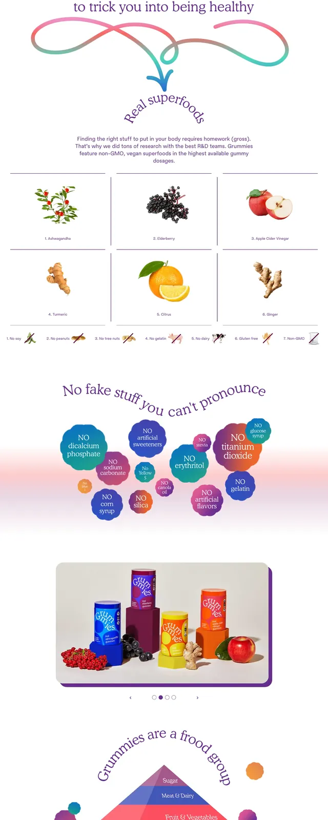
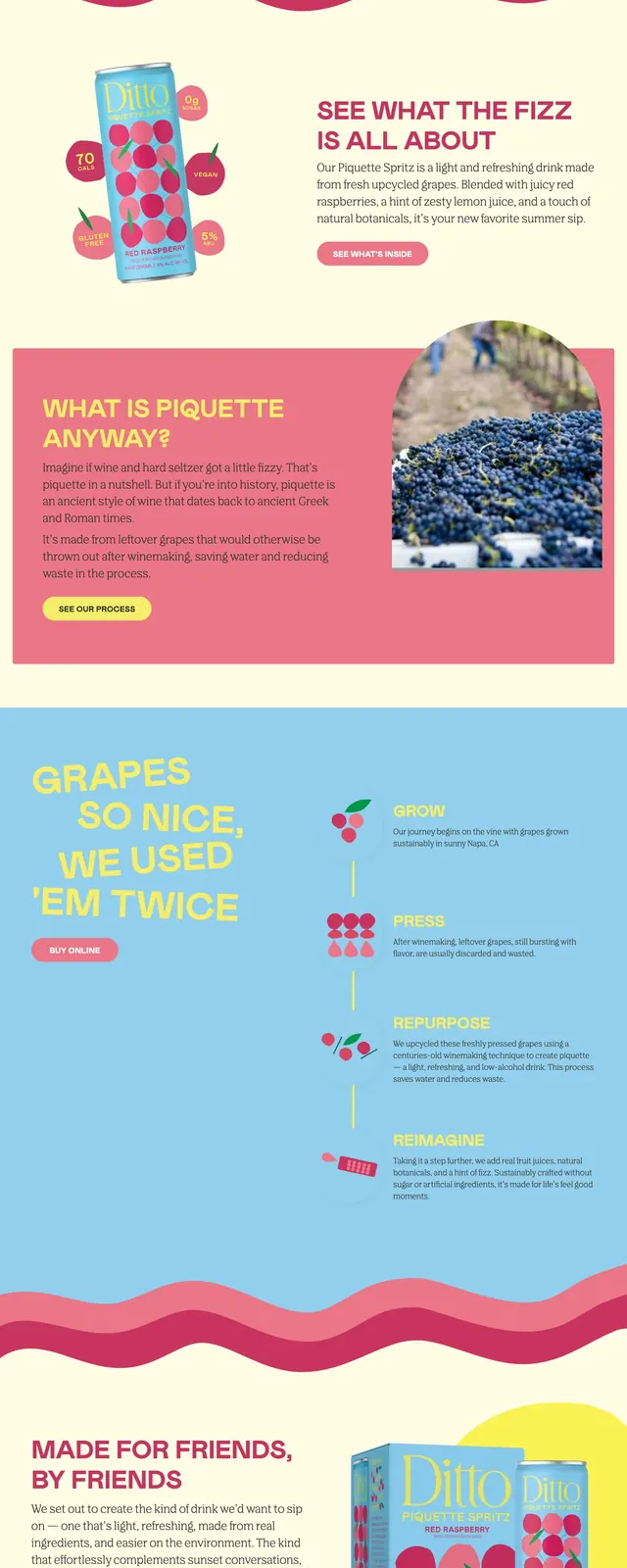
The page uses a sky-blue and cream palette with hot pink accents, creating a soft but energetic brand feel. Large yellow headline text anchors the hero alongside angled product cans, with a curved wavy divider separating sections. Lower sections mix product storytelling, a simple process timeline, a brand statement block, social-style image tiles, and a newsletter signup. The footer repeats the brand identity with compact navigation and logo treatment.
Key takeaway
The strongest pattern is a product-first hero paired with playful editorial typography and high-contrast pastel branding. The page feels handcrafted and approachable while still clearly selling a consumer beverage.
Reuse notes
Reuse the split hero, oversized headline, and wavy section divider for any playful DTC product site. The timeline-and-copy layout works well for explaining a simple process or origin story.