Preview image. Unlock full-res
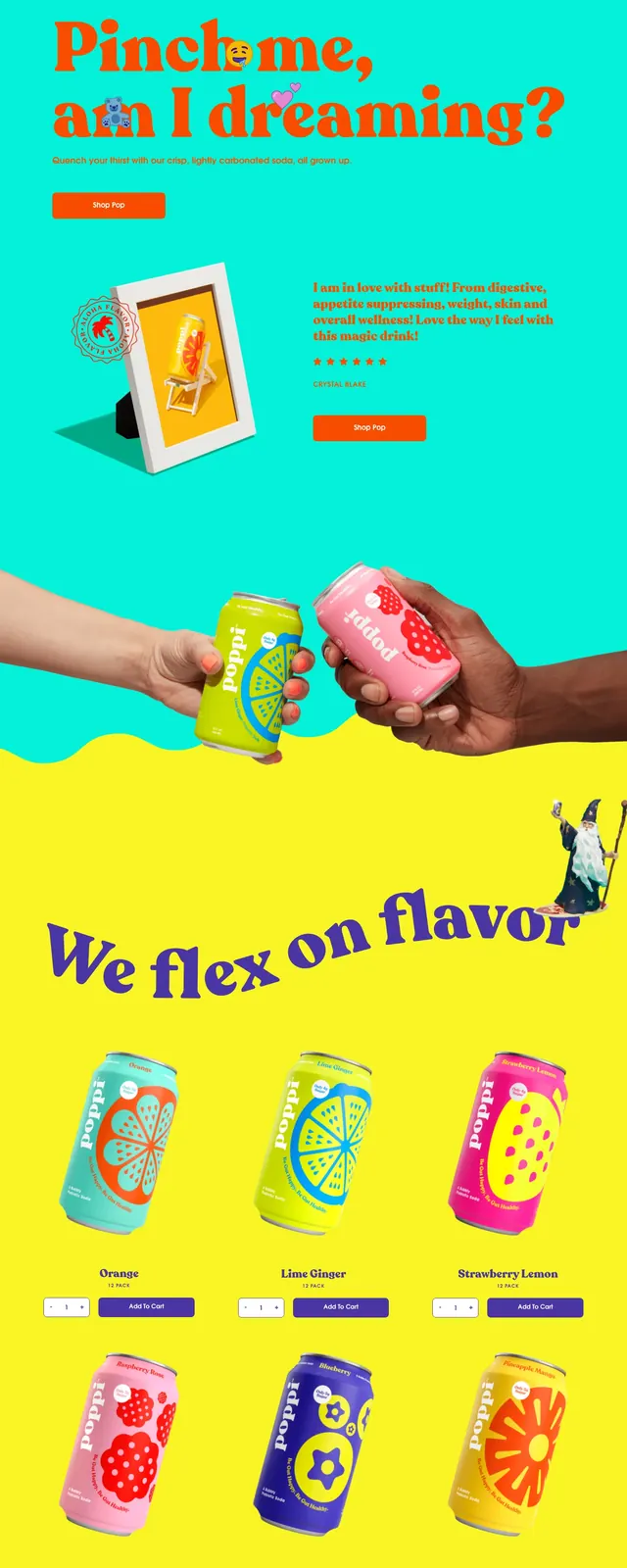
A playful, full-page beverage landing page built from oversized color blocks, big display type, and product-and-lifestyle imagery.
Summary
A playful, full-page beverage landing page built from oversized color blocks, big display type, and product-and-lifestyle imagery.
Visual description
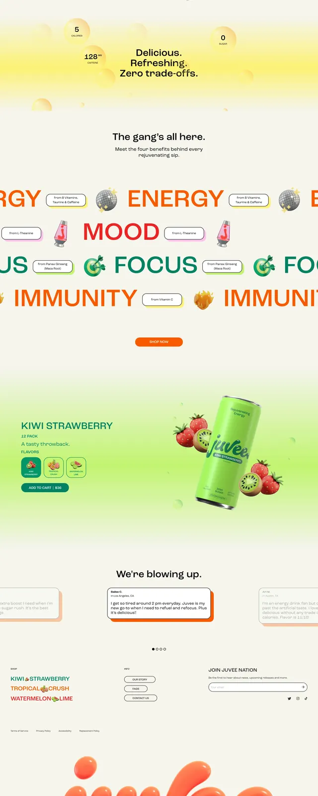
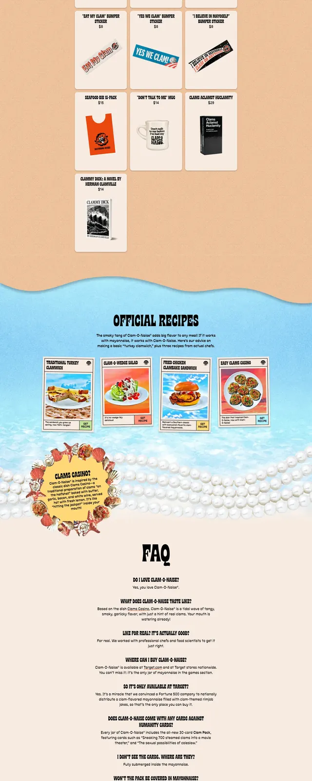
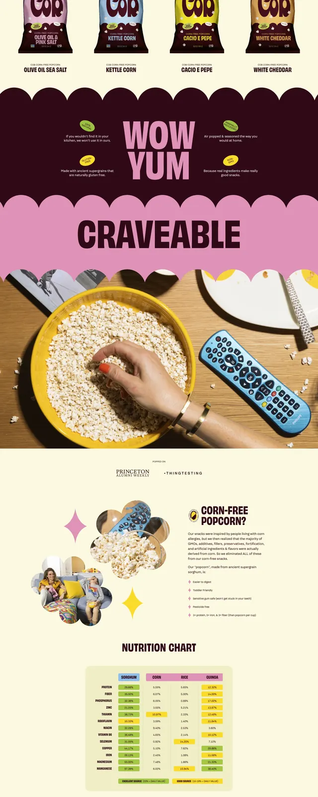
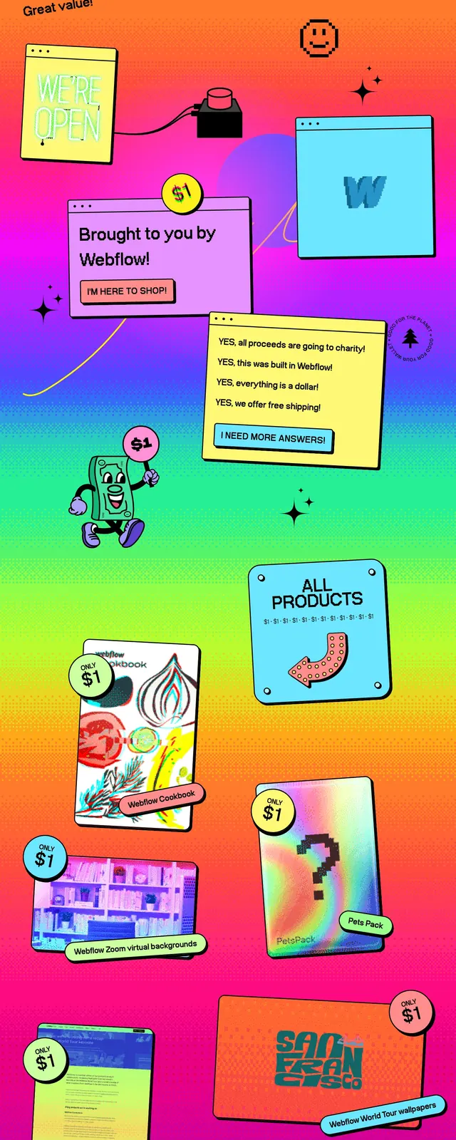
The page opens with a pink hero area featuring a small top navigation, a centered logo, a large serif headline on the left, and a circular product can image on the right. Bright yellow and turquoise sections follow with wavy, organic dividers and oversized curved text, creating a loud, poster-like rhythm across the scroll. Product cans are shown in hand-held lifestyle imagery, followed by a pink section with a longhorn graphic and a centered call-to-action button. The footer continues the bright palette with the logo, simple links, and an email signup form.
Key takeaway
Use oversized display typography, saturated brand colors, and playful wave-shaped section breaks to make a product page feel energetic and memorable. The layout is simple, but the color blocking and illustration-heavy composition do most of the work.
Reuse notes
Best for consumer brands that want a loud, youthful landing page with strong personality and a simple conversion path. Reuse the wave dividers, circular product framing, and bold CTA placement, but avoid this treatment for serious or data-heavy brands.