Preview image. Unlock full-res
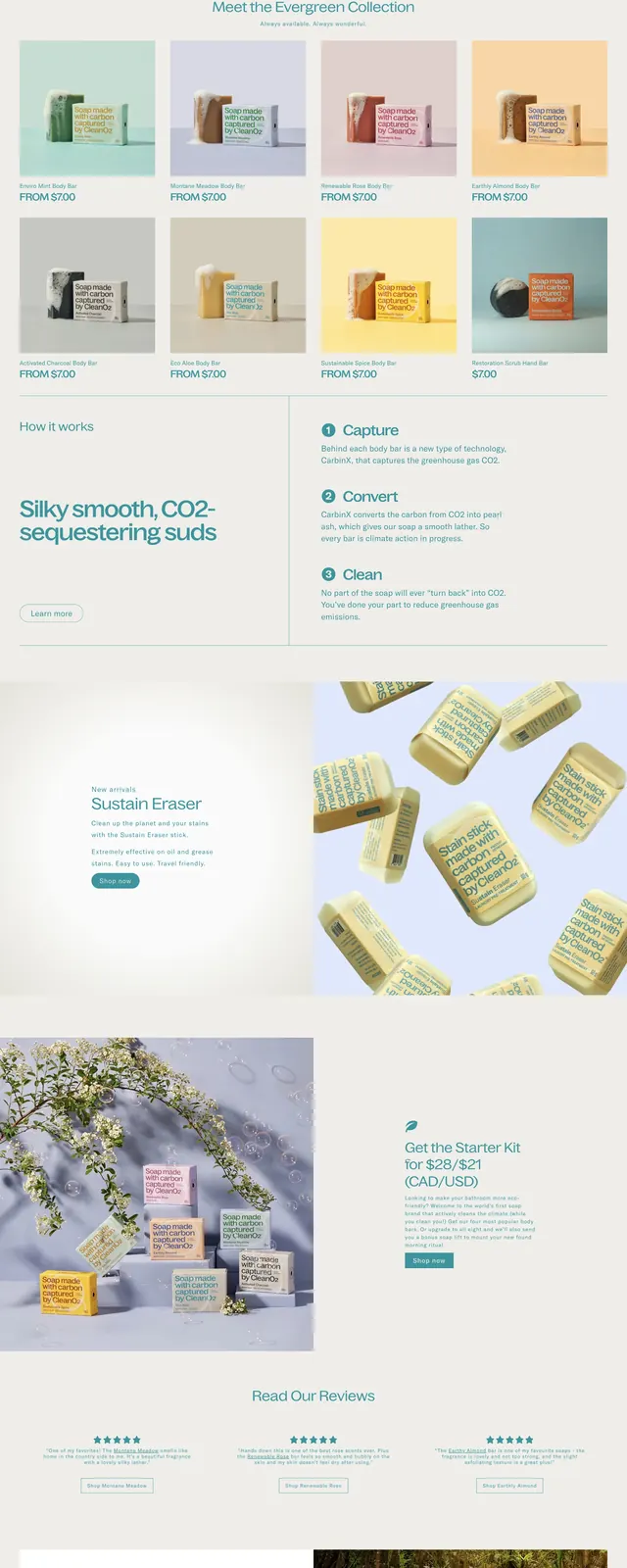
A soft, nature-forward ecommerce homepage for CleanO2 with calm teal accents, product storytelling, testimonials, and sustainability messaging.
Summary
A soft, nature-forward ecommerce homepage for CleanO2 with calm teal accents, product storytelling, testimonials, and sustainability messaging.
Visual description
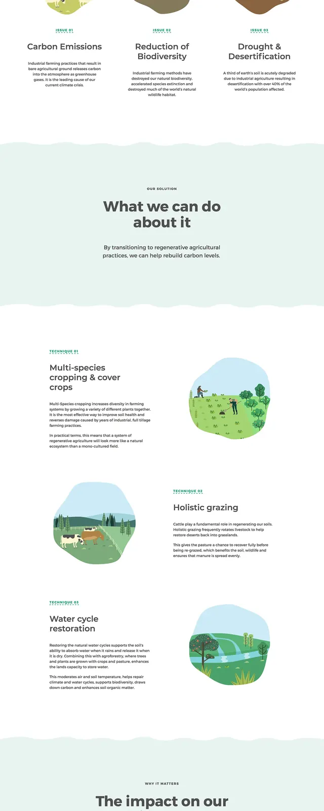
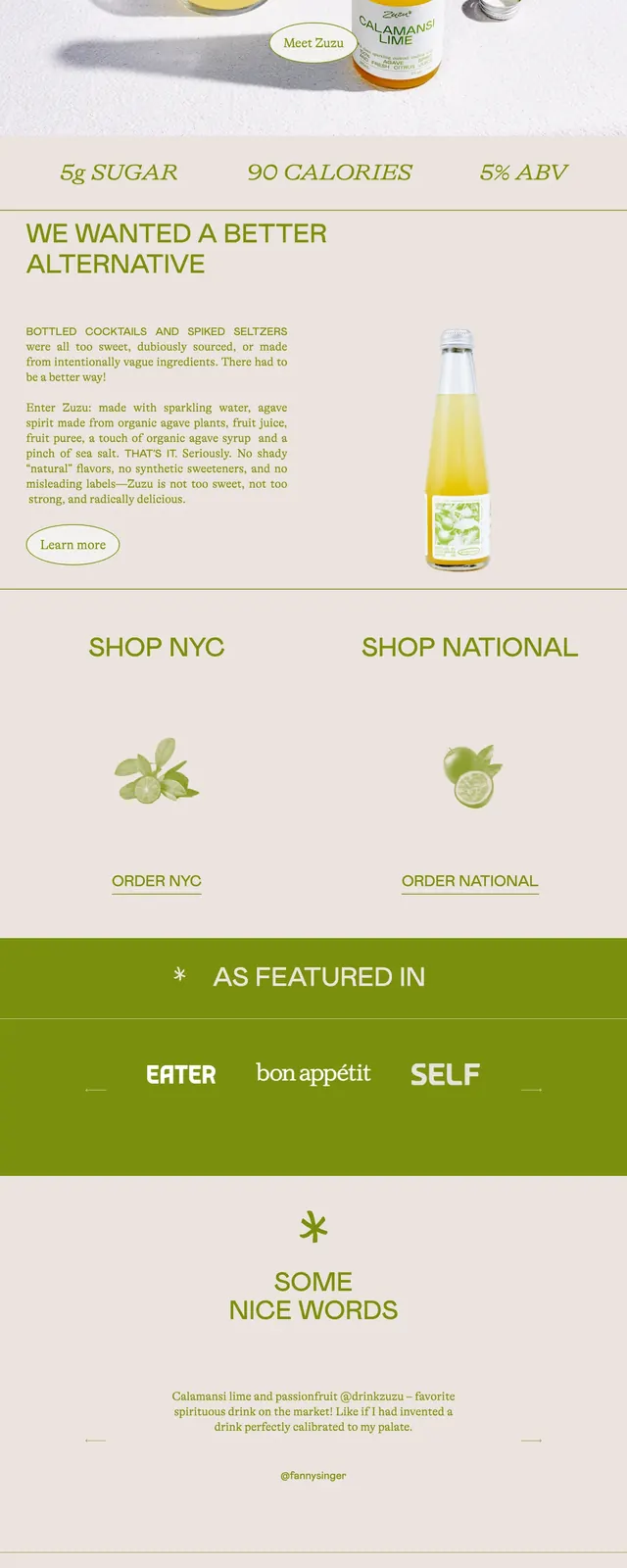
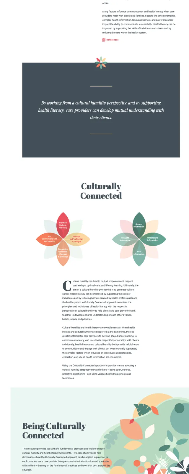
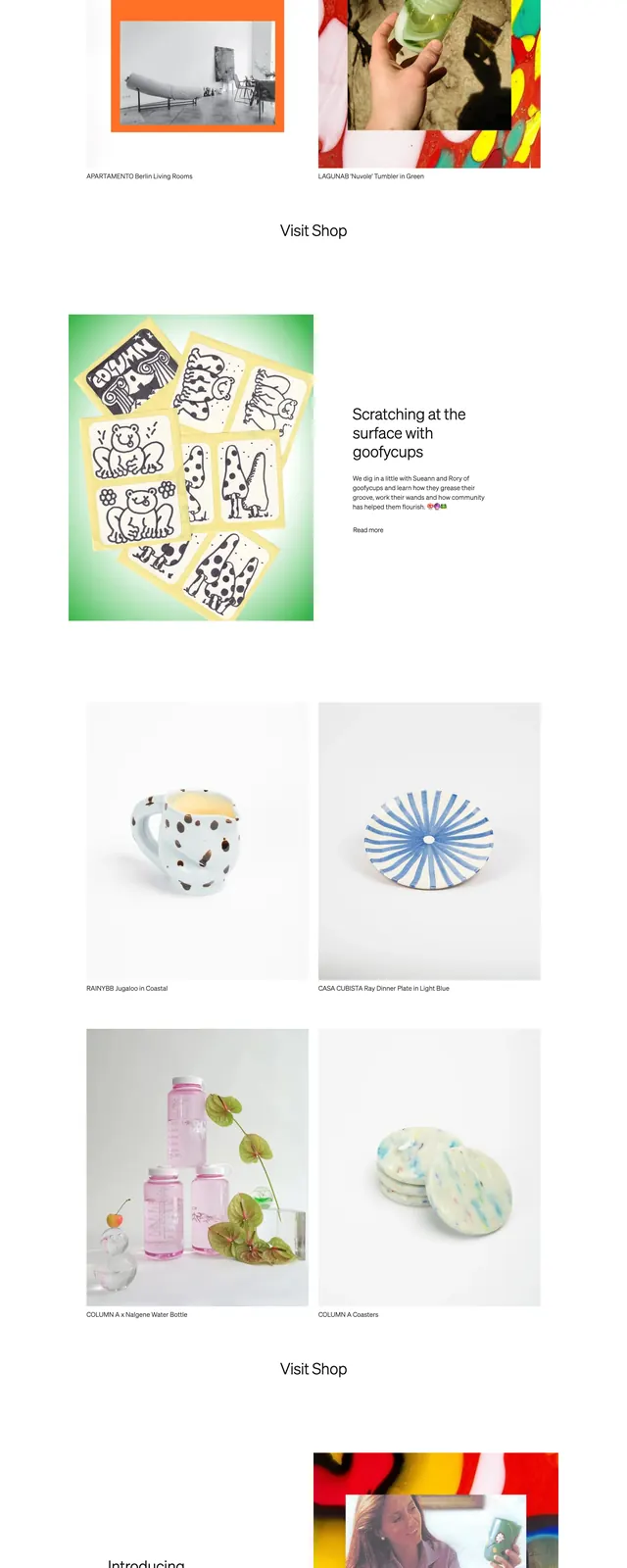
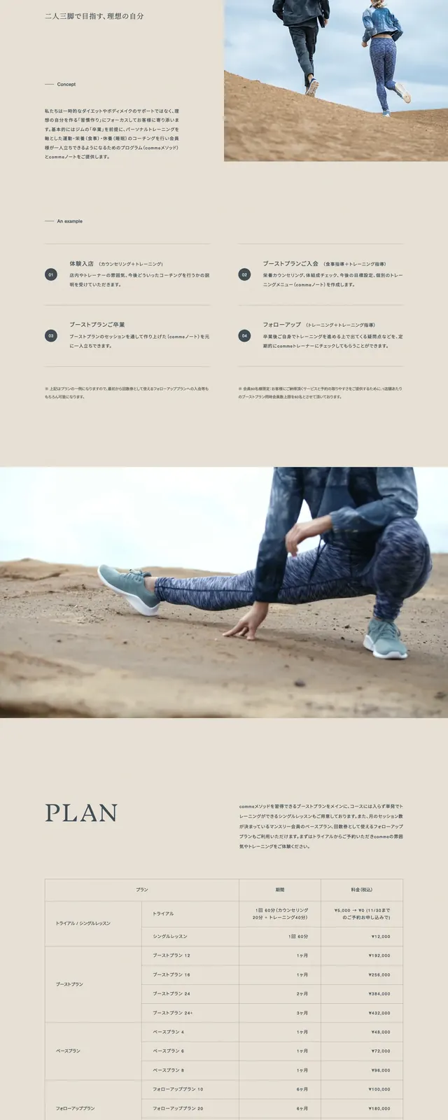
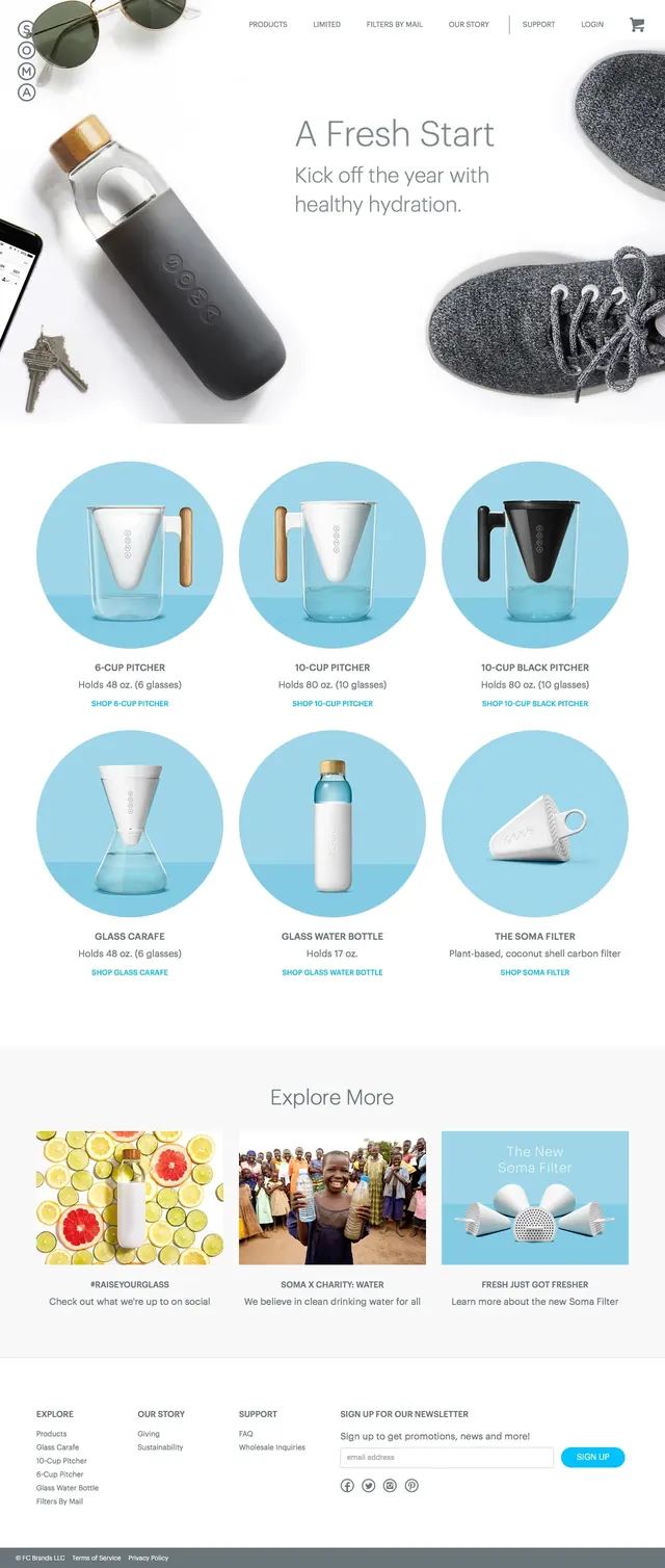
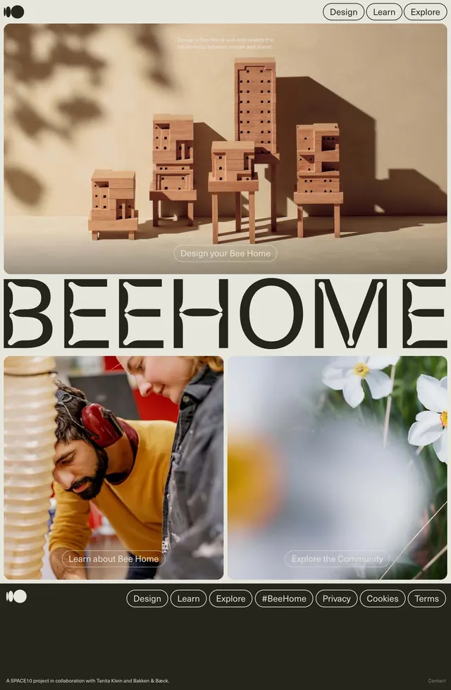
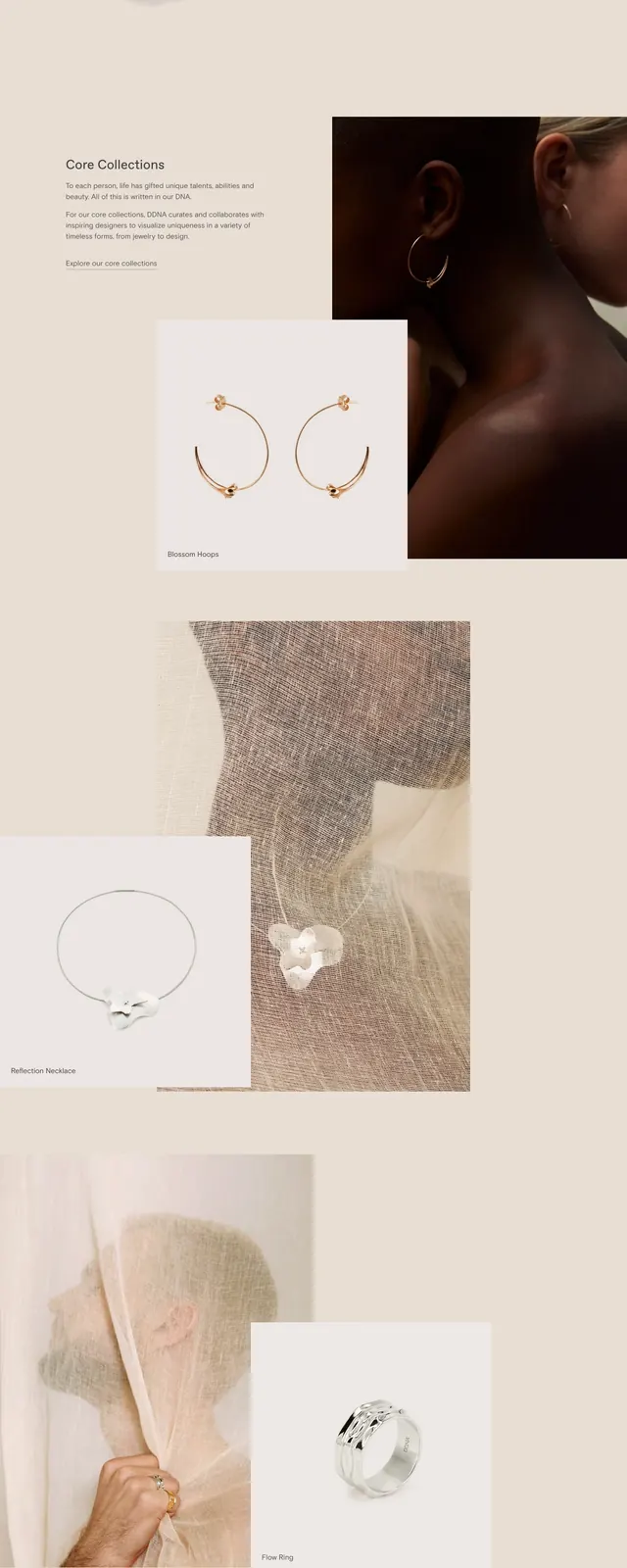
The page uses a pale cream background with teal accents and a clean top navigation bar, followed by a split hero with a teal text panel on the left and a warm product/lifestyle photo on the right. Below the hero, a centered brand statement sits above a row of circular icon badges and a featured collection grid with pastel product cards. Farther down, the layout alternates between large editorial copy blocks and product or nature imagery, includes a testimonial strip with star ratings, and ends with a newsletter signup and footer. The overall composition is spacious, soft, and heavily image-led with simple buttons and light divider lines.
Key takeaway
This is a strong example of making sustainability feel approachable through gentle color, generous whitespace, and calm editorial hierarchy. The design balances ecommerce merchandising with brand-purpose storytelling instead of pushing a hard sales layout.
Reuse notes
Use this pattern for eco, wellness, or purpose-driven ecommerce brands that need a premium but friendly homepage. It works best when you have strong product photography, simple iconography, and a few clear proof points to break up the storytelling.