Preview image. Unlock full-res
An airy, research-informed landing page with a soft pastel hero, illustrated floral motifs, and structured informational blocks.
Summary
An airy, research-informed landing page with a soft pastel hero, illustrated floral motifs, and structured informational blocks.
Visual description
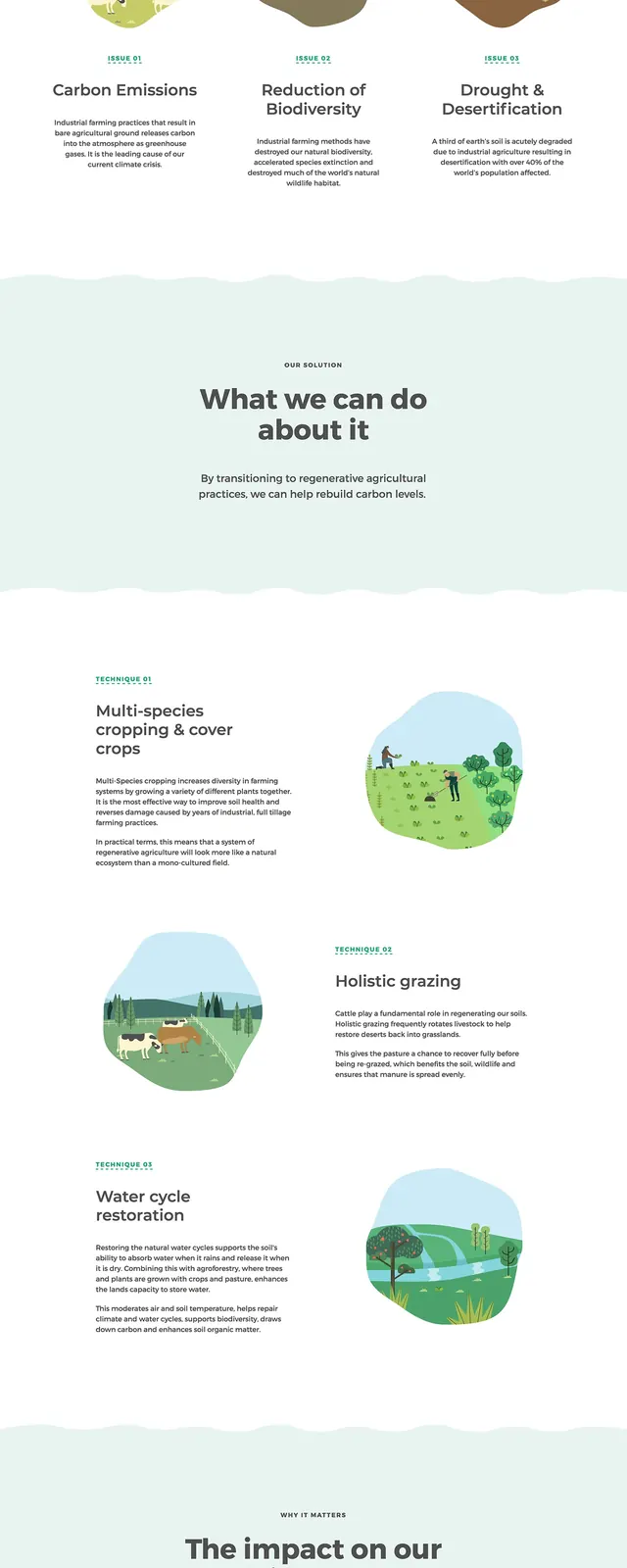
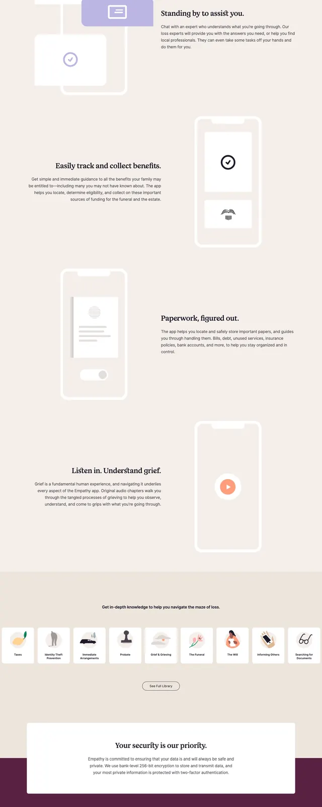
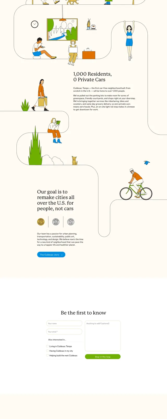
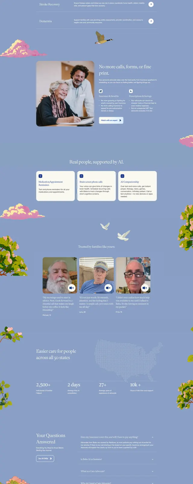
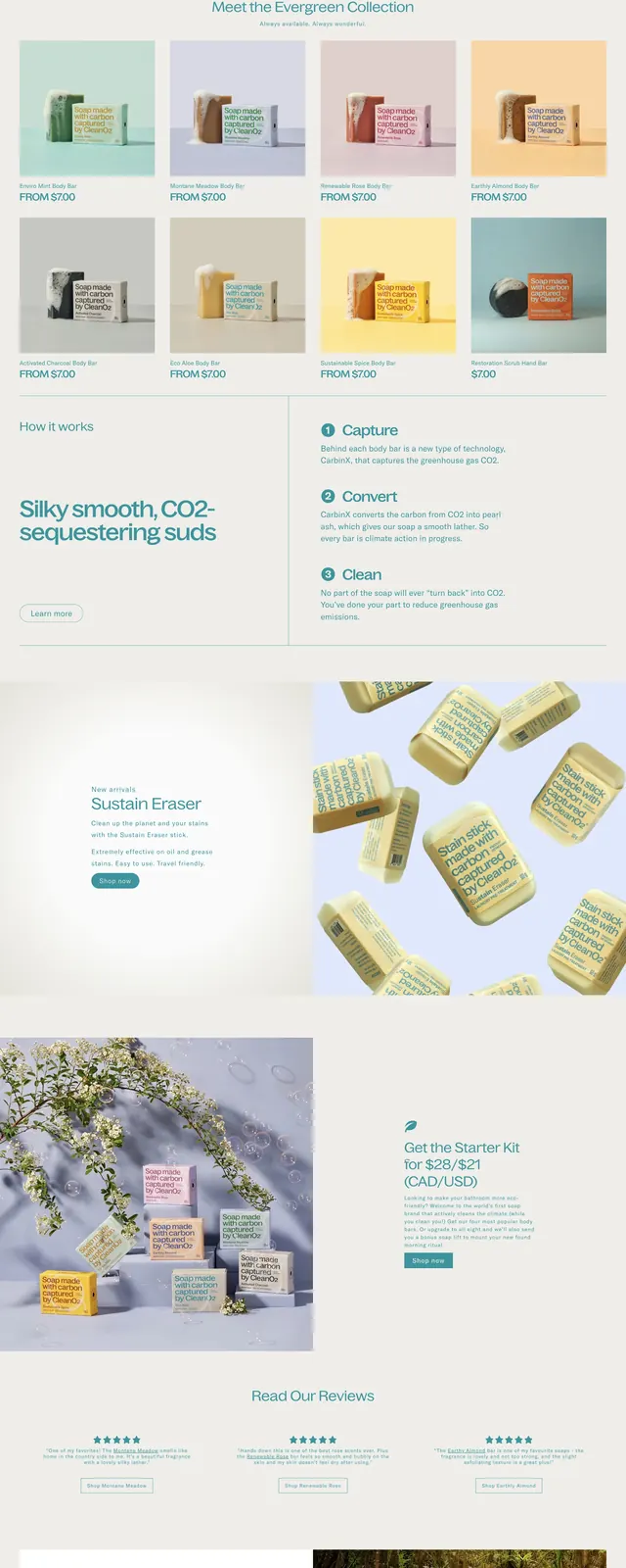
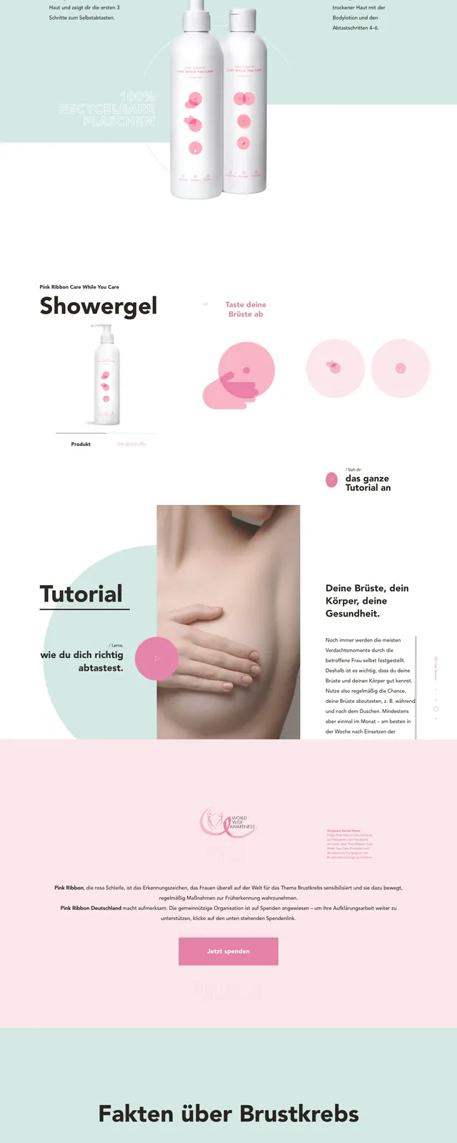
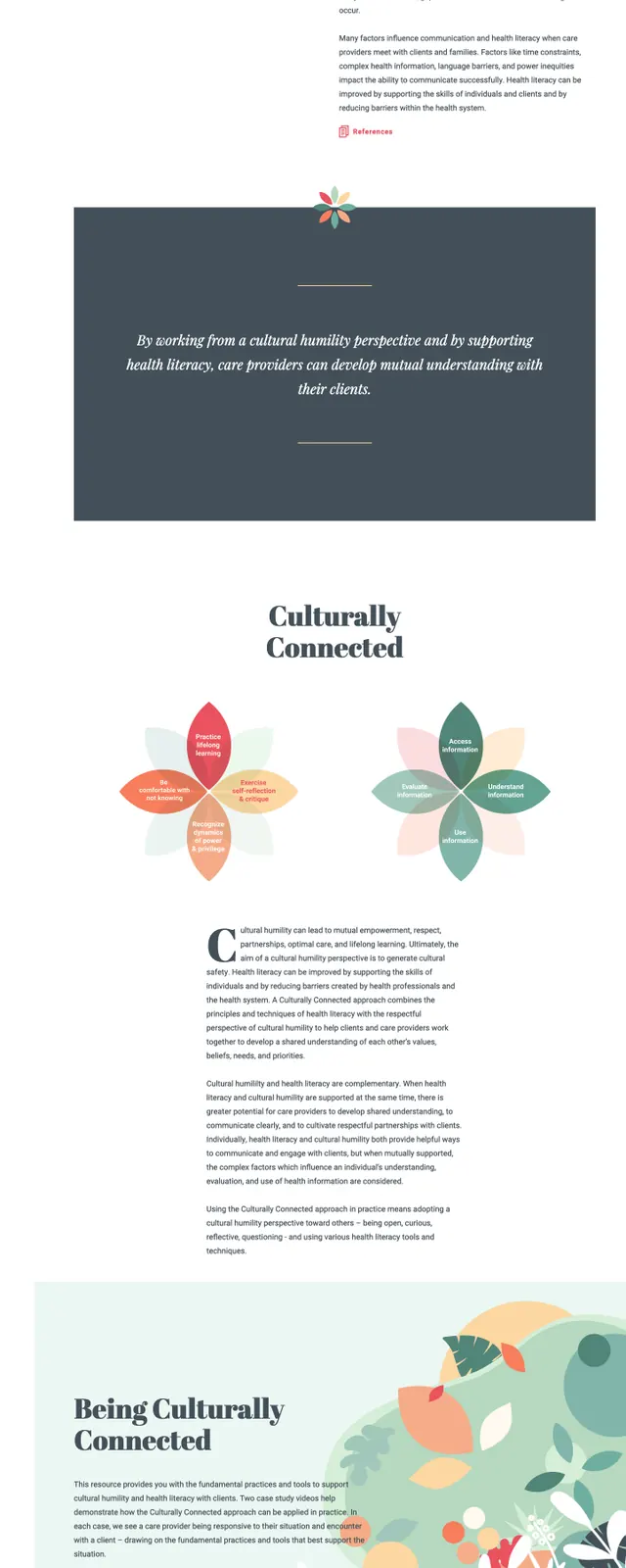
The page opens with a left-aligned text hero and a large abstract floral illustration on the right, using pale mint and peach tones. Below, the layout shifts into an about section with a bold serif heading, a thick horizontal divider, and two flower-like diagram graphics that explain concepts visually. Further down, there are three pastel information cards, followed by a two-column footer-style area with About, Contact, Resources, References, and partner logos.
Key takeaway
The design combines institutional clarity with gentle, human-centered illustration. It feels educational and community-oriented while staying clean and highly readable.
Reuse notes
This pattern works well for public-health, nonprofit, or education sites that need a friendly but credible tone. Reuse the split hero, diagram-based explainer section, and soft card grid for content-heavy informational pages.