Preview image. Unlock full-res
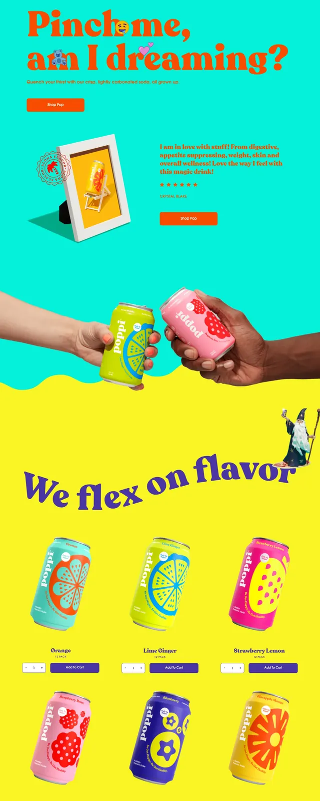
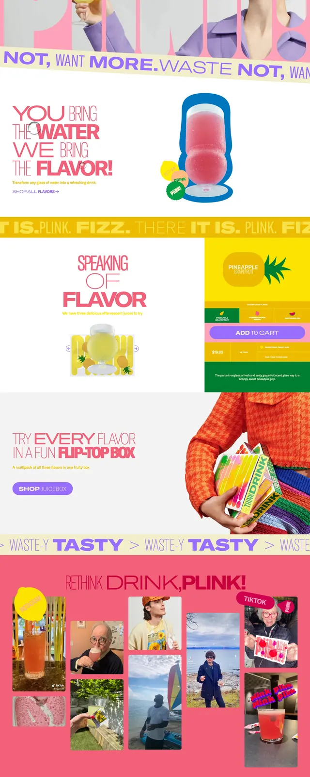
A playful eco-personal-care landing page with oversized typography, pastel pink and blue panels, and bold product storytelling.
Summary
A playful eco-personal-care landing page with oversized typography, pastel pink and blue panels, and bold product storytelling.
Visual description
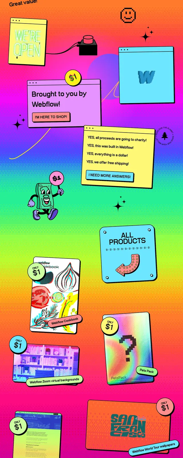
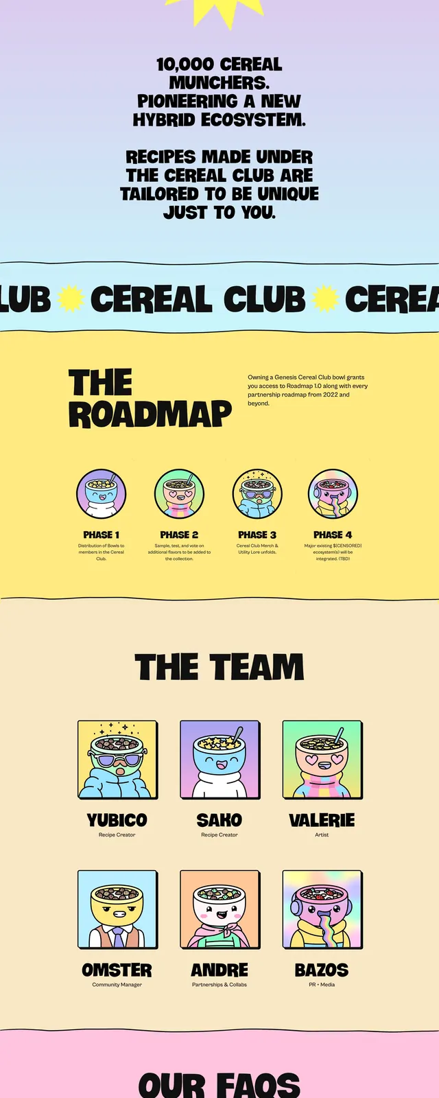
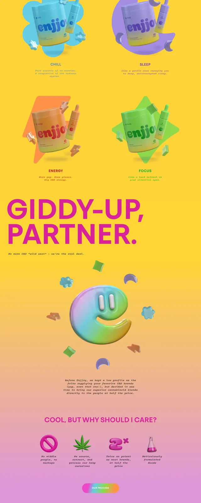
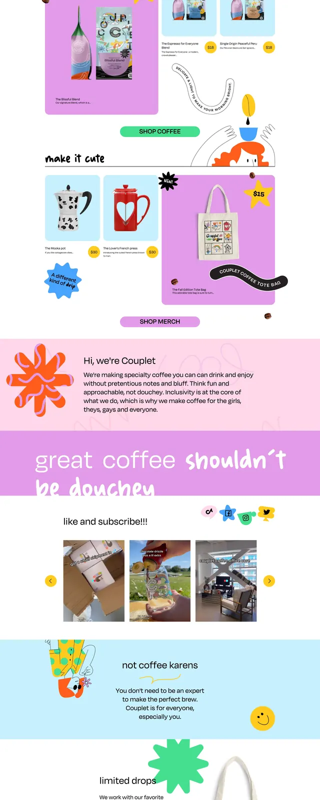
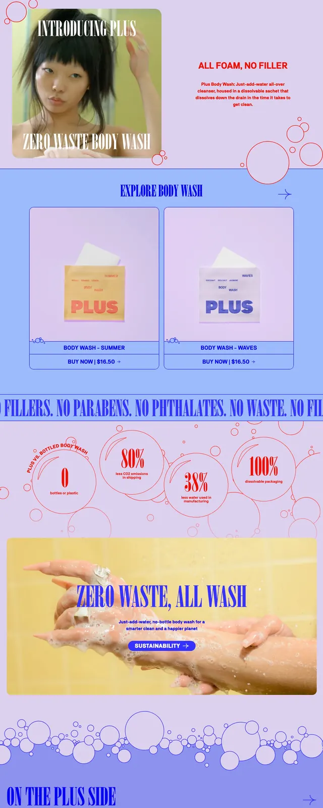
The page opens with a full-bleed hero featuring a large product package floating in a watery pink environment, topped by a slim navigation bar. Oversized red editorial headlines and a centered call-to-action sit over the main image, followed by a bold promotional strip. Lower sections include a product grid, a stats band with circular metric callouts, an image gallery, and a newsletter sign-up area in a bright coral footer.
Key takeaway
The design relies on strong contrast between playful pastel backgrounds and punchy red/blue typography to make a sustainability message feel lively and memorable. It combines product merchandising, brand storytelling, and lightweight data visuals in one highly reusable landing-page structure.
Reuse notes
Reuse the layout for consumer brands that want a colorful mission-led hero with product cards and proof points below. The stats bubbles, marquee banner, and centered newsletter module are especially easy to adapt for eco, wellness, and DTC ecommerce sites.