Preview image. Unlock full-res
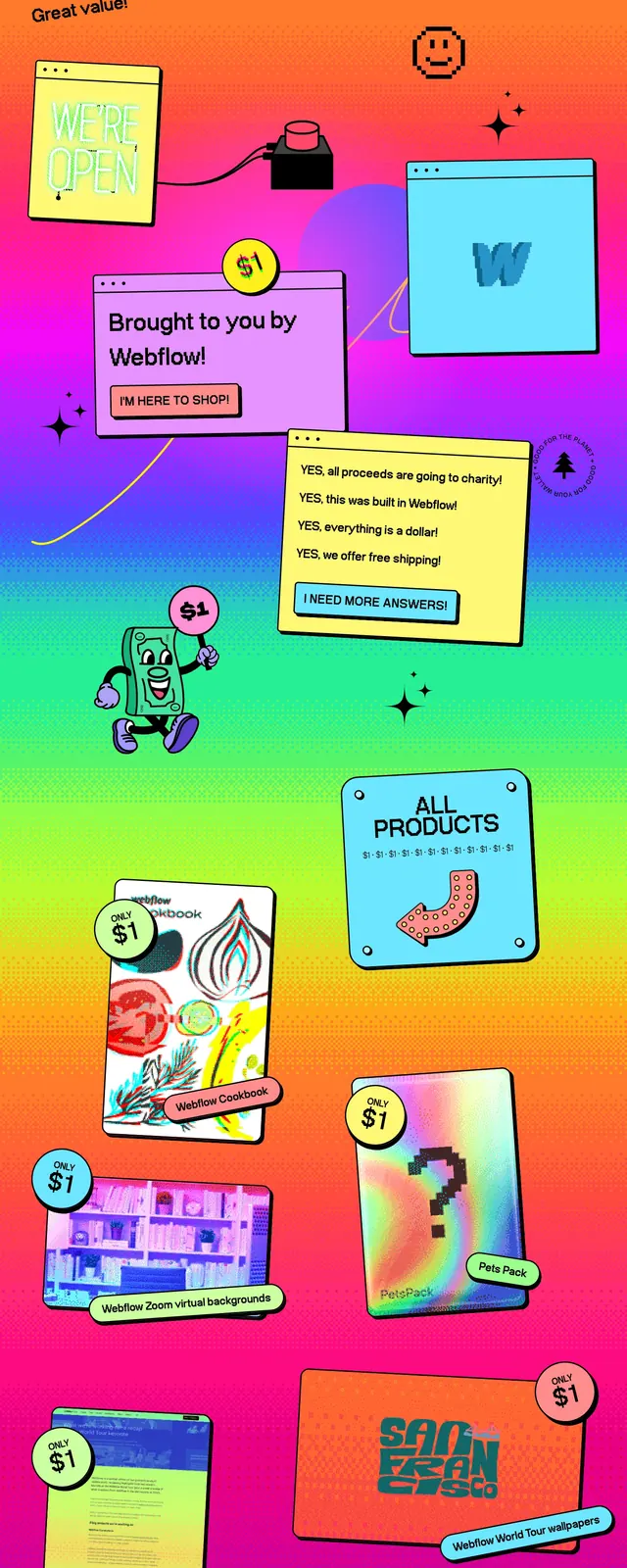
A playful full-page ecommerce landing page with a bright retro gradient, pixel-style headline, and scattered product-like callouts.
Summary
A playful full-page ecommerce landing page with a bright retro gradient, pixel-style headline, and scattered product-like callouts.
Visual description
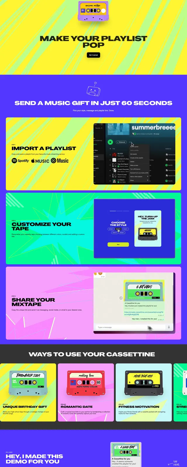
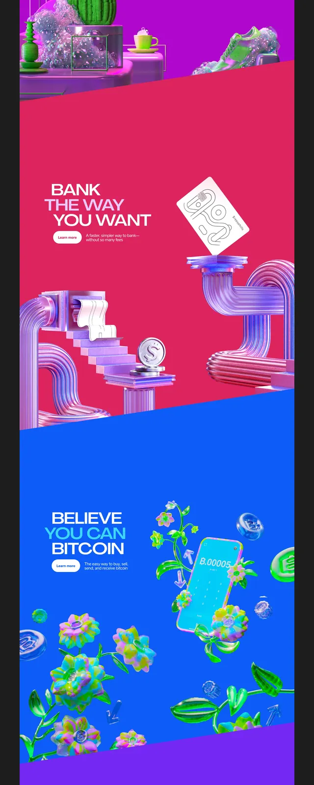
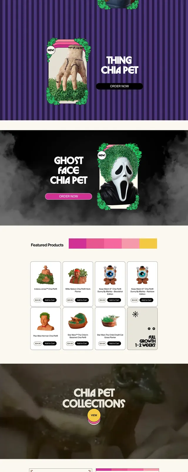
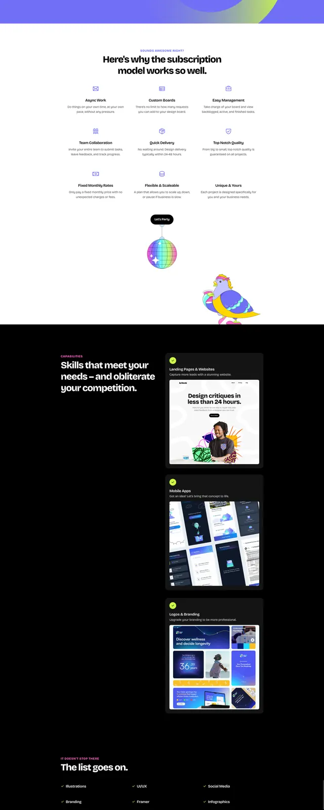
The page opens with a thin yellow navbar showing a simple logo on the left and About, Shop, and Cart on the right. Below it, a centered hero headline reads "THE DIGITAL DOLLAR STORE" in chunky pixel-style type over a dark-to-magenta-to-orange gradient background with halftone texture. As the tall capture continues, the layout becomes a collage of brightly colored product tiles, sticky-note-like cards, cartoon illustrations, and CTA buttons arranged in an overlapping, scrapbook-like composition.
Key takeaway
The strongest idea is the mix of ecommerce structure with loud arcade-era visuals: simple navigation, clear CTA cards, and collectible-style product callouts. The halftone gradients and sticker-like elements make the page feel intentionally chaotic without losing readability.
Reuse notes
Use this approach for playful ecommerce, promo microsites, or brand worlds that want a nostalgic digital-toy feel. It works best when the content can be broken into many small visual modules and paired with bold, simple copy.