Preview image. Unlock full-res
A loud, illustrated agency landing page with neon pink and purple sections, oversized hero copy, and cartoon characters driving the brand personality.
Summary
A loud, illustrated agency landing page with neon pink and purple sections, oversized hero copy, and cartoon characters driving the brand personality.
Visual description
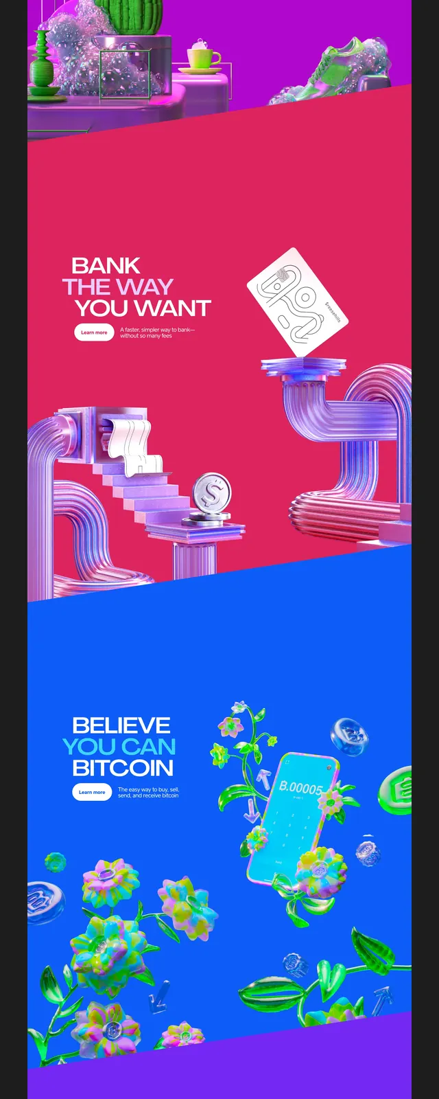
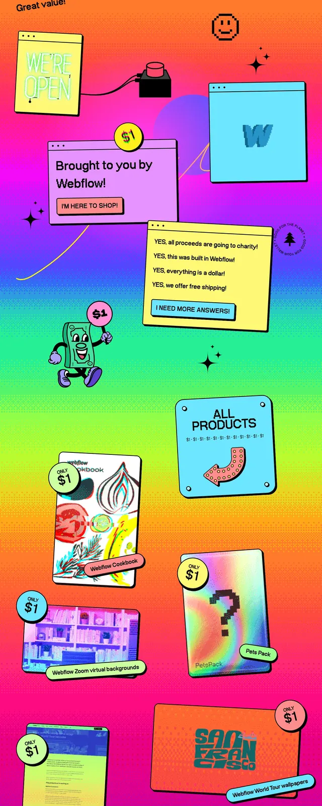
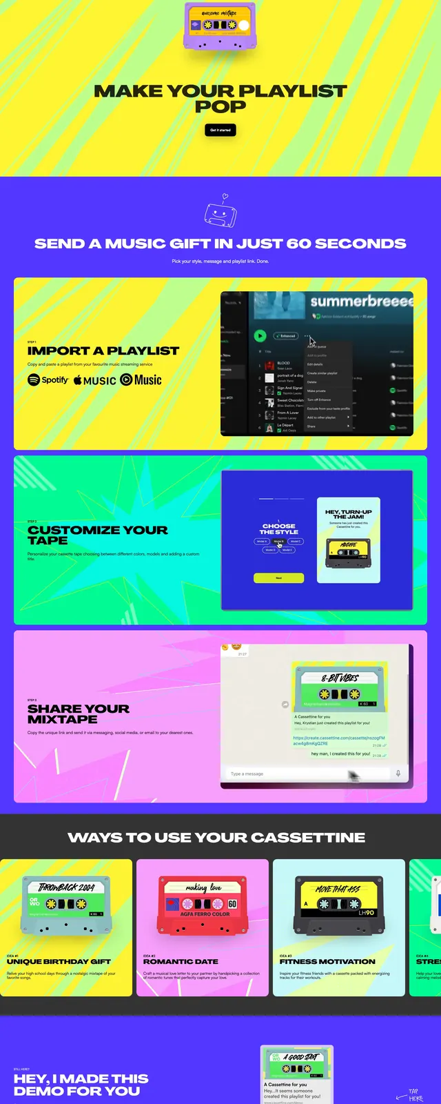
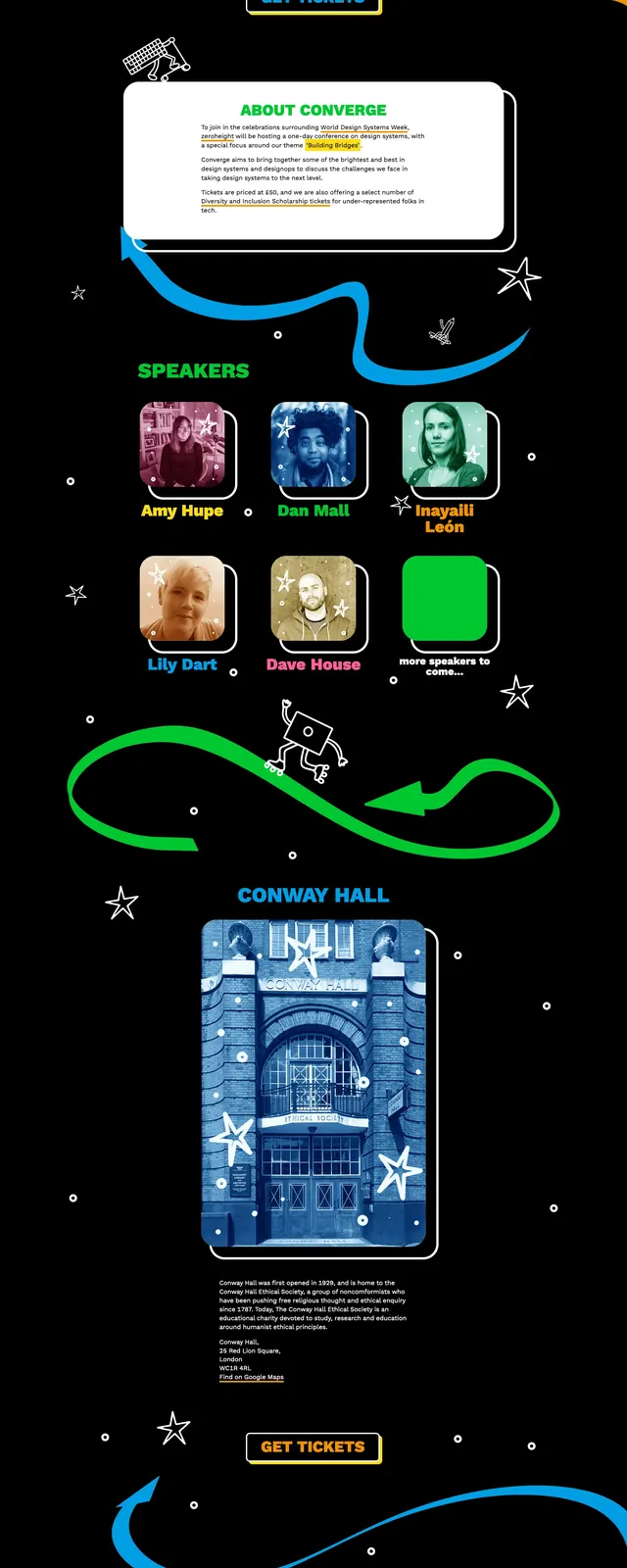
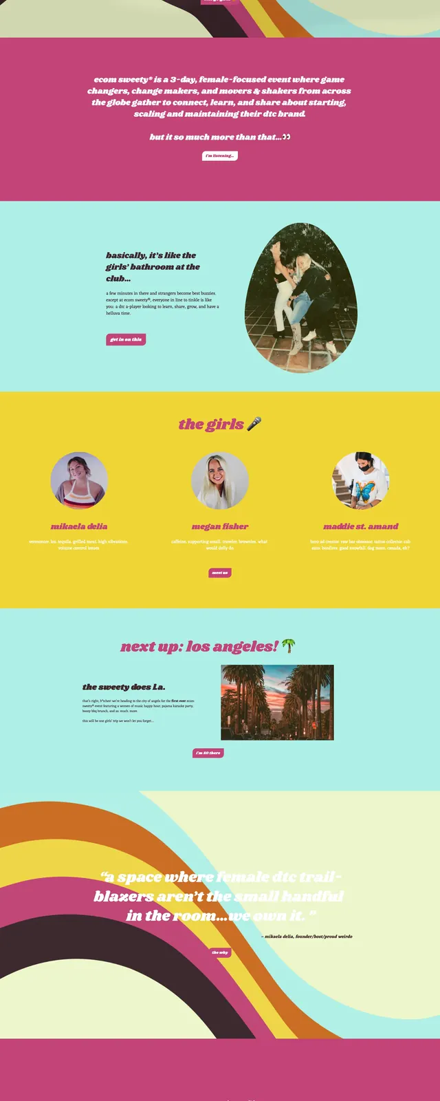
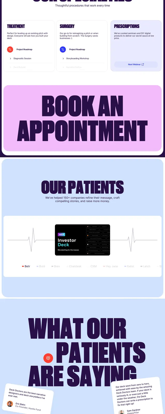
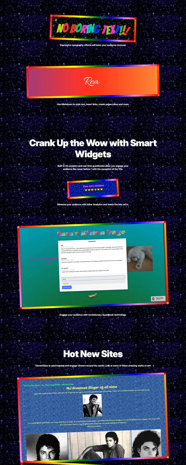
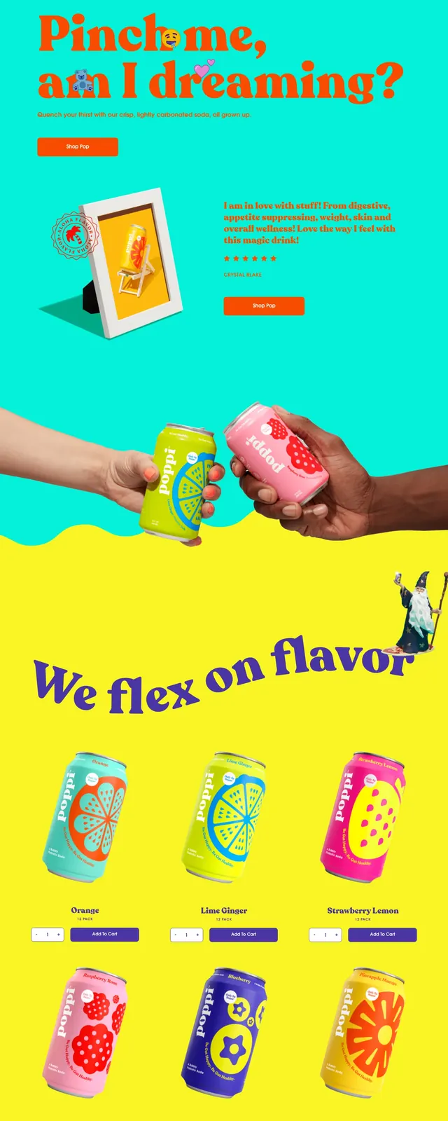
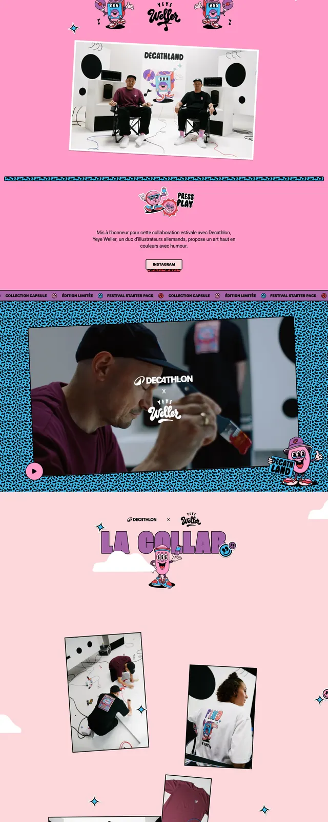
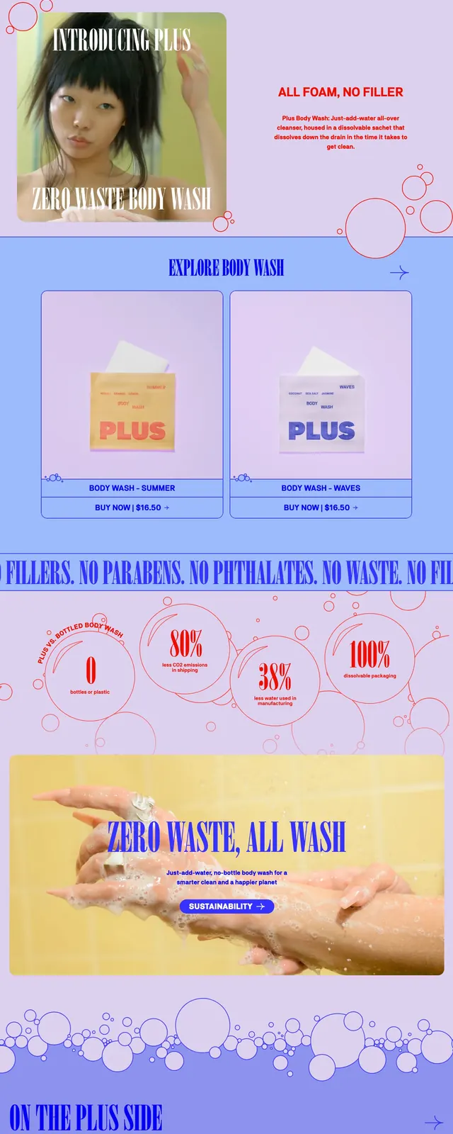
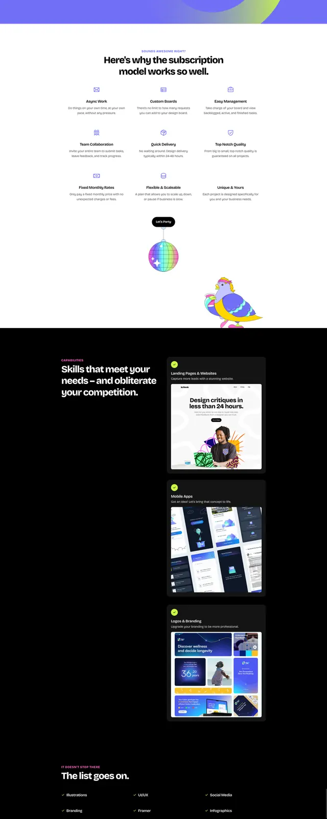
The page opens with a centered hero on a hot pink background, featuring a large white headline, small supporting text, and a single call-to-action button. A big cartoon character illustration sits over layered abstract shapes, lightning bolts, and cloud forms for a chaotic, energetic look. Lower sections switch to a black feature block with stacked content cards, then a purple CTA area with another large illustrated scene and a dark callout panel. The overall composition uses bold color blocking, playful character art, and oversized spacing to keep the page visually loud and memorable.
Key takeaway
This design leans hard into illustration and color to make an agency landing page feel memorable and unconventional. It works especially well for creative studios that want to signal personality before they explain services.
Reuse notes
Reuse the centered hero structure with a concise headline, one primary CTA, and a dominant mascot or branded illustration. The black feature strip and high-contrast CTA panel can be adapted for service highlights and conversion-focused ending sections.